Understanding why employees leave and how frequently it happens is critical to HR decision-making. But analyzing attrition data using Excel can be a challenge—messy formats, date math, and endless formulas often get in the way of insights.
In this tutorial, we’ll show how to analyze employee departure data using Excelmatic, an AI-powered Excel analysis tool. With just a few smart prompts, you’ll clean the data, calculate turnover, and visualize patterns—no formulas required.
The Example Dataset: Employee Exit Log
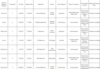
We’re working with a table that looks like this:

You want to:
- Calculate turnover rate
- See which departments lose the most staff
- Identify why people leave
The Traditional Way: Formulas and Frustration
To do this in Excel, you'd normally:
- Use
DATEDIF()orYEARFRAC()to calculate tenure - Build pivot tables to group by department and departure type
- Manually count keywords in reasons for leaving
This is slow, manual, and not scalable.
The Excelmatic Way: Just Ask Smart Questions
Prompt 1: Calculate Turnover Rate
Please calculate the employee turnover rate based on the Join Date and Departure Date.
Result:
Excelmatic calculates turnover as:
Departures / Average Headcount
Includes visual breakdown of resignation, dismissal, contract expiry
Prompt 2: Department-Level Breakdown
Please show the number of departures by department and by type of departure.
Result: Get a clean table like:
Prompt 3: Visualize Departure Trends
Please create a Bar Chart showing resignation vs dismissal vs contract expiry counts.
Result:
A polished, presentation-ready Bar Chart shows the overall distribution of exit types.
Final Thoughts
No formulas. No wasted hours. Just insights delivered instantly.
Upload your own Excel file and ask your first question:Try Excelmatic Now >>


