In sales, numbers talk—but only if you can hear what they’re saying. And too often, that conversation gets lost in Excel chaos. You're looking at dozens of rows, scattered across reps, products, and months, trying to answer a simple question: are we hitting our goals?
If you're managing sales KPIs with spreadsheets, you already know the pain: tracking actual vs. target, monitoring trends, highlighting underperformers, and prepping it all for a Monday review meeting. You spend more time formatting than thinking. But there’s a better way.
Let’s first walk through how this looks the traditional way—and why AI makes it faster, cleaner, and less frustrating.
The Traditional Way: Many Steps, Many Chances to Go Wrong
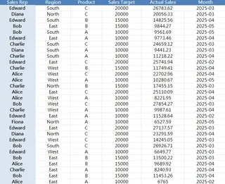
Say you have a file with monthly sales targets and actuals across 30 records.

You want to know:
- Who is consistently missing targets?
- Which regions outperform?
- How do Product A vs. B vs. C compare in Q2?
Step-by-step, here's what you'd normally do:
- Sort the data by rep, product, or month.
- Add a new column to calculate achievement rate (Actual / Target).
- Apply conditional formatting to highlight low performers (<90%).
- Insert pivot tables to group by region or product.
- Manually filter for date ranges (e.g., Q2 only).
- Create charts to visualize performance.
- Clean up labels, titles, color codes before sharing with your manager.
It sounds simple, but every small step adds time. Miss a formula bracket, and your insights go off-track. And if your file updates weekly? You repeat everything.
Now imagine you're not a formula guru. The learning curve steepens fast.
The Excelmatic Way: Ask Smart Questions, Get Smart Output
This is where Excelmatic changes the game. Instead of building a multi-tab report, you upload your Excel sheet and type questions like:
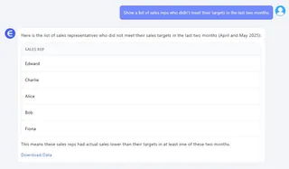
1.Show a list of sales reps who didn’t meet their targets in the last two months.
✅ Instantly returns a filtered, grouped table showing underperformance by month.

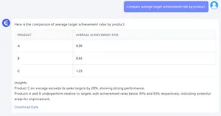
2.Compare average target achievement rate by product.
✅ Produces a clean table with achievement % by Product A, B, and C.

3.Generate a Bar Chart comparing actual sales vs. target for each region.
✅ You get a clear, presentable chart ready for slide decks.
No formulas. No pivot tables. No endless formatting.
What used to take 30 minutes now takes 30 seconds—and you focus more on insight, less on cleanup.
Why It Matters for Sales Ops and Team Leads
Sales KPIs change fast. New reps get onboarded. Promotions affect numbers. You can’t afford to wait on analysts or BI dashboards every time you want a mid-month snapshot.
With tools like Excelmatic, your sales ops lead can run a quick win-rate analysis before the pipeline review. Your regional manager can dig into lagging SKUs before QBRs. Your CFO can see actual-to-target summaries without needing a new report.
It democratizes data—not by dumbing it down, but by letting everyone interact with it more naturally.
Traditional vs. Excelmatic: A Recap
| Task | Traditional Excel | Excelmatic Approach |
|---|---|---|
| Highlight low performers | Manual formula + conditional formatting | Natural language question |
| Compare products or regions | Pivot tables + sorting | One query + auto charting |
| Visualize goal tracking | Create chart + tweak settings | Ask for a visual chart |
| Update analysis monthly | Repeat formatting and formulas | Upload new file + reask question |
Final Thoughts: Smarter Sales Starts with Smarter Sheets
You don’t need to ditch Excel. You just need to make it smarter.
Excelmatic helps you turn messy performance data into clean insights, fast. It doesn't replace your team or dashboards—it empowers you to spot trends, flag issues, and act quicker.
If you spend more time building reports than reading them, try switching from formulas to questions. Your KPIs will thank you.


