If you’ve ever run a survey—whether it’s for employee feedback, customer satisfaction, or service reviews—you know the hardest part isn’t collecting the data. It’s making sense of it.
Who’s satisfied? Where’s performance lagging? What are people really saying?
In this tutorial, I’ll walk you through how to use Excelmatic to analyze survey results with just three plain-English prompts—no AVERAGEIFS, no pivot tables, no formula pain.
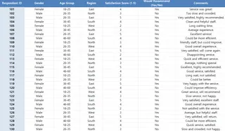
The Dataset: Survey Results Table
Suppose you have the following survey data sheet

What I Asked Excelmatic (and What I Got)
1️⃣ Visualize Satisfaction by Region
Prompt: Please create a Bar Chart showing average satisfaction score per region.
Result: Excelmatic generated a clean Bar Chart comparing average satisfaction scores across East, North, South, and West.
Great for identifying regional gaps in satisfaction.
2️⃣ Extract Key Comments
Prompt: Please extract feedback comments that mention ‘slow’, ‘great’, or ‘efficient’.
Result: Excelmatic returned a filtered table like this:
You instantly know which comments highlight service quality or bottlenecks—without reading every line.
3️⃣ Identify Critical Responses
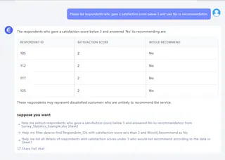
Prompt: Please list respondents who gave a satisfaction score below 3 and said No to recommendation.
Result:

These are the voices you need to hear—and address fast.
What You Can Do With This
- Create a dashboard for stakeholder reports
- Compare performance across regions or age groups
- Identify common issues with service or experience
- Filter key complaints for follow-up
- Save hours digging through raw Excel rows
Final Thoughts
Analyzing survey data shouldn’t feel like a spreadsheet nightmare. With Excelmatic, I skipped all the formulas and still got:
Whether you’re an HR manager, customer service lead, or project owner—this is how you get from data to action. Fast.
Klicken Sie hier, um den vollständigen Promptflow zu sehen und das Tool auszuprobieren >>
Möchten Sie es mit Ihrer eigenen Umfragedatei ausprobieren? Testen Sie Excelmatic jetzt >>


