Key takeaways:
Stop the Manual Grind: Ditch the hours spent on complex formulas and manual chart-building in Excel. Excelmatic is built for speed and simplicity.
AI Does the Heavy Lifting: Describe your dashboard goal in plain English, and the AI instantly generates a complete, interactive layout with charts, insights, and filters.
Edit and Refine with Ease: Every part of the AI-created dashboard is fully customizable. Adjust charts, edit text, and rearrange elements in just a few clicks.
From File to Dashboard in Six Simple Steps: The process is streamlined: Upload, Describe, Review, Style, Share, and Save. No steep learning curve is required.
More Than Just Dashboards: Excelmatic is a versatile toolkit that also converts images and PDFs to Excel and provides smart, conversational data analysis.
Tired of spending hours wrestling with Excel formulas and chart settings just to build a basic dashboard? You're not alone. For years, professionals have relied on traditional spreadsheet tools to visualize data — a process often involving manual formatting, complex functions, and a lot of copying and pasting. While tools like Tableau or Power BI offer more power, they come with a steep learning curve and often feel like overkill for quick, impactful reports.
What if you could turn your Excel file into a clean, interactive dashboard just by describing what you need? Enter Excelmatic — an AI-powered tool that bridges the gap between simple spreadsheets and advanced business intelligence, all within your browser.
Why Excelmatic Stands Out
Before we dive into the "how," let's talk about the "why." Traditional dashboard creation usually follows a rigid, time-consuming workflow: clean your data, choose charts, configure them one by one, format, and then hope it conveys the right message. Other BI tools require you to learn their interface, understand dimensions and measures, and often still demand manual setup.
Excelmatic takes a different approach:
No technical jargon needed — You guide it using plain English.
AI does the heavy lifting — From chart selection to insight generation.
Fully editable results — What AI creates, you can refine in clicks.
All online — No installation, no steep learning curve.
It's like having a data analyst and a designer working with you in real-time.
Creating a meaningful dashboard can be a roadblock. Here's a clear comparison of how Excelmatic offers a smarter path:
| Aspect | Traditional Spreadsheet Tools | Classic BI Tools | Excelmatic |
|---|---|---|---|
| Starting Point | Daunting blank canvas. You figure everything out. | Requires complex data modeling first. | Instant AI draft from your description. |
| Time to Insight | Slow. Hours of manual formatting and chart building. | Slow setup. Significant learning and setup before seeing results. | Fast. A complete dashboard is generated in seconds. |
| Skill Required | Advanced Excel skills for a polished result. | Steep learning curve; must learn the tool's logic. | Zero learning curve. Use simple language. |
| Core Value | Raw flexibility at the cell level. | Enterprise-scale power and customization. | Unmatched speed & simplicity for turning data into stories. |
Excelmatic removes the complexity. You don't build from scratch — you guide an AI to build it for you, then refine it together in minutes, not hours.
How to Build Your First Dashboard with Excelmatic
Step 1: Upload Your File
Start by visiting Excelmatic and clicking the "Excel to Dashboard" option. Here, you can upload your own .xlsx or .csv file. If you're just exploring, feel free to use one of our sample datasets — like the Weekly CashFlow Analysis data from Domo (shown below).
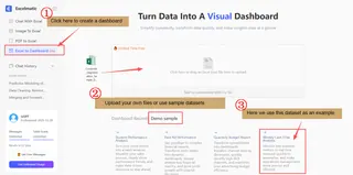
- Tip: While Excelmatic can detect and help fix missing or abnormal values, you'll get the best results if your data is already cleaned and structured. Every dashboard you create is saved locally in your history, so you can easily return to it later.
Step 2: Tell Excelmatic What You Need
In the chat-like input box, describe the dashboard you have in mind. You don't need technical terms — just speak naturally. Example requests:
- "Show me sales by region and month"
- "Compare actual vs. forecasted expenses"
- "Create an executive summary for Q3 performance"
If you're unsure where to start, Excelmatic will suggest prompts based on your data. For this walkthrough, let's select one of their recommended prompts:
"Monitor key business metrics in real time, respond quickly to anomalies, and make operations management more precise and efficient."
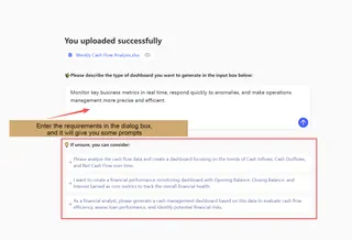
Step 3: Review & Refine Your AI-Generated Dashboard
Within seconds, Excelmatic builds a complete dashboard containing:
Overview Section — A written summary of key takeaways.
Filter Criteria — Interactive filters based on your data's categories.
Visualizations — Charts and graphs chosen to best represent your metrics.
Key Stats & Insights — Important figures highlighted with explanatory text.
Everything is editable.
- To adjust a chart: Click on it. A dialog opens where you can tell the AI what to change (e.g., "show as a line chart instead" or "group by quarter"). Again, you'll get smart suggestions.
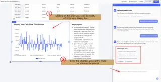
- To edit text: Click any headline or description to modify content, font size, color, or alignment.

- To rearrange: Drag and drop sections, delete or add components, or resize visuals on the fly.
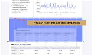

- To use filters: Select specific fields to drill down into your data instantly.

A quick note on charts: Excelmatic supports bar charts, line graphs, scatter plots, heatmaps, and more — each chosen based on what best tells your data's story. For instance, trends over time are usually shown with lines, comparisons among categories with bars, and correlations with scatter plots.
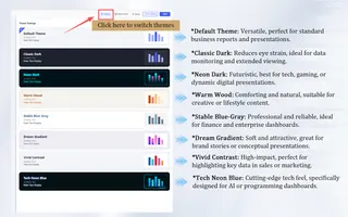
Step 4: Choose a Color Theme
Dashboards aren't just about data — they're about clear communication. Excelmatic offers multiple built-in color themes. The default is clean and professional, but you can switch to themes better suited for presentations, reports, or specific branding. Each theme is designed with readability and visual harmony in mind.
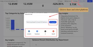
Step 5: Share Your Dashboard
Click "Share" in the top-right corner to generate a link or share directly to platforms like Facebook, LinkedIn, or via email. This is especially useful for team collaboration — you can give others view or edit access without sending files back and forth.
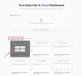
Step 6: Save & Return
Once you're satisfied, hit "Save". Your dashboard is stored in your Excelmatic workspace, ready to be reopened, updated with fresh data, or modified anytime.
Beyond Dashboards: Excelmatic's Full Toolkit
Excelmatic isn't just a dashboard builder. It's a versatile Excel companion that also includes:
Image to Excel — Extract tables from photos or screenshots.
PDF to Excel — Convert PDF reports into editable spreadsheets.
Smart Data Analysis — Ask questions about your data and get instant answers.
For entrepreneurs, analysts, and business users, it's an all-in-one solution for data tasks that used to require multiple tools.
Why Excelmatic is a Game-Changer
Simplicity & Speed — Go from data to dashboard in minutes, not hours.
Conversational AI — No coding, no complex settings — just describe what you want.
Human-Centric Design — Editable every step of the way, with smart suggestions when you need inspiration.
High Visual Impact — Professional, interactive, and presentation-ready outputs.
Automated Reporting — Let AI generate summaries and highlight insights you might have missed.
Ready to Transform Your Data Workflow?
If you've ever wished you could visualize Excel data faster, communicate insights more clearly, or simply free up time from manual chart-building, Excelmatic is your answer.
It's more than a tool — it's your AI partner for data storytelling.
👉 Try Excelmatic today. Upload your file, type what you need, and watch your dashboard come to life.
Frequently Asked Questions (FAQ)
Q: What if the AI generates a chart that doesn't make sense for my data?
A: This is where the "fully editable" feature shines. Simply click the chart and use the AI dialog to refine it. For example, you can say, "This should be a bar chart, not a pie chart," or "Compare these two specific metrics instead." The AI learns from your correction and applies it immediately.
Q: Is Excelmatic free to use?
A: Excelmatic typically offers a free tier with generous limits (e.g., a number of dashboards per month) so you can fully test its capabilities. For frequent business use, affordable paid plans unlock more advanced features, larger file support, and team collaboration options.
Q: Can I use Excelmatic on mobile devices?
A: Yes. Since it's entirely browser-based, Excelmatic works on tablets and smartphones. The interface is responsive, allowing you to view and lightly edit dashboards on the go, though complex creations are best done on a desktop.

