If you’ve ever tried to break down cost structures in Excel, you know how quickly it gets out of hand.
You start with a simple question: How much are we spending on labor vs materials? You end up in a VLOOKUP vortex, buried in pivot tables and conditional formatting, wondering why your Bar Chart won’t align with your summary totals.
Let’s unpack what it really takes to analyze cost structure in Excel the “traditional way”—and how tools like Excelmatic let you skip the mess and go straight to the insight.
The Manual Excel Approach (a.k.a. spreadsheet gymnastics)
Let’s say you’re given a spreadsheet with 30+ cost records. Each row contains:
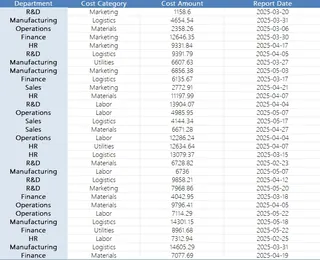
- Department (Finance, Sales, etc.)
- Cost Category (Labor, Materials, etc.)
- Amount
- Report Date
And your task is to answer basic questions like:
“What percentage of total cost comes from each category?”
“Which departments are overspending on logistics?”
“How has our cost structure changed over the last 2 months?”
Here’s how you’d do it in old-school Excel:
Step 1: Clean and check the data
Make sure date formats are consistent. Check for missing cost categories. Fix inconsistent department names (“Ops” vs “Operations”).
Step 2: Create a Pivot Table
Rows = Cost Category
Values = Sum of Amount
Columns = Department (if you want cross view)
Filter = Date range
Now you’ve got your totals, but want percentages?
→ Insert another column, use =Amount/SUM(Amount).
Step 3: Create the charts
Pie charts for share of category, stacked bar for department breakdown.
Manually copy and paste pivot outputs into separate tables if needed.
Step 4: Highlight outliers
Conditional format rows over a threshold (say, $10,000 in “Utilities”).
Or use IF(Amount>10000,"Flag","") to tag suspicious values.
Step 5: Check trends
Add a second pivot with Report Date in rows, Cost Category as values. Group dates by week or month. Manually spot shifts.
You’ve spent 60 minutes. Your model works.
But it’s fragile, slow to update, and god help you if someone asks for a different category filter.
The Excelmatic Way: Three Prompts to Rule Them All
Now imagine uploading that same Excel file to Excelmatic, and simply asking:
1. “Please calculate the total cost per category and show it as a percentage of total expenses.”
→ You get a clean table like:
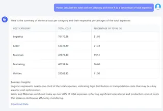
No formulas. No pivots. Just the data, the way you need it.
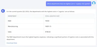
2. “Which departments have the highest cost in ‘Logistics’ this quarter?”
→ Excelmatic returns a sorted table with totals by department for just the ‘Logistics’ category. Great for budget reviews and internal audits.
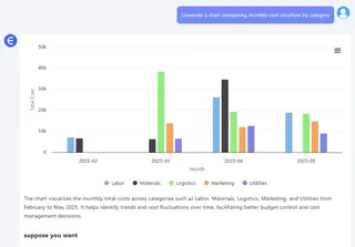
3. “Generate a chart comparing monthly cost structure by category.”
→ Instantly, you get a stacked column chart. Month on X-axis. Category segments on Y. No dragging, grouping, or swearing required.
Why This Is a Game-Changer
Excel isn’t bad. But it's designed for flexibility, not speed.
If you know all the formulas, filters, and formatting rules—it’s powerful.
But most of us just want answers, not a crash course in pivot table troubleshooting.
Excelmatic flips the script. You don’t need to “build” a model—you just ask a question.
It’s not about eliminating Excel. It’s about eliminating Excel friction.
Manual vs Excelmatic – Side-by-Side
| Task | Traditional Excel | Excelmatic AI |
|---|---|---|
| Cost percentage by category | Pivot + formula + manual cleaning | One smart question |
| Cross-department analysis | Multiple grouped pivots | Filtered table, sorted cleanly |
| Trend charts | Build visuals manually from pivots | Instant dynamic chart |
| Outlier detection | Conditional formatting rules | Smart prompt + flag return |
| Time | 45–90 minutes | Under 3 minutes |
Final Thoughts: Focus on Insight, Not Syntax
If your job is to explain why “Marketing costs just jumped 42%,”
you shouldn’t have to spend an hour prepping the data to prove it.
Excelmatic lets you skip the grunt work and go straight to the storytelling.
Upload the file. Ask what you want.And finally, get back to making actual decisions.

