In the realm of data processing, Excel has always held a significant position. However, dealing with complex data and intricate formulas often leaves us feeling overwhelmed. Now, Excelmatic, driven by AI, is here to make Excel data analysis simple and intelligent.
Conversational Data Analysis: Simplifying the Process
1. Summation Function
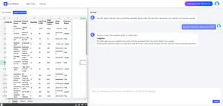
In the past, calculating sums required memorizing formulas, which could easily lead to errors. With Excelmatic, you can simply say, Help me sum up the values. It will quickly provide the result. For example, if you have a sales data table and want to calculate the total sales for each month, you no longer need to manually enter formulas. Just a single command, and Excelmatic will handle it for you.
2. Average Calculation
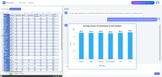
Calculating averages is equally straightforward. For instance, when calculating average scores for students in different subjects, you can tell Excelmatic, Calculate the average scores for each subject and generate a chart. It will not only provide the answers quickly but also offer some analysis based on the averages.
Intelligent Chart Generation: Intuitive Data Visualization
1. Pie Chart
Pie charts are great for intuitively displaying the proportion of each part relative to the whole. With Excelmatic, you can simply say, "Generate a pie chart for sales percentage." It will quickly produce a well-colored pie chart. For example, if you have sales data from different regions and want to see the proportion of each, a pie chart will make it crystal clear.

2. Bar Chart
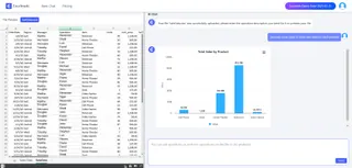
Bar Charts are suitable for comparing data. For example, if you want to compare the sales of different products, just tell Excelmatic, "Generate a Bar Chart." It will represent the sales of each product with bars, making it easy to see which products are selling well and which are not.
3. Line Chart
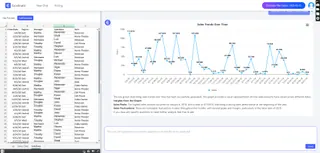
Line charts are excellent for analyzing trends. For example, if you want to see the price trend over a period of time, ask Excelmatic to generate a line chart. It will clearly display the price fluctuations.
Precise Analysis and Recommendations: Supporting Decision-Making
1. Financial Budget Analysis
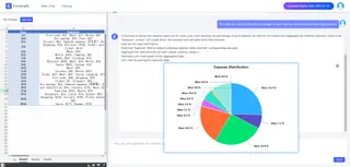
In financial budgeting, Excelmatic can help you analyze departmental expense ratios and predict future expenditures. You can use pie charts to show the proportion of different expenses or Bar Charts to compare the costs of various projects.
2. Market Sales Forecast
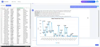
Based on historical sales data, Excelmatic can predict sales for the next quarter. You can use line charts to show the trend of sales or Bar Charts to compare sales across different months.
In summary, Excelmatic is like your personal data assistant, making Excel easy to handle. Whether it's complex formulas, chart generation, or analysis and recommendations, it can handle everything with ease. With Excelmatic, you can navigate the world of data processing with confidence and ease!

