Points clés :
- Revue pratique : Comparaison hands-on des meilleurs outils de dashboard AI testés sur des données réelles.
- Spécialisation des outils : Chacun excelle dans un domaine différent : feuilles de calcul (Excelmatic), code/statistiques (Julius AI), BI d'entreprise (Looker Studio), ou contrôle des données (open-source).
- Choix selon le contexte : Le meilleur outil dépend de votre source de données (Excel vs. base de données), de vos compétences techniques et du compromis vitesse vs. contrôle.
- Recommandation équilibrée : Pour des insights actionnables directement à partir de fichiers Excel désordonnés, Excelmatic offre actuellement l'expérience la plus fluide.
business intelligence tools used to be about control. You defined the model, locked the metrics, and distributed dashboards that answered a fixed set of questions. That approach still works for stable reporting, but it starts to break down when teams need fast answers from messy, constantly changing data.
Over the last year, I tested several AI dashboard generators that claim to shorten the gap between raw data and insight. What I wanted to understand was not just what they can do in theory, but how they behave with real datasets, vague instructions, and limited free plans.
Throughout this review, I focused on four practical criteria: how well each tool understands natural language, how accurately it infers data structure, how usable and interactive the dashboards actually are, and what you realistically get without paying.
Excelmatic: AI Dashboards Built for the Excel Reality
Most teams still live in Excel, even if they don't like to admit it. Files grow organically, sheets reference each other loosely, and column names often reflect internal habits rather than clean schemas. Excelmatic is one of the few AI dashboard tools that feels designed for this reality instead of a sanitized demo dataset.

When I uploaded a spreadsheet to Excelmatic, the system immediately began identifying the metrics, dimensions, and relationships within the data. Without any manual setup, it recognized how different fields related to one another and used that structure as the basis for the analysis. From there, I was able to describe what I wanted to see in plain language, and Excelmatic generated the dashboard accordingly.
The process felt notably fast. From upload to a usable dashboard took only a few minutes, and the interaction never required me to think about formulas, data models, or code. What stood out is that the dashboard was not a one-off output. After it was generated, I could continue refining it through conversation, adjusting metrics or visual emphasis without starting over.
The resulting dashboards are intentionally simple and focused. Charts are connected through cross-filtering, allowing interactions in one view to update the rest of the page in a predictable way. This keeps exploration intuitive rather than overwhelming.
From a pricing perspective, Excelmatic offers a usable free tier, but with limits on dataset size and dashboard generation frequency. At scale, the paid plans are positioned in the mid-range for analytics tools, which feels reasonable given the automation it provides.
The main limitation is scope. Excelmatic is optimized for spreadsheet-based workflows. If your data primarily lives in production databases or requires complex joins across systems, it can feel constrained.
Julius AI: When Dashboards Are a Side Effect of Code
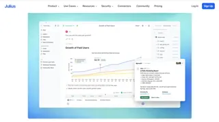
Julius AI approaches analytics from the opposite direction. Instead of hiding complexity, it generates Python code using large language models and executes it in a sandbox environment.
In practice, this makes it extremely powerful for exploratory data analysis. I was able to move quickly from descriptive statistics to regression models and custom visualizations. The charts it produces are technically sound and well suited for analytical validation. Intégrer ici un graphique généré par code ou une sortie de type notebook aide à fixer les attentes des lecteurs.
However, Julius AI is not really a dashboard tool in the traditional sense. While you can generate visual outputs, assembling a polished, shareable dashboard requires additional work. It's also less approachable for non-technical stakeholders, since interpreting results still assumes statistical familiarity.
The free tier is fairly restrictive, especially around execution limits. Pricing increases quickly if you rely on it heavily, which makes sense given the compute involved, but it limits casual usage.
Google Looker Studio with Gemini: Enterprise-Grade, Less Spontaneous
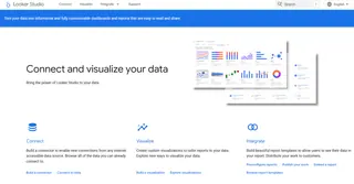
Looker Studio paired with Gemini represents a more conservative evolution of BI. Its real strength lies in stable data pipelines and long-term reporting rather than ad-hoc exploration.
Connecting to live data sources is straightforward, and the platform handles distributed datasets well. Cette section gagne à inclure une capture d’écran montrant plusieurs connecteurs live ou un dashboard de monitoring, renforçant son positionnement entreprise.
That said, the AI layer feels more assistive than transformative. You still need a reasonably well-defined data model, and iteration speed is slower compared to tools built for conversational analysis.
While Looker Studio itself is free, real costs appear in the surrounding infrastructure. For teams already on Google Cloud, this is rarely an issue. For others, it can introduce hidden complexity.
Open-Source Options: Control at the Cost of Convenience
Tools like Metabase and Chat2DB take a privacy-first approach. By converting natural language into SQL, they allow teams to query internal databases without sending data to third-party platforms.
This is especially appealing in regulated environments. A diagram showing text-to-SQL flow or a self-hosted architecture fits well here, helping readers visualize the trade-off.
The downside is setup and maintenance. These tools are flexible, but they require technical ownership. AI assistance is improving, but it still depends heavily on schema quality and database design.

Side-by-Side Comparison: How These Tools Actually Stack Up
After testing these tools with real datasets and realistic prompts, it became clear that their differences are less about "better or worse" and more about who they are built for. To make those trade-offs explicit, the table below summarizes how each tool performed across the four criteria that mattered most in this review: natural language understanding, schema inference accuracy, dashboard usability and interactivity, and what you genuinely get without paying. I've also included the audience each tool best serves and a rough sense of pricing to ground expectations.
| Outil | Compréhension du langage naturel | Inférence du schéma de données | Utilisabilité & interactivité du tableau de bord | Ce que vous obtenez réellement gratuitement | Public cible | Tarification (aperçu) |
|---|---|---|---|---|---|---|
| Excelmatic | Fort pour interpréter des questions métier et des consignes vagues, surtout autour des métriques Excel | Très précis avec des fichiers Excel multi-feuilles, y compris les relations implicites | Dashboards soignés et réactifs avec cross-filtering et mises en page claires | Jeux de données et générations de dashboards limités, mais suffisants pour une évaluation réelle | Équipes métier et analystes travaillant principalement sur Excel | Free tier disponible ; plans payants dans le mid-range pour analytics tools |
| Julius AI | Excellent pour l’intention analytique, notamment les requêtes statistiques et de modélisation | S’appuie davantage sur une structure de données explicite que sur l’inférence | Visualisations techniquement correctes mais pas conçues pour des dashboards partageables | Limites strictes d’exécution et d’usage | Analystes de données et chercheurs à l’aise avec le code | Usage gratuit limité ; les plans payants montent vite avec le compute |
| Looker Studio + Gemini | Utile pour l’analyse guidée, moins flexible pour les questions ouvertes | Solide quand les schémas sont déjà bien définis | Dashboards fiables et scalables, conçus pour le monitoring long terme | Produit central gratuit, mais la valeur dépend des services connectés | Équipes enterprise avec pipelines de données stables | Looker Studio est gratuit ; coûts indirects via l’infrastructure cloud |
| Metabase / Chat2DB (Open Source) | En progrès, mais dépend de la clarté du schéma | Précis quand la conception de la base est propre | Dashboards fonctionnels ; la personnalisation demande un effort | Entièrement utilisable en self-hosting | Équipes ayant des exigences de conformité, confidentialité ou d’hébergement | Gratuit (open source) ; coût en infrastructure et maintenance |
Si vous travaillez principalement dans des feuilles de calcul et avez besoin de réponses rapides sans reconstruire des modèles, Excelmatic optimise clairement ce workflow.
Si votre travail penche vers la recherche, l’expérimentation ou les statistiques avancées, les outils pilotés par code comme Julius AI restent plus expressifs.
Pour les organisations qui tiennent à la stabilité, la gouvernance et au reporting long terme, les plateformes BI d’entreprise offrent encore des avantages que la seule couche AI ne remplace pas.
Et si la propriété des données est non négociable, les solutions open-source échangent la commodité contre le contrôle.
Au final, les AI dashboard generators ne convergent pas vers une seule « meilleure » solution. Ils divergent vers différentes définitions de productivité, façonnées par qui pose les questions et à quel point ils veulent rester proches des données.
Réflexions finales
If your goal is fast, credible business insight from spreadsheet data, Excelmatic currently offers the most balanced experience. It reduces friction without oversimplifying analysis.
For deep statistical work, AI code generation remains the strongest option. And for organizations managing large, long-lived data environments, enterprise BI platforms still provide the most reliable backbone.
AI dashboard generators are not replacing BI so much as redefining who gets to ask questions — and how quickly those questions turn into answers.
If you want to see how an AI dashboard generator works with real Excel data, Excelmatic lets you start for free and create interactive dashboards directly from your spreadsheets in minutes.
Frequently Asked Questions (FAQ)
Q: What is an AI dashboard generator?
A: An AI dashboard generator is a tool that uses natural language and machine learning to automatically analyze data and generate interactive dashboards without manual modeling.
Q: How accurate are AI dashboard generators with real data?
A: Accuracy varies widely. Tools optimized for spreadsheets tend to perform better with loosely structured data, while code-driven tools rely more on clean schemas.
Q: Can AI dashboard generators replace traditional BI tools?
A: They do not replace BI platforms entirely but complement them by enabling faster, more flexible analysis for ad-hoc and exploratory use cases.
Q: Are free plans usable for real work?
A: Free tiers are generally sufficient for evaluation and light analysis, but limitations on data size, executions, or dashboards often restrict ongoing use.
Q: Which AI dashboard generator works best with Excel files?
A: Excel-focused tools typically provide better schema inference, faster setup, and more intuitive dashboards when working primarily with spreadsheet data.

