Key takeaways:
The Shift is from Days to Minutes: AI Dashboards transforms a process that traditionally took days of manual work into one that delivers actionable insights in a matter of minutes, solving the acute pain of deadline-driven reporting.
It Democratizes Data Analysis: By lowering the technical barrier, AI-powered dashboards empower business professionals across all departments to perform and share data analysis independently, fostering a more data-driven culture.
AI Eliminates the Technical Grind: Tools like Excelmatic remove the need to learn complex BI software, technical jargon, or manual design skills, allowing you to create dashboards through simple conversation.
The Core Workflow is Radically Simple: The process boils down to three steps: connect your Excel data, describe your goal in plain English, and instantly receive a professional, interactive dashboard draft.
Deadline in 48 hours. Your screen is a chaos of a dozen Excel sheets. You need a clear dashboard to make sense of it all, but tools like Tableau or Power BI feel like learning a new language from scratch. There's no time.
This isn't just a bad week — it's the exhausting reality of traditional data reporting. You're stuck between complex software you can't master and manual work that never ends.
But what if you could build that dashboard not in days, but in 10 seconds?
This is the shift brought by AI. Tools like Excelmatic are turning a process of endless learning and manual labor into a simple conversation. Forget "data modeling" and "calculated fields." You just ask for what you need.
Here's why this change is essential, and how you can do it.
Meet Your AI Analyst: The Excelmatic Advantage
Excelmatic represents the new wave of AI-powered analytics tools designed for the professional who lives in spreadsheets, not in code. It bypasses the traditional barriers entirely.
No Technical Expertise Required: You don't need to know SQL, data modeling, or complex formulas.
Forget Complex Jargon: There are no "dimensions," "measures," or "DAX" to learn. You communicate in plain language.
No Design Headaches: Stop worrying about chart types, color schemes, or layout alignment. The AI handles it.
The core promise is radical simplicity: connect your data, state your goal, and get a professional, interactive dashboard in seconds. This shift is part of a larger trend where AI is transforming data visualization from a manual, skill-based task into a conversational, outcome-oriented process
Why Making the Switch to AI Dashboards is Non-Negotiable
To understand the value, let's contrast the old and the new:
The Traditional Dashboard Grind:
Time-Consuming: Manual data preparation and chart building can swallow entire days.
High Learning Cost: Each traditional platform requires significant investment to master.
Repetitive Labor: Updating monthly reports involves manually repeating the same steps.
Brittle Workflows: A change in data source or structure can break the entire dashboard, requiring technical fixes.
The AI Dashboard Advantage:
Instruction-Based, Not Manual: You describe what you want to see (e.g., "Show monthly sales trend and regional performance").
Smarter Chart Selection: The AI analyzes your data structure and intent to recommend and apply the most effective visualization types — be it a trend line, a heat map, or a bar chart comparison.
Speed and Adaptability: A basic dashboard is generated almost instantly. More importantly, adjustments are made through simple conversation or clicks, not rebuilding from scratch
Comparison: Traditional vs. AI Dashboards
| Dimension | The Traditional Dashboard | The AI-Powered Dashboard |
|---|---|---|
| Ease of Use | Requires technical expertise. | Needs only natural language commands. |
| Speed & Efficiency | Manual process takes hours or days. | Generates dashboards in seconds. |
| Intelligence | Relies on manual chart selection. | Intelligently recommends optimal visuals. |
| Maintainability | Workflows are brittle and break easily. | Flexible and adapts to changes seamlessly. |
Step-by-Step Guide: From Data to Dashboard in Minutes
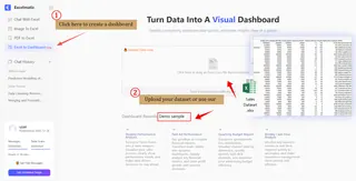
Step 1: Connect Your Data
Simply upload your Excel file or connect to a live data source. The AI engine automatically scans your file, understands the structure, and performs initial data cleaning — handling inconsistencies so you don't have to. You can also try using our dataset.
Step 2: Command & Generate
In the built-in chat, tell the AI what you need. Be as descriptive as you like — the clearer your request, the better the result. No need for "SQL," "dimensions," "measures," or "DAX."
If you have no idea, you can refer to the instructions we provide.
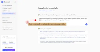
In about 10 seconds, a draft dashboard appears. Review it by checking:
Data Accuracy: Do the numbers in the charts match your source data?
Chart Suitability: Did the AI choose the right chart type? (e.g., a line for trends, a bar for comparisons).
Layout & Focus: Is the arrangement clear and does it highlight the key message?
Step 3: Refine & Polish
The first draft is just the start. Excelmatic offers powerful, intuitive tools for fine-tuning — all on one page.
Drag & Drop: Easily rearrange any chart or component.
Change Anything with a Click: Select any area to change its type (text, chart, filter) or configuration.
- Swap Chart Types (e.g., from bar to line chart).
- Modify Data Fields (e.g.switch from "Revenue" to "Order Count").
- Adjust Styles like colors, labels, and legends.
- Use the AI Assistant: Simply tell the AI in the side panel what you want to change.
Apply a Cohesive Theme: Instantly unify the look with one-click themes.
- Classic Dark: Professional and focused, ideal for data-intensive analysis or presentations in low-light environments.
- Stable Blue-Gray: Authoritative and trustworthy, perfectly suited for executive-level reports and formal business reviews.
- Warm Wood: Approachable and collaborative, great for internal team dashboards and brainstorming sessions.
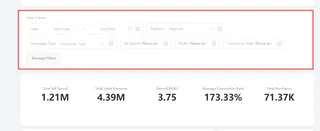
- Add Interactive Filters: While AI generates static views, you can empower viewers by adding filters. Excelmatic often suggests relevant ones — you just need to configure the field (e.g., "Region") and options. Users can then dynamically explore data for different segments or time periods.
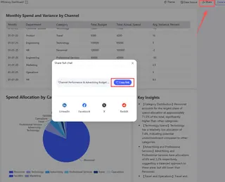
Step 4: Share & Collaborate
Once perfected, share the dashboard with your team with a single link. Colleagues can view, interact with filters, and even suggest or make edits directly within Excelmatic, enabling truly collaborative data analysis.
Conclusion: Reclaim Your Time, Command Your Insights
The scramble before a deadline, the maze of spreadsheets, the daunting complexity of traditional BI tools — this isn't just an inconvenience; it's a significant drain on productivity and strategic thinking. Your data holds the story, but for too long, the process of telling that story has been the hardest part.
As we've seen, the evolution to AI-powered analytics tools like Excelmatic is not merely an upgrade; it's a fundamental redefinition of the workflow. It directly answers the core frustrations outlined in your document:
From Days to Seconds: It turns the manual, days-long grind of data prep and chart building into a task measured in seconds.
From Complex to Conversational: It eliminates the steep cliff of technical jargon ("SQL", "DAX", "measures") and replaces it with the simplicity of natural language.
From Static to Adaptive: It moves you away from brittle, hard-to-maintain dashboards to flexible views that can be refined with a click or a simple command to the AI assistant.
The step-by-step guide demonstrates that gaining powerful, interactive insights is no longer a privilege reserved for data specialists. With Excelmatic, you are not learning a tool; you are directing an analysis.
Stop spending your valuable time building the dashboard. Start spending it understanding what the dashboard reveals.
Embrace the shift. Transform your data chaos into clarity in minutes. Start your first AI-powered dashboard with Excelmatic today
Frequently Asked Questions (FAQ)
Q: My data is messy. Can an AI tool really understand it?
A: Yes. A key strength of tools like Excelmatic is automatic data profiling and cleaning upon upload. They handle common inconsistencies (formatting, duplicates to create a usable starting point. For best results, a minimally structured file (clear headers, consistent columns) is still recommended.
Q: I'm not in Finance. What are other use cases?
A: AI dashboards are ideal for any frequent, data-driven review. Examples include:
- Marketing: Tracking campaign performance and ROI in real-time.
- Operations: Visualizing project progress or supply chain metrics.
- Product: Analyzing user engagement and feature adoption.
- HR: Monitoring team performance or recruitment pipeline health.
Q: How does the AI know what the "right" chart is? What if its choice is misleading?
A: The AI follows best practices in data visualization. However, you are the final editor. The tool's real power is giving you a 90% complete draft in seconds. It's your responsibility to apply domain knowledge during the "Refine & Polish" stage to ensure the narrative is accurate and ethical. The AI is a powerful assistant, not an autonomous analyst.

