Key takeaways:
- AI simplifies dashboard creation by automating data cleaning and visualization.
- Excelmatic allows users to build dashboards quickly without advanced technical skills.
- AI-driven dashboards are adaptable, easy to update, and enhance team decision-making.
- Using natural language instructions, you can generate insights effortlessly.
- AI dashboards turn raw Excel data into actionable insights efficiently.
Creating a dashboard should be a straightforward process. In reality, it rarely is.
Most teams start with good intentions. They have data. They know what they want to monitor. Yet somewhere between raw spreadsheets and a usable dashboard, progress slows down. Time is spent cleaning data, debating metrics, adjusting charts, and reworking layouts every time requirements change.
AI does not eliminate the need for thinking. But it fundamentally changes how dashboards are created — by removing friction at each step of the workflow. This article explains how to use AI to create a dashboard, where it helps the most, and how a practical AI workflow works in real projects using Excelmatic as an example.
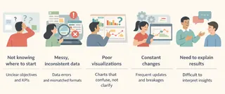
The Five Core Pain Points of Dashboard Creation
Before looking at tools or workflows, it helps to understand why dashboard projects often stall. Across teams and industries, the same issues appear again and again.
1. Not knowing where to start
The first challenge is rarely technical. It is conceptual.
Teams struggle to decide which KPIs matter, how granular the dashboard should be, and what questions it is supposed to answer. Without a clear structure, dashboards either become overcrowded or too shallow to be useful.
AI helps at this stage by supporting metric ideation and dashboard framing. When you describe your goal in plain language — such as monitoring weekly sales performance or tracking customer retention trends — AI can propose a logical set of KPIs and dimensions. This gives teams a starting point that can be refined, instead of beginning with a blank sheet.
2. Messy, inconsistent data
In most organizations, data is not dashboard-ready. Files come from different systems. Formats are inconsistent. Dates, numbers, and categories often require manual correction before analysis can begin.
This data preparation phase consumes a disproportionate amount of time and introduces errors.
AI-driven tools can automatically interpret table structures, normalize formats, and flag inconsistencies. Instead of manually fixing every issue, teams can focus on whether the data makes sense from a business perspective. The cleaning still happens — but largely in the background.
3. Visualizations that fail to communicate
Even when the data is correct, dashboards often fall short visually. Charts do not clearly show trends. Important changes are easy to miss. Users understand the numbers, but not the story.
AI improves this step by applying visualization best practices automatically. It matches chart types to the nature of the data, highlights anomalies, and organizes views around how people actually read dashboards. The result is not just a cleaner layout, but a dashboard that communicates intent more clearly.
4. Constant changes that break the dashboard
Dashboards are rarely final. Stakeholders ask for new filters, comparisons, or metrics. In traditional tools, each change risks breaking formulas or forcing a partial rebuild.
With AI, dashboards become more adaptable. Changes can be made through natural language instructions — adding a segment, adjusting a time comparison, or redefining a metric — without restructuring the entire dashboard. This allows teams to iterate quickly without losing stability.
5. The need to explain the dashboard
A dashboard alone does not guarantee understanding. Teams still need to explain what changed, why it matters, and what actions should follow.
AI can generate summaries, highlight key movements, and provide short narratives alongside charts. This turns dashboards into communication tools, not just reporting surfaces.
Two Ways Teams Use AI to Build Dashboards Today
Most AI dashboard tools differ less in intelligence and more in how easy they are to start using.
In practice, they fall into two camps.
AI-enhanced BI platforms extend traditional tools with natural language features. Products like Power BI Copilot or Tableau GPT help analysts generate calculations, suggest charts, or explain trends faster. They work well if your data model is already in place — but they still assume familiarity with BI concepts, schemas, and dashboard design.
Conversational AI dashboard tools, such as Excelmatic, start from a different premise. Instead of asking users to configure models or layouts, they let people describe what they want to monitor in plain language. You upload your data — often Excel files — and the AI handles structure, visualization choices, and iteration behind the scenes.
This approach lowers the barrier for teams who understand the business but don't want to learn another complex analytics platform. More importantly, it turns dashboards into something you shape through conversation, not something you assemble piece by piece.
That distinction is why the workflow looks different. And why building a dashboard with Excelmatic feels less like configuration — and more like collaboration.
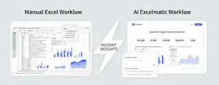
A Step-by-Step Guide: Using AI to Create a Dashboard with Excelmatic
To see how this works in practice, let's walk through a typical AI-driven workflow using Excelmatic.
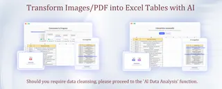
Step 1: Import data without manual preparation
The process starts by uploading your data into Excelmatic. This can be an Excel file, a CSV export, or even tabular data extracted from PDFs(utilise Excelmatic's PDF-to-Excel conversion functionality.).
Leave the task of cleaning up these data to Excelmatic! Excelmatic's data analysis capabilities can automatically recognizes headers, fixes common formatting issues, and standardizes data types. This step alone removes hours of manual work from the dashboard process.
Step 2: Define the dashboard goal in plain language
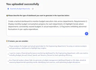
Instead of designing the dashboard layout manually, you describe the objective.
Excelmatic interprets this request and translates it into a dashboard structure. It selects relevant KPIs, defines time-based views, and applies visual indicators for exceptions. The focus is on business intent, not technical configuration.
Step 3: Generate and refine through conversation
Once the initial dashboard is created, refinement happens iteratively.
You can adjust the dashboard by giving direct instructions:
- Add regional filters
- Modify chart type
- Change the visual theme for presentations
- Share with colleagues you collaborate with
Each instruction updates the dashboard immediately. There is no need to rebuild charts or rewrite formulas. This conversational approach makes dashboards flexible and easy to adapt as needs change.
The Role of AI in Dashboard Creation
AI is more than a tool—it shapes how dashboards come to life. Think of it in three layers:
1. The Accelerator
At the base level, AI handles repetitive, time-consuming tasks that used to slow teams down. Data cleaning, formatting inconsistencies, pivot table setup... all of this can be done automatically, so you can skip the grunt work and focus on asking the right questions. It's like having an invisible assistant that sets the stage for insight.
2. The Co-Pilot
Once the foundation is ready, AI becomes your co-pilot. It helps structure dashboards, recommends the right charts for each metric, and ensures your KPIs are meaningful. You don't need to be an Excel wizard or a visualization expert. Instead, you guide the AI with natural language: "Show me sales trends by region, highlight the underperforming territories, and compare with last month." The dashboard takes shape while you think strategically.
3. The Insight Partner
At its highest level, AI starts to think with you. It surfaces patterns you might overlook, suggests explanations for anomalies, and can even generate short narrative summaries. Imagine presenting a dashboard where key insights are already highlighted—your team can act immediately without digging through raw tables. AI moves from executing tasks to augmenting your understanding, turning dashboards into a real decision partner.
Together, these layers transform dashboard creation from a slow, error-prone process into a fast, reliable, and scalable workflow.

Final Thoughts: Why AI-Driven Dashboards Matter
Dashboards are no longer just reporting tools. They are part of how teams operate day to day.
When dashboard creation is slow or fragile, insights arrive too late to matter. AI changes this dynamic by reducing friction at every stage — from raw data to actionable views.
Excelmatic brings this approach directly into the Excel-based workflows that teams already rely on. By combining familiar spreadsheets with AI-powered analysis and visualization, it makes dashboard creation more efficient and far more adaptable.
If you want to spend less time building dashboards and more time using them, AI-driven workflows are no longer optional.
Try Excelmatic and experience how AI can transform the way you create dashboards — starting with the next one on your list.
Frequently Asked Questions (FAQ)
Q1: What is an AI dashboard?
A: An AI dashboard uses artificial intelligence to automate data cleaning, visualization, and KPI tracking, making insights easier to access.
Q2: How does Excelmatic make dashboard creation easy?
A: Excelmatic interprets your plain-language instructions, organizes data, and applies visualization best practices automatically.
Q3: Can I create dashboards without coding or Excel expertise?
A: Yes, AI-driven tools like Excelmatic enable users to create dashboards quickly and easily without technical skills.
Q4: How fast can I build a dashboard with AI?
A: Most dashboards can be generated in minutes, as AI handles data preparation, chart selection, and iterative refinements automatically.
Q5: Are AI dashboards adaptable for changing business needs?
A: Yes, AI dashboards allow natural language updates and instant adjustments without breaking formulas or layouts.

