Key takeaways:
- Match the dashboard tools to your specific goal, like fast reporting or trusted data, not to the longest feature list.
- The 10 dashboard tools categorize into clear lanes: simple & fast for business teams (Excelmatic, Looker Studio), powerful for analysts (Tableau, Power BI), engineered for data products (Looker, Sisense), and specialized for monitoring (Grafana).
- For teams skilled in spreadsheets, Excelmatic offers the fastest path to creating interactive, shareable dashboards by building on what you already know.
- Avoid choosing a tool too complex for your main users, as low adoption is the biggest failure. The right dashboard tools is the one your team will actually use daily.
If you've ever stayed up late stitching together spreadsheets for a presentation, watched a meeting derail into an argument over which number is "right," or clicked into a "real-time" dashboard only to find data that's days old — you're far from alone. Those frustrations aren't usually about the data itself; they come from the tools and workflows around it: fragile integrations, unclear metric definitions, and dashboards built for engineers instead of decision-makers.
Picking a dashboard tool isn't about grabbing the one with the most features. It's about matching the tool to the problem you actually need to solve — faster reporting, trusted metrics, easier sharing, or the ability to scale. Below I've rounded up 10 practical dashboard tools, starting with Excelmatic, with a one-line intro plus clear pros, cons, and the teams that benefit most. Read on and you'll be able to rule out the mismatches and home in on the right fit.
The 2025 Dashboard Toolkit: From Spreadsheets to Strategic Insights
1. Excelmatic
Excelmatic turns spreadsheet workflows into browser-ready dashboards with a familiar Excel-like experience.
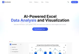
- Advantages: Fast to learn for Excel users, quick templating and sharing in the browser, good for rapid dashboard delivery.
- Disadvantages: Newer product so deep enterprise integrations, advanced governance, and very large dataset handling may be less mature.
- Best for: Analysts and small-to-medium teams who want Excel-style speed and shareable dashboards.
2. Microsoft Power BI
Power BI offers powerful data modeling and Microsoft ecosystem integration for broad business intelligence needs.

- Advantages: Strong Excel/Office/ Azure integration, robust modeling with DAX, large template and community ecosystem.
- Disadvantages: Learning curve for advanced modeling; some authoring remains desktop-focused; premium features add cost.
- Best for: Organizations invested in Microsoft tech and analysts needing self-service BI.
3. Tableau
Tableau is focused on rich visual analysis and interactive storytelling with data.
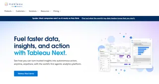
- Advantages: Exceptional visualization capabilities, excellent for ad-hoc exploration and dashboard storytelling.
- Disadvantages: Can be costly at scale and requires time to master for polished deployments and server administration.
- Best for: Data visualization specialists and teams prioritizing exploratory analysis.
4. Looker (Google Cloud)
Looker provides a centralized, governed metric layer and scalable embedding options.

- Advantages: LookML enables consistent, reusable metrics; strong embedding and cloud integration.
- Disadvantages: Enterprise pricing and modeling expertise required to unlock full value.
- Best for: Data-engineering-led teams and companies needing a single source of truth.
5. Looker Studio (formerly Google Data Studio)
Looker Studio is a free, user-friendly tool for quick, shareable reports with native Google product connectors.
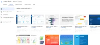
- Advantages: No cost, easy to connect to Google services, very shareable and fast to set up.
- Disadvantages: Limited advanced modeling, performance, and visualization complexity for large-scale analytics.
- Best for: Marketing teams, small businesses, and Google-centric reporting needs.
6. Domo
Domo is an end-to-end cloud platform combining connectors, ETL, storage, visualization, and apps.
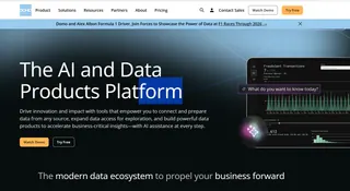
- Advantages: Comprehensive feature set with many connectors and mobile-ready dashboards; designed for business users.
- Disadvantages: Can be expensive and complex; platform breadth introduces a steeper adoption curve.
- Best for: Mid-to-large enterprises seeking an all-in-one cloud solution.
7. Qlik Sense
Qlik Sense uses an associative engine to enable flexible, free-form data exploration across datasets.

- Advantages: Fast, flexible exploration and strong in-memory performance for complex discovery.
- Disadvantages: Licensing and architecture can be complex; steeper learning curve for developers and admins.
- Best for: Teams needing deep ad-hoc exploration and associative analytics.
8. Sisense
Sisense focuses on scalable analytics and strong embedded-analytics capabilities for product teams.

- Advantages: Good for embedding dashboards into customer-facing apps, scalable back-end for big data.
- Disadvantages: Implementation often requires engineering resources and can be costly for smaller teams.
- Best for: SaaS companies and product teams embedding analytics into their products.
9. Grafana
Grafana excels at real-time metrics and time-series dashboards for monitoring and observability.

- Advantages: Open-source, many data-source plugins, highly customizable for metrics and operational dashboards.
- Disadvantages: Not designed for relational business reporting; requires ops know-how to run at scale.
- Best for: DevOps, SREs, and engineering teams monitoring systems and metrics.
10. Metabase
Metabase is a simple, open-source BI tool for quick self-service queries and dashboards.
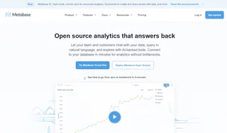
- Advantages: Very easy to set up and use, approachable interface for non-technical users, cost-effective.
- Disadvantages: Limited advanced analytics, governance, and scaling features compared to enterprise BI tools.
- Best for: Startups and small teams that need straightforward dashboards without heavy setup.
| Tool | Main advantage | Main drawback | Best for |
|---|---|---|---|
| Excelmatic | Spreadsheet-like interface; fast browser dashboards | Newer product; integrations/enterprise features may be less mature | Excel users, SMBs wanting quick dashboards |
| Microsoft Power BI | Strong MS integration; powerful data modeling (DAX) | Learning curve for DAX; desktop-centric authoring | MS-centric orgs, analysts |
| Tableau | Best-in-class visualization and interactivity | Can be expensive; server/admin overhead | Visualization-focused analysts, enterprises |
| Looker (Google) | Governed metric layer (LookML); great for embedding | Enterprise pricing; requires modeling expertise | Data-engineering teams, product embedding |
| Looker Studio (Google Data Studio) | Free; easy Google integrations; very shareable | Limited modeling/performance for complex analytics | Marketers, small teams, Google ecosystem users |
| Domo | End-to-end cloud platform (ETL, storage, viz) | Costly at scale; platform breadth creates a learning curve | Mid-to-large enterprises needing all-in-one |
| Qlik Sense | Associative engine for flexible exploration | Licensing/architecture complexity; steeper learning curve | Teams needing deep ad-hoc data discovery |
| Sisense | Strong embedded analytics; scalable for big data | Implementation often requires engineering; cost | SaaS/product teams embedding analytics |
| Grafana | Excellent for metrics/time-series; many plugins | Not for relational business analytics; ops-heavy setup | DevOps, SRE, monitoring/observability teams |
| Metabase | Open-source, very easy to set up and use | Limited advanced analytics & governance | Startups, small teams needing quick BI |
| Klipfolio | Fast KPI-focused dashboards; many connectors | Less suited for complex analytics or modeling | SMBs, marketing and sales KPI reporting |
From Spreadsheets to Shared Insights: The Excelmatic Path
For many teams, the journey to better data visibility starts right where the data already lives — in spreadsheets. If your needs center on escaping static files, speeding up reporting, and sharing live insights without a complex toolchain, then the path is clear.
Excelmatic is designed for this exact transition. It turns the spreadsheet skills you already have into a superpower, allowing you to create browser-based, interactive dashboards faster than learning a whole new system. It's the practical choice for teams that value clarity, speed, and collaboration over overwhelming complexity.
Ready to transform your spreadsheet workflows into interactive, team-wide dashboards?
Visit Excelmatic's website to start a free trial or request a personalized demo to see how you can build and share your first dashboard in minutes.
Frequently Asked Questions (FAQ)
Q: What's the best tool for a small team just getting started?
A: For ease and speed, consider Excelmatic (if you live in spreadsheets), Looker Studio (for Google/Marketing data), or Metabase. They offer low learning curves, quick setup, and are cost-effective for smaller groups.
Q: What's the biggest mistake teams make when choosing a dashboard tool?
A: Choosing a tool for its advanced features, rather than for the skill level of its daily users. A complex tool like Tableau given to non-technical teams leads to low adoption. The best tool is the one your team will actually use to make decisions.
Q: We use multiple data sources (Salesforce, MySQL, Google Sheets). Can one tool handle it all?
A: Yes, most modern tools are built for this. Domo and Power BI are known for their extensive connector libraries. Looker models data from multiple sources into a single layer. For a simpler setup starting with spreadsheets and common services, Excelmatic and others offer core integrations.


