Key takeaways:
Choosing the correct dashboard type is foundational. It directly determines the right KPIs, layout, and value for your intended user, moving from cluttered data to clear communication.
Dashboards serve distinct roles. The eight core types — Strategic, Financial, Operational, Tactical, Project, Sales, Marketing, and HR — each address specific user questions and time horizons.
Start with the user and their key question. The two questions, "Who is this for?" and "What is their one most important question?" are the essential blueprint for any effective dashboard.
Modern, AI-driven tools like Excelmatic transform creation. They streamline the process by automating data integration, suggesting intelligent designs, and generating narrative insights, removing technical barriers.
Ever felt lost staring at a spreadsheet full of numbers, knowing there's a story in there but having no idea how to tell it visually? You need a dashboard. But the moment you start looking for tools, you're hit with a dizzying array of options — from familiar spreadsheet software to complex platforms with a steep learning curve.
How do you choose? This guide cuts through the noise. We'll break down exactly what a dashboard is, explore every major type of tool available, and give you a clear framework to select the right one. By the end, you'll know exactly where to start.
What Exactly is a Dashboard?
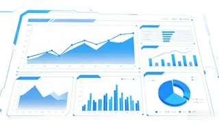
Think of a dashboard not just as a collection of charts, but as a visual command center. It consolidates key metrics and data points from various sources into a single, interactive view. Its primary job is to answer critical business questions at a glance:
- Is sales on track this quarter?
- Where are our website visitors coming from?
- What's our current cash flow health?
A good dashboard transforms raw data into insights, enabling faster, more informed decisions.
The Toolkit: How Dashboards Are Built (And How to Use Each Tool)
Choosing the right tool isn't just about features — it's about understanding the fundamental method of creation each one requires. Here's a comprehensive look at the primary tool categories and exactly how you use them to build.
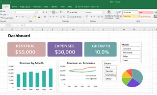
1. The Manual Craftsman: Spreadsheet Software (Excel, Google Sheets)
The Method: Hand-built, cell-by-cell assembly. You are the architect and the builder.
- How You Use It: You start with raw data in a grid. To create a chart, you manually select data ranges, insert a chart type, and then meticulously format colors, labels, and axes. For interactivity, you create pivot tables and add slicers or filters. Every calculation requires a written formula (like
SUMIFSorVLOOKUP). - The Workflow: Data Entry → Formulas/Calculations → Create Charts → Format Design → Repeat for each element → Assemble on a separate sheet.
- The Vibe: Complete control with immense manual effort. It's like building a model from individual pieces of plastic — powerful but time-consuming.
2. The Visual Modeler: Professional BI & Drag-and-Drop Tools (Tableau, Power BI)
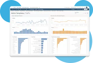
The Method: Connect, Model, and Drag-and-Drop. You work at the "business logic" layer, not the cell layer.
- How You Use It: First, you connect the tool to your database, cloud warehouse, or Excel file. Then, you define relationships between tables and create calculated fields or measures (e.g., "Profit" = Sales - Cost). Building the dashboard happens on a canvas: you drag these fields onto shelves to define charts — dropping "Date" on Columns and "Sales" on Rows to create a line chart.
- The Workflow: Connect Data Source → Build Data Model → Drag Fields to Create Visuals → Format Dashboards → Set up Refresh Schedules.
- The Vibe: Building with pre-fabricated, intelligent components. It's powerful and scalable but requires learning a new system of thought.
3. The Code Creator: Development Frameworks (Plotly Dash, Streamlit for Python)
The Method: Programmatic construction with code. You write instructions to define both data logic and visual presentation.
- How You Use It: Using Python (or R/JavaScript), you write scripts that load and process data. Then, using a library like Dash or Streamlit, you write code to specify UI elements: a title, a dropdown menu for filters, and a specific chart type with its data binding. The framework turns this code into a web application.
- The Workflow: Write Code (Data Processing) → Write Code (UI & Chart Definitions) → Run Application/Server → View in Browser.
- The Vibe: Ultimate flexibility and integration, akin to custom-building furniture from raw wood. It requires skilled craftsmanship.
You need to enter a piece of code in tools such as Python, for example:
import pandas as pd
import plotly.express as px
import plotly.graph_objects as go
from dash import Dash, dcc, html, Input, Output

Load data
df = pd.read_excel('customer_feedback_analysis_dataset.xlsx')

Initialize app
app = Dash(__name__)
app.title = "Customer Feedback Dashboard"

App layout
app.layout = html.Div([
    html.H1("Customer Feedback Dashboard"),

……
4. The AI Co-Pilot: Conversational AI Tools (Like Excelmatic)
The Method: Describe, Generate, and Refine. You collaborate with an AI that handles the technical execution.
- How You Use It: You start by uploading your spreadsheet. Instead of dragging fields or writing code, you describe your goal in a chatbox:
Show a line chart of monthly revenue and a bar chart comparing regional performance.
The AI interprets this, analyzes your data, and generates a complete dashboard layout. You then refine it through follow-up conversations: "Make the bars blue and add a trendline," or by using simple point-and-click edits.
- The Workflow: Upload Data → Describe Goal in English → AI Generates Draft → Conversational Refinement → Style & Share.
- The Vibe: Working with an expert junior analyst. You provide the vision and feedback; the AI handles the execution, dramatically lowering the technical barrier.
How to Choose: Your Decision Framework
Stop feeling overwhelmed. Ask yourself these questions:
What's my technical skill level?
- Non-technical / Value speed → Prioritize AI-powered tools or basic Spreadsheets.
- Willing to learn → Consider Professional BI Tools.
- Developer/Data Scientist → Explore Development Frameworks.
What is my data's source and complexity?
- Static Excel/CSV files, simple analysis → AI-powered tools or Spreadsheets are ideal.
- Multiple live databases, large-scale data → You likely need a Professional BI Tool.
What is my primary goal?
- "I need a clear report for tomorrow's meeting." → AI-powered tool.
- "We need a company-wide reporting system." → Professional BI Tool.
- "I'm building a unique analytical product." → Development Framework.
Conclusion: Your Shortcut to Clarity Starts Here
The world of dashboard tools is vast, but the right choice isn't about finding the most powerful one — it's about finding the most effective one for you.
For the vast majority of professionals, students, and business owners, the traditional trade-off has been brutal: settle for a time-consuming, manual process in spreadsheets, or embark on a months-long journey to learn a complex BI platform.
There's a better way. Tools like Excelmatic are reshaping this landscape by leveraging AI. They address the core need — transforming data into understanding — while removing the traditional barriers of time, complexity, and technical skill.
Why spend hours building when you can describe and refine? Why struggle with complex interfaces when you can use simple language?
👉 Start your dashboard journey the smart way. Experience the speed and simplicity of an AI-powered approach with Excelmatic. Upload your data, describe your goal, and see a functional, insightful dashboard come to life in moments. It might just change how you see your data forever.

