Key takeaways:
- A strategic dashboard is defined by structure. Without a clear framework, dashboards become passive reporting tools.
- The five pillars form a complete decision system. Metric hierarchy, context, root-cause exploration, cognitive simplicity, and interactivity must coexist.
- Strategic dashboards reduce data-to-decision latency by design. Their value lies in accelerating understanding, not exposing more data.
- Any dashboard missing one pillar is not strategic. It may inform, but it cannot reliably guide decisions.
- Strategic dashboards shape better questions, not just answers. They transform data into an ongoing decision engine.
In the high-stakes environment of modern enterprise, the primary bottleneck to growth is rarely a lack of data. It is the persistent data-to-decision latency that prevents organizations from acting with speed and confidence. Despite increasingly sophisticated data pipelines, many teams remain tethered to traditional spreadsheets — static, fragile artifacts that obscure insight beneath layers of rows and columns.
A Strategic Dashboard is not merely a collection of charts. It is a decision-oriented system designed to translate complex data into strategic clarity. Its purpose is not to report everything, but to surface what matters most — clearly, consistently, and in context.
Moving from passive reporting to true strategic insight requires more than better visualization tools. It requires a deliberate structural foundation. A strategic dashboard that succeeds is built on five essential pillars. These pillars define whether a dashboard enables strategic reasoning or simply digitizes old reporting habits.
Pillar I: A Strategic Dashboard Must Enforce a Hierarchy of Hero Metrics
The most common failure in dashboard design is metric overload. When every number is given equal weight, strategic signal is lost in operational noise.
A strategic dashboard must be anchored by a small set of Hero Metrics — high-level indicators that directly reflect progress toward strategic objectives. These metrics form the top of a clear hierarchy, supported by secondary and diagnostic measures.
Without this hierarchy, dashboards become encyclopedic rather than directional. With it, the dashboard communicates priorities instantly and prevents distraction from what truly drives outcomes.
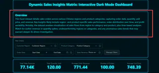
Excelmatic supports this pillar by generating a clear Overview Section at the top of each dashboard, which explicitly lists the selected Hero Metrics and their current status against targets. This narrative introduction ensures that the primary strategic story is immediately understood, guiding focus before users engage with detailed charts.
Pillar II: A Strategic Dashboard Requires Built-In Context and Comparison
A number in isolation is informational, not actionable.
Strategic dashboards must embed comparison by default — actual versus target, current versus historical, performance versus baseline. Context transforms metrics into meaning and answers the implicit question: Is this good or bad?
When comparison is structurally integrated rather than manually assembled, the dashboard eliminates ambiguity and enables faster interpretation without additional analysis layers.
Excelmatic translates this principle into an automated visualization workflow. It intelligently interprets tabular data and automatically generates the most appropriate chart type to illustrate comparisons — whether it’s actual vs. target, current period vs. prior period, or segment performance vs. average. These visuals are not just decorative; they are purpose-built to highlight variance and trend.
Furthermore, each chart is equipped with intuitive drill-down capabilities. Clicking on a bar, line, or segment immediately filters the entire dashboard to that specific dimension — allowing users to move seamlessly from a high-level comparison into the underlying transactional detail. This ensures that context is not only presented but can also be actively explored, turning observation into explanation.
Pillar III: A Strategic Dashboard Must Support Root-Cause Exploration
Seeing variance is only the beginning. A strategic dashboard must help explain why performance deviates from expectation.
This requires the ability to move seamlessly from high-level indicators to underlying drivers. When anomalies appear, users should be able to trace them to contributing factors — across dimensions such as geography, product, or function.
Without this capability, dashboards become endpoints. With it, they become starting points for strategic investigation.
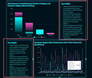
Excelmatic is designed to support root-cause exploration by pairing every chart with clear, contextual insights. Instead of leaving users to interpret metrics on their own, the dashboard highlights what each indicator represents, how it has changed over time, and why that change matters in a strategic context. These embedded insights help users quickly understand trends, anomalies, and underlying implications, turning visual data into actionable understanding rather than isolated signals.
Pillar IV: A Strategic Dashboard Must Minimize Cognitive Load
The effectiveness of a strategic dashboard is inversely proportional to the effort required to understand it.
Cluttered visuals, excessive color, and dense layouts slow interpretation and dilute impact. Strategic dashboards must prioritize clarity through intentional visual hierarchy and restraint.
Cognitive efficiency is not an aesthetic preference; it is a functional requirement. If insight is not immediately visible, it is effectively inaccessible.
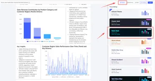
Excelmatic adheres to this principle by generating dashboards that are visually clean and logically structured. It employs a restrained color palette that can be intelligently adapted to highlight performance states. The layout prioritizes clarity, ensuring that insight, not ornamentation, occupies the cognitive foreground.
Pillar V: A Strategic Dashboard Must Enable Ongoing, Interactive Inquiry
Static dashboards freeze insight at a single moment in time.
A strategic dashboard must allow users to explore, question, and refine understanding without rebuilding reports or restructuring data. Interaction turns observation into inquiry and insight into action.
This final pillar ensures that the dashboard remains relevant as questions evolve, supporting continuous strategic reasoning rather than one-time review.
Excelmatic ensures dashboards are living tools. Users can interactively filter views, swap dimensions, and pose new questions without rebuilding the underlying analysis. Furthermore, dashboards can be refreshed with updated Excel data at any time, ensuring the strategic view evolves alongside the business. This transforms the dashboard from a static snapshot into a persistent platform for inquiry.
Conclusion: A Strategic Dashboard Is Defined by Its Pillars
A strategic dashboard is not defined by the tools used to build it, nor by the volume of data it displays. It is defined by structure.
The five pillars — Metric Hierarchy, Contextual Comparison, Root-Cause Exploration, Cognitive Simplicity, and Interactive Inquiry — form an interdependent system. Remove any one, and the dashboard ceases to be strategic.
A dashboard that respects all five pillars does more than visualize data. It reduces decision latency and restores strategy to its proper place at the center of organizational action.
Putting these principles into practice requires more than discipline — it requires the right system. Excelmatic operationalizes these five pillars, enabling strategic dashboards that support clarity, inquiry, and faster decisions.
Frequently Asked Questions (FAQ)
Q: What is a strategic dashboard?
A: A strategic dashboard is a structured decision interface designed to align performance metrics with long-term strategic objectives, rather than operational monitoring.
Q: What are the five pillars of a strategic dashboard?
A: The five pillars are metric hierarchy, contextual comparison, root-cause exploration, cognitive simplicity, and interactive inquiry.
Q: How is a strategic dashboard different from an operational dashboard?
A: Operational dashboards track real-time activities, while strategic dashboards focus on direction, alignment, and decision-making over time.
Q: Why do strategic dashboards fail?
A: Most fail due to metric overload, lack of context, high cognitive load, or an inability to explore underlying causes of performance changes.
Q: Can a dashboard be strategic without all five pillars?
A: No. Without all five pillars, a dashboard becomes a reporting surface rather than a strategic decision system.

