Key takeaways:
From Static Tool to Intelligent Partner: AI dashboards shift the role from manual report-building to interactive, conversational analysis.
Five Core Capabilities Define Intelligence: True value comes from smart visualization, conversational exploration, contextual explanations, adaptive design, and seamless collaboration.
Solves Real Workflow Pain: It automates tedious tasks, saves time, and cuts through data clutter to focus on insight.
This is the practical AI approach behind Excelmatic, turning dashboard promise into daily reality.
Does your dashboard create more work than insight? You build it manually, connect the data, design the charts, yet it often delivers a confusing wall of numbers. It's static, slow to update, and fails to explain what the data actually means. This leaves you no better off than when you started, still relying on gut feeling and scattered spreadsheets to make decisions.
This is the core problem: traditional tools demand high effort for low clarity. A modern, AI driven dashboard solves this by shifting your role from report builder to strategic decision maker. The AI handles the tedious work of data preparation and basic analysis, allowing you to focus on asking questions and interpreting answers. It doesn't replace the dashboard; it makes it finally live up to its promise.
Let's examine the practical advantages and features that make an intelligent dashboard a genuine asset.
What is an AI Dashboard?
An AI dashboard is an evolution of the traditional business intelligence dashboard, distinguished by its use of artificial intelligence and machine learning to augment human analysis. At its core, it is not merely a visualization tool with an added automation layer. Instead, it represents a fundamental shift in interaction: from a static, user-built report to a dynamic, conversational analytics interface.
The Tangible Advantages of an AI-Enhanced Dashboard
An intelligent dashboard amplifies the core benefits of traditional BI while directly solving its pain points.
- From Hours to Instants: It saves critical time by automating the journey from raw data to visual insight. Instead of manually building reports, you ask questions and get answers.
- A Unified Source of Truth, Enhanced: It pulls data from different sources into a single, coherent view. AI assists in harmonizing this data, ensuring everyone works from the same accurate foundation and planning sessions are based on shared facts, not conflicting spreadsheets.
- Focus on Analysis, Not Mechanics: It frees people from chasing numbers and configuring charts. By handling data preparation and visualization logic, it allows teams to spend their energy on interpretation, strategy, and action.
- Clarity Over Clutter: It actively works to prevent the "wall of charts" problem. AI can suggest the most relevant metrics and optimal chart types to highlight the real story, cutting through the noise to reveal what matters.
Core Features That Move Beyond Basic Visualization
These are the functionalities that transition a static report into an interactive, intelligent system.
1. Intelligent Data Visualization
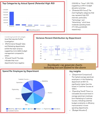
It goes beyond simply offering chart types. The AI recommends the most effective visualization based on the story your data needs to tell. Whether you need a line chart to reveal trends, a heat map for regional comparisons, or a scatter plot to uncover correlations, it ensures key patterns are immediately clear and impossible to miss.
2. Conversational & Interactive Exploration
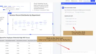
This is the core of modern AI interaction. Replace complex filters and menus with natural language. Ask questions, drill down into details, or pivot your view seamlessly. Start with a high-level KPI and intuitively explore the specific products, regions, or time periods driving the results.
3. Context-Rich Explanations with Real-Time Data
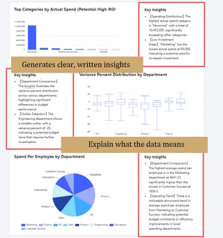
It delivers more than just live charts and numbers. The AI automatically generates clear, written insights that explain what the data means. Understand why a metric changed, what a correlation implies, or if a trend is significant. You get the "so what" in plain language alongside the visualization, making complex data immediately understandable.
4. Adaptive Themes & Layouts
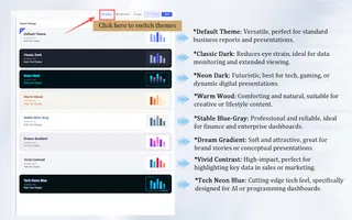
Tailor the dashboard to your audience and purpose. Choose from a variety of professional themes and layout styles. Select a formal, clean theme for an executive report, or a vibrant, dynamic one for a team performance tracker. Match the look and feel to your data story for maximum impact.
5. Seamless Sharing & Team Collaboration
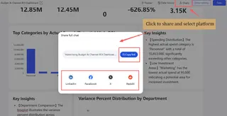
Share insights effortlessly. Generate a shareable link to a live, interactive dashboard or export a static image for reports with one click. Go further by inviting team members to collaborate directly within the dashboard. Comment on data points and make adjustments together to streamline analysis and align everyone faster.
Excelmatic: Bringing Practical AI to Your Dashboard
At Excelmatic, we build on this proven framework of advantages, features, and components. Our AI is designed not as a flashy gimmick, but as a practical engine that makes every part of the dashboard experience smoother and more insightful.
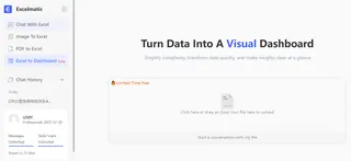 We focus on where AI delivers immediate, tangible value: suggesting the most effective visualizations for your data, powering conversational exploration so anyone can ask questions in plain English, generating clear, contextual insights to explain trends, and automating data preparation to unify your sources faster. This is how we turn the classic BI dashboard from a static report into a dynamic, intelligent partner for daily decision-making.
Ready to build a dashboard that combines proven BI principles with practical AI power?
See how Excelmatic delivers these core advantages without the hype.
Frequently Asked Questions (FAQ)
Q: How is an AI dashboard different from an automated traditional dashboard?
A: An automated dashboard simply updates pre-set charts. An AI dashboard actively analyzes data to suggest key metrics, explain changes, and answer your questions conversationally, moving from a static report to an interactive analyst.
Q: Does the AI create or guess my data?
A: No. It never generates raw data. It only analyzes your connected, trusted data sources to surface patterns, correlations, and insights, ensuring all conclusions are grounded in your actual numbers.
Q: Can it help if I'm not sure which KPIs to track?
A: Yes. A key strength is its ability to analyze your data and suggest potential key metrics and trends, helping you define a relevant measurement framework from the start.

