Key takeaways:
- Supply chain dashboards are analytical systems designed to organize supply, demand, inventory, and logistics data into decision-ready signals, rather than simple performance reports.
- A supply chain dashboard is best understood through the decision problems it supports, with different dashboard types serving operational execution, planning, risk management, and executive alignment.
- Common supply chain metrics only create value when they are structured to reveal variability, constraints, and trade-offs, instead of isolated averages or static KPIs.
- AI-supported workflows, such as those enabled by Excelmatic, streamline the process of turning existing Excel-based supply chain data into interpretable dashboards and actionable insights.
By 2025, supply chain volatility is no longer driven by single shocks but by persistent structural instability. According to global logistics and operations reports released entering 2025, companies now manage supply chains shaped by shorter demand cycles, multi-tier supplier risk, tighter inventory policies, and increasing geopolitical and regulatory fragmentation.
In this environment, the challenge is no longer data availability. Most organizations already capture inventory levels, supplier performance, logistics costs, and demand signals in granular detail. The challenge lies in how this information is structured to support ongoing decisions, rather than retrospective explanations.
This is where Supply Chain Dashboards have evolved from reporting tools into decision infrastructure.
What Are Supply Chain Dashboards—From an Analytical Perspective
A Supply Chain Dashboard is a structured analytical interface designed to support continuous decision-making across supply, demand, inventory, and logistics. Its defining characteristic is not visualization, but contextualization.
Professionally designed dashboards translate operational data into interpretable signals by organizing information around uncertainty, constraints, and trade-offs. Instead of answering “what happened,” they help decision-makers assess where pressure is building, which variables are interacting, and how risks propagate over time.
In modern supply chains, dashboards function less like scorecards and more like early-warning and alignment systems, enabling multiple functions to reason from the same analytical frame.
Core Types of Supply Chain Dashboards and the Decisions They Support
1. Operational Supply Chain Dashboards
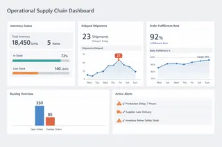
Operational dashboards focus on short-term execution and exception management. They support decisions that must be made daily or weekly, such as expediting orders, reallocating inventory, or responding to logistics disruptions.
These dashboards emphasize current state visibility combined with deviation detection. Their value lies in quickly identifying when reality diverges from plan, rather than explaining performance in detail. Poorly designed operational dashboards overwhelm users with metrics; effective ones narrow attention to constraints and bottlenecks.
2. Inventory and Demand Planning Dashboards
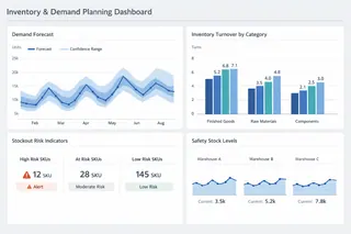
Planning-oriented dashboards address medium-term decisions, including replenishment policies, safety stock adjustments, and demand forecasting confidence.
Rather than presenting single forecast values, these dashboards highlight variability, forecast error, and demand stability over time. They help planners understand not only expected demand, but also the reliability of that expectation — an essential distinction in volatile markets.
In this context, dashboards are less about precision and more about risk-aware planning.
3. Supplier Performance and Risk Dashboards
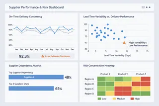
Supplier-focused dashboards support decisions around sourcing, dependency management, and risk mitigation. Their analytical purpose is to surface structural exposure rather than isolated performance issues.
Effective dashboards in this category emphasize concentration risk, lead time behavior, and performance consistency, allowing teams to detect fragility before disruptions occur. A supplier that performs “well on average” may still pose significant risk if variability is high or alternatives are limited.
4. Logistics and Network Performance Dashboards
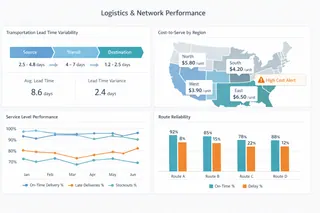
These dashboards support decisions related to transportation, distribution networks, and fulfillment strategies. They focus on flow efficiency and cost-to-serve dynamics, rather than static cost measures.
By analyzing transit times, route reliability, and service variability across regions, logistics dashboards help organizations understand how network design choices affect resilience and responsiveness — not just cost efficiency.
5. Strategic and Executive Supply Chain Dashboards
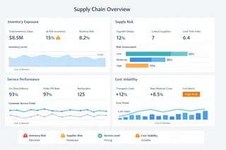
At the strategic level, dashboards are designed to support cross-functional alignment and long-term decisions. These include network redesign, make-or-buy analysis, and resilience investments.
Executive dashboards prioritize signal aggregation and narrative clarity, translating complex operational realities into interpretable trends and scenarios. Their purpose is not control, but shared understanding across leadership.
Common Supply Chain Metrics and How They Support Decisions
Rather than listing KPIs, effective dashboards organize metrics by decision relevance. The table below illustrates how commonly used indicators support different analytical judgments.
| Decision Area | Key Metrics | What They Help Decision-Makers Understand |
|---|---|---|
| Inventory Management | Inventory turnover, days of supply, stockout frequency | Buffer adequacy and risk of service failure |
| Demand Planning | Forecast accuracy, demand variability, bias | Reliability of plans and exposure to volatility |
| Supplier Performance | On-time delivery, lead time variance, dependency ratio | Stability and structural supplier risk |
| Logistics & Distribution | Transit time variability, cost-to-serve, service level | Network efficiency and resilience trade-offs |
| Cost Control | Unit cost trends, volatility drivers | Sustainability of cost structures under change |
What matters is not the metric itself, but how it is interpreted within a broader decision context.
How AI Helps You Build a Supply Chain Dashboard (Step-by-Step with Excelmatic)
In practice, the promise of modern dashboards is not simply “better visuals,” but accelerating the transformation from raw data to interpretive insight, especially when data comes from spreadsheets — still the most ubiquitous format for supply chain reporting in 2025.
AI capabilities integrated into dashboard workflows reduce manual effort at every stage: from data preparation to metric discovery to visualization selection. Excelmatic, for example, illustrates how this can be done in an integrated, workflow-centred way:
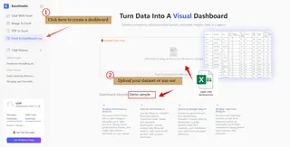
Step 1: Upload and Understand Data
First, you upload the supply chain dataset — whether inventory logs, supplier performance tables, delivery records, or mixed CSVs and Excel sheets — to Excelmatic’s interface. The AI automatically reads headers, data types, and relationships, helping you avoid common pitfalls in manual preparation such as inconsistent formatting or hidden duplicates.
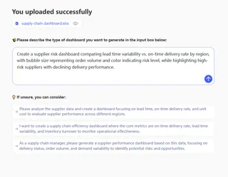
Step 2: Describe Your Dashboard Intent in Plain Language
Instead of navigating menus or writing formulas, you simply explain what you want to analyze in natural language — e.g., “Show inventory turnover by SKU and highlight top 10 suppliers by late delivery rate.” Excelmatic interprets this high-level request, identifies the relevant data segments, and determines how to operationalize them.
Step 3: Generate Visualizations and Analytical Blocks
Within seconds, the AI builds a structured dashboard tailored to your supply chain context: key metrics grouped by decision relevance, visualizations chosen for interpretability (lines for trends, bars for comparisons, heatmaps for concentration risk), and filters aligned with operational queries. All elements remain interactive and editable.
Step 4: Iterate and Refine Through Conversation
You can refine the dashboard by asking follow-up questions or adjusting visual components. For example, “Group the chart by region and overlay average lead time trend” will prompt the system to reorganize panels and apply the appropriate chart type.

By embedding AI at each step — data ingestion, intent interpretation, visualization selection, and explanation generation — the entire dashboard creation process becomes decision-centred rather than mechanic-centred. Users spend less time constructing and more time interpreting and acting.
Conclusion and a Measured Next Step
Supply Chain Dashboards in 2025 are less about visibility and more about decision quality under uncertainty. Their effectiveness depends on how well they align data structures with real decision needs across time horizons and functions.
Frequently Asked Questions (FAQ)
Q: What is a supply chain dashboard?
A: A supply chain dashboard is an analytical interface that structures supply, demand, inventory, and logistics data to support ongoing operational and strategic decisions.
Q: What are the main types of supply chain dashboards?
A: Common types include operational dashboards, inventory and demand planning dashboards, supplier risk dashboards, logistics performance dashboards, and executive dashboards.
Q: What metrics are commonly used in supply chain dashboards?
A: Typical metrics include inventory turnover, demand variability, lead time behavior, service level, supplier reliability, and cost-to-serve indicators.
Q: How does AI improve supply chain dashboards?
A: AI helps identify patterns, highlight anomalies, and summarize insights automatically, reducing analysis time and improving decision clarity.

