Data visualization is a very important part of data analysis. It can help us visualize the data and quickly discover the patterns and trends in the data. Today, I will share with you how to use Excelmatic to create a stunning data visualization.
First of all, we need to clarify what is data visualization. Data visualization is to present data in the form of graphs or charts to better understand and analyze the data. Good data visualization not only makes the data more intuitive, but also enhances the persuasiveness and attractiveness of the report. In Excelmatic, data visualization is very simple. Next, I will share some practical tips to help you create a more stunning data visualization.
Tip 1: Choose the right chart type
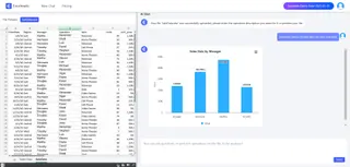
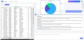
Different data types are suitable for different chart types. Column charts are suitable for comparing data between different categories, pie charts are suitable for showing the proportion relationship between various parts, and line charts are suitable for showing the trend of data over time.
In Excelmatic, we can flexibly choose chart types according to the characteristics of the data and what we want to show. For example, if we want to show the sales volume of different products, we can choose a Bar Chart. If we want to show the market share, pie chart is a better choice.

Tip 2: Using Smart Charts
Excelmatic provides Smart Chart Templates that allow us to create smarter and more interactive charts.
Smart Chart Templates automatically generate the most appropriate chart type and layout based on the characteristics of the data. All we need to do is select the data range, and Excelmatic will automatically generate a beautiful and professional-looking chart for us, which greatly saves time when designing charts.

Tip 3: Combining Data Visualization with Reporting
Data visualization can not only be used alone, but also combined with reports to form a complete data analysis report.
In Excelmatic, we can let Excelmatic explain and illustrate the results of data visualization, so that readers can better understand the meaning behind the data. In this way, readers can not only visualize the data visualization results, but also understand the specific data in detail through the data table.

Conclusion
In a nutshell, data visualization is a very important part of data analysis, and Excelmatic provides powerful tools and rich features to help us easily create stunning data visualizations. By choosing the right chart type, using smart chart templates, and combining reports for a comprehensive presentation, we can make data more intuitive and vivid, thus better communicating the value of the data. Come and try Excelmatic for free!


