Key Takeaways:
- Creating Sankey diagrams in Excel traditionally requires third-party add-ins and technical know-how, creating barriers for business professionals
- Excelmatic simplifies the process by generating Sankey diagrams instantly from simple language instructions—no coding or complex setup needed
- Compared to manual methods in Excel, Python, or R, Excelmatic delivers professional Sankey visualizations in seconds, keeping your focus on insights rather than technical implementation
- For market, sales, and operations professionals needing to visualize data flows quickly, adopting AI tools like Excelmatic means faster analysis and better decision-making
The beauty of Sankey diagrams lies in their ability to simplify multi-stage systems. Instead of hunting through rows of data to find the largest energy losses or budget allocations, you can spot them instantly by looking for the thickest flows. This makes them useful for energy management, financial analysis, marketing funnel optimization, and any scenario where understanding the flow and transformation of resources matters more than precise numerical comparisons.
What Is a Sankey Diagram?
A Sankey diagram is a specialized flow visualization where the width of connecting arrows represents the magnitude of flow between different stages, categories, or entities. Unlike traditional flowcharts that show process steps or bar charts that compare discrete values, Sankey diagrams excel at showing how quantities move, transform, or get distributed through a system.
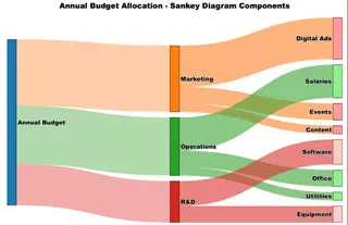
The diagram above illustrates how a $100,000 annual budget flows through different categories. Notice how the Marketing allocation ($40,000) appears as a visibly thicker flow compared to R&D ($25,000), making the proportional differences immediately apparent.
History and evolution of Sankey diagrams
The first known Sankey diagram appeared in 1898 when Captain Matthew Henry Phineas Riall Sankey used it to show the energy efficiency of a steam engine. His diagram revealed that only a small portion of the fuel's energy actually contributed to useful work, with most being lost as waste heat.

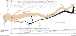
However, the concept of proportional flow visualization predates Captain Sankey. Charles Joseph Minard created what many consider the most famous flow diagram in 1869, depicting Napoleon's disastrous 1812 Russian campaign. Minard's diagram showed the army's diminishing size as it advanced into Russia and then retreated, with the line thickness representing the number of surviving soldiers.
Components of a Sankey diagram
Understanding the key elements of a Sankey diagram helps you both interpret existing ones and create your own effectively.
- Nodes represent the categories, stages, or entities in your system. In our budget example, "Annual Budget," "Marketing," and "Digital Ads" are all nodes. Source nodes (like "Annual Budget") typically appear on the left, while target nodes (like "Digital Ads") appear on the right.
- Flows or links are the directional connectors between nodes, and their width is proportional to the value they represent. The thick orange flow from Annual Budget to Marketing represents $40,000, while the much thinner flow to Content represents only $5,000. This proportional width is the defining characteristic that makes Sankey diagrams so effective.
- Values are the numerical data that determine each flow's width. These could represent money, energy, people, or any quantifiable resource moving through your system.
- Drop-offs are special flows that represent losses, waste, or resources that exit the system without reaching a target node. While our budget example doesn't show drop-offs, you might see them in energy diagrams showing heat loss or in marketing funnels showing customers who abandon the process.
How to Create a Sankey Diagram
Creating Sankey diagrams requires different approaches depending on your preferred tools and technical comfort level. We'll walk through the same budget allocation example using Excel, Python, and R, so you can choose the method that best fits your workflow and expertise.
Sankey Diagram in Excel: AI vs. Traditional Add-ins
Excel doesn't include a native Sankey chart type, forcing users to find workarounds. Let's compare the traditional add-in method with a modern, AI-powered approach.
The AI-Powered Method (with Excelmatic)
The fastest and most intuitive way to create a Sankey diagram in Excel is by using an AI agent like Excelmatic. Instead of navigating menus and installing third-party software, you can simply state your request in plain language.
The process is refreshingly simple:
- Upload your data file containing the source, target, and value for each flow.
- State your need: Type a simple prompt like, "Create a Sankey diagram from this data to show the budget allocation."
- Get your chart: Excelmatic analyzes your data and instantly generates a professional, accurate Sankey diagram.
This approach eliminates the learning curve associated with add-ins and automates the entire process. It's ideal for business professionals who need to generate complex visualizations quickly without getting bogged down in technical steps or writing code. The AI handles the chart creation, so you can focus on the insights.
The Traditional Method (with Add-ins)
For those who prefer a manual approach, you'll need to use a third-party add-in. ChartExpo is one of the most popular options.
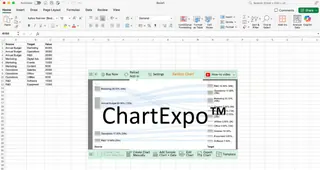
Before creating the diagram, you'll need to structure your data in a source-target-value format. Each row must represent one flow connection.
The process is straightforward once you have ChartExpo installed. First, install the add-in from Microsoft AppSource. Then, select your data range (including headers) and choose Sankey Chart from ChartExpo's visualization options. The add-in detects your source, target, and value columns and provides a preview, allowing you to create and customize the chart.
Comparison: While add-ins get the job done, they require installation, manual data selection, and navigating a separate interface. An AI tool like Excelmatic streamlines this into a single conversational step, making it significantly faster and more user-friendly.
Sankey Diagram in Python
For those who prefer coding, Python's Plotly library is an excellent option for creating interactive, high-quality Sankey diagrams. We'll use the same budget allocation data to recreate the visualization.
Step 1: Data Preparation
Start by organizing your data into the format Plotly expects: a list of node names, and arrays specifying the source indices, target indices, and values for each flow.
import plotly.graph_objects as go

# Define all nodes in your diagram
nodes = ["Annual Budget", "Marketing", "Operations", "R&D",
         "Digital Ads", "Events", "Content", "Salaries",
         "Office", "Utilities", "Software", "Equipment"]

# Define the connections (using node indices)
source_indices = [0, 0, 0, 1, 1, 1, 2, 2, 2, 3, 3]
target_indices = [1, 2, 3, 4, 5, 6, 7, 8, 9, 10, 11]
values = [40, 35, 25, 25, 10, 5, 20, 10, 5, 15, 10]
The indices correspond to positions in your nodes list, so source_indices = [0, 0, 0] means the first three flows start from "Annual Budget" (position 0).
Step 2: Basic Sankey Creation
Create the core diagram structure using Plotly's Sankey object.
fig = go.Figure(data=[go.Sankey(
    node=dict(
        label=nodes,
        pad=15,
        thickness=20
    ),
    link=dict(
        source=source_indices,
        target=target_indices,
        value=values
    )
)])
This creates a functional Sankey diagram with default styling. The pad controls spacing between nodes, while thickness determines how wide the node rectangles appear.
Step 3: Styling and Customization
Enhance your diagram with colors, improved layout, and professional formatting.
# Add colors and transparency
fig.update_traces(
    node_color=["#1f77b4", "#ff7f0e", "#2ca02c", "#d62728",
                "#ff9999", "#ff9999", "#ff9999", "#90ee90",
                "#90ee90", "#90ee90", "#ffcccb", "#ffcccb"],
    link_color=["rgba(255, 127, 14, 0.4)", "rgba(44, 160, 44, 0.4)",
                "rgba(214, 39, 40, 0.4)", "rgba(255, 127, 14, 0.6)",
                "rgba(255, 127, 14, 0.6)", "rgba(255, 127, 14, 0.6)",
                "rgba(44, 160, 44, 0.6)", "rgba(44, 160, 44, 0.6)",
                "rgba(44, 160, 44, 0.6)", "rgba(214, 39, 40, 0.6)",
                "rgba(214, 39, 40, 0.6)"]
)

# Update layout for better presentation
fig.update_layout(
    title="Annual Budget Allocation",
    font=dict(size=16, family="Arial Black", color="black"),
    width=900,
    height=600
)
Step 4: Display and Export
Display your diagram and save it in various formats.
fig.show()  # Display in Jupyter notebook or browser

# Export options
fig.write_html("budget_sankey.html")  # Interactive web version
fig.write_image("budget_sankey.png")  # Static image
Sankey Diagram in R
R's networkD3 package is another powerful tool for creating interactive, web-ready Sankey diagrams. This approach offers built-in interactivity like hover effects and easy integration with R Markdown.
Step 1: Setup and Data Preparation
First, install and load the required packages, then structure your data into nodes and links dataframes.
# Install required packages (run once)
install.packages(c("networkD3", "dplyr"))

# Load libraries
library(networkD3)
library(dplyr)

# Create nodes dataframe
nodes <- data.frame(
  name = c("Annual Budget", "Marketing", "Operations", "R&D",
           "Digital Ads", "Events", "Content", "Salaries",
           "Office", "Utilities", "Software", "Equipment")
)

# Create links dataframe (note: networkD3 uses 0-based indexing)
links <- data.frame(
  source = c(0, 0, 0, 1, 1, 1, 2, 2, 2, 3, 3),
  target = c(1, 2, 3, 4, 5, 6, 7, 8, 9, 10, 11),
  value = c(40, 35, 25, 25, 10, 5, 20, 10, 5, 15, 10)
)
Step 2: Basic Sankey Creation
Create your diagram using the sankeyNetwork() function.
# Create basic Sankey diagram
sankey_plot <- sankeyNetwork(
  Links = links,
  Nodes = nodes,
  Source = "source",
  Target = "target",
  Value = "value",
  NodeID = "name",
  units = "K USD"
)

# Display the plot
sankey_plot
This generates an interactive diagram where users can hover over flows and drag nodes to reorganize the layout.
Step 3: Customization and Styling
Enhance your diagram with colors, sizing, and other formatting options.
# Advanced Sankey with customization
(sankey_advanced <- sankeyNetwork(
  Links = links,
  Nodes = nodes,
  Source = "source",
  Target = "target",
  Value = "value",
  NodeID = "name",
  units = "K USD",
  fontSize = 14,
  fontFamily = "Arial",
  nodeWidth = 30,
  nodePadding = 20,
  margin = list(top = 50, right = 50, bottom = 50, left = 50),
  height = 600,
  width = 900
))
Step 4: Export and Integration Options
Save your interactive diagram as a self-contained HTML file.
# Save as HTML file
library(htmlwidgets)
saveWidget(sankey_advanced, "budget_sankey.html", selfcontained = TRUE)

# For static image export (optional - requires webshot2 package)
install.packages("webshot2")
library(webshot2)
webshot("budget_sankey.html", "budget_sankey.png", vwidth = 900, vheight = 600)
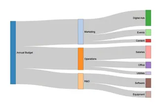
This resulting diagram provides the same visual insights as our Python and Excel versions but with built-in interactivity that helps users explore the data more thoroughly.
Sankey Diagram Alternatives and Comparisons
Sankey diagrams work best when you have clear directional relationships between categories. However, several situations call for different visualization approaches.
When not to use Sankey diagrams
- No directional flow: If your data simply shows different groups without movement between them, a bar chart is more appropriate.
- Need for precise comparisons: The varying widths make it difficult to extract exact values. If accuracy is key, use tables or bar charts.
- High complexity: With too many nodes or interconnected flows, Sankey diagrams can become a cluttered mess.
- Unfamiliar audience: Since they're less common, some audiences may find them confusing. Stick with familiar chart types unless the flow is essential to your message.
Better alternatives for specific scenarios
- Alluvial diagrams work better for categorical or time-based flows, such as tracking how voters move between parties across multiple elections.
- Parallel coordinate plots serve better for comparing multivariate data, like comparing cars across price, fuel efficiency, and safety ratings.
- Bump charts handle rank changes over time more effectively, like tracking companies' market positions over several quarters.
Conclusion
Successful visualization depends on choosing the right tool for your specific situation. Sankey diagrams are excellent when directional flow matters more than precise numbers.
For Excel users, the choice is between the manual, multi-step process of using an add-in and the streamlined, instant results of an AI tool like Excelmatic. For those comfortable with code, Python and R offer powerful, customizable solutions. By understanding these different methods, you can select the approach that best fits your skills, timeline, and analytical needs, allowing you to turn complex flow data into clear, impactful stories.
Ready to create professional Sankey diagrams without the complexity? Try Excelmatic today and transform your data flows into clear visual insights in seconds.
FAQ
What's the difference between a Sankey diagram and a flowchart?
While flowcharts show process steps and decision points, Sankey diagrams specifically visualize the flow and quantity of resources, energy, or data between different stages. The width of the arrows in Sankey diagrams is proportional to the values being measured, whereas flowcharts focus on process logic rather than quantities.
What kind of data is best suited for Sankey diagrams?
Sankey diagrams work best with flow-based data that shows movement or transformation from one stage to another, such as energy distribution, website conversion funnels, supply chain flows, or budget allocations. They're not suitable for purely categorical data or datasets where there's no directional relationship between the variables.
What are some good online tools for creating Sankey diagrams without coding?
For users who prefer web-based solutions, SankeyMATIC offers a free, simple interface for basic diagrams, while Flourish provides more advanced features and interactivity for professional presentations. Google Charts and Highcharts are excellent for developers who want to embed Sankey diagrams in websites, and Visual Paradigm offers comprehensive diagramming capabilities as part of a broader business tool suite.
When should I avoid using a Sankey diagram?
Avoid Sankey diagrams when you need precise numerical comparisons (since flow widths can be hard to measure exactly), when your data has too many categories that would create visual clutter, or when there's no actual directional flow between your data points. Also consider simpler alternatives if your audience is unfamiliar with this visualization type, as the novelty might overshadow your message.
How do I handle negative values or losses in a Sankey diagram?
Sankey diagrams typically don't display negative values directly since arrow widths represent positive quantities. Instead, show losses as separate outgoing flows from nodes, or use drop-off flows that don't connect to target nodes to represent waste or lost resources.
What's the difference between Sankey and Alluvial diagrams?
Sankey diagrams focus on flow quantities at a single point in time, while alluvial diagrams show how categorical data changes across multiple time periods or stages. Alluvial diagrams are better for tracking migration, changes in categories, or evolution over time.


