Messy return logs? Random refund reasons? And five slightly different versions of “Missing Parts” in your dropdown?
But instead of opening Excel, firing up a COUNTIFS formula, and convincing myself I’ll clean this “tomorrow,” I uploaded the file to Excelmatic and just typed what I wanted to know—in English.
No syntax. No VLOOKUPs. Just honest curiosity and three smart prompts.
The Setup
I had two simple sheets:
- Return Records – showing order numbers, products, reasons for return, refund amounts, and satisfaction scores (ranging from 1 to 5).
- Customer Service Logs – with customer IDs, handling time, issue types, and how customers responded to the service (“Satisfied,” “Neutral,” etc.).

Not perfect. Not clean. Very real.
What I Asked Excelmatic
Here are the exact questions I typed—nothing more, nothing less:
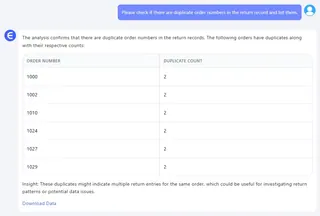
1. “Please check if there are duplicate order numbers in the return record and list them.”

This is a problem I didn’t even know I had. Excelmatic ran a check and listed all duplicate Order IDs in a clean, separate table.
Turns out: we had a few rows where the same order showed up more than once—same customer, same product, same return reason. Probably someone hit “Export” twice or logged the same return again after follow-up. A real-life mess that would’ve gone unnoticed in a spreadsheet with 1,000 rows.
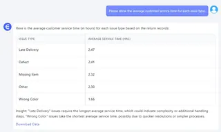
2. “Please show the average customer service time for each issue type.” Here’s where it gets fun. In a regular Excel flow, you’d:
- Create a pivot table
- Drop “Issue Type” in Rows
- Add “Service Time” to Values
- Change it to “Average”
- Format the decimals
- Hope the intern didn’t mess with the source sheet
Excelmatic just gave me the answer. It grouped the issue types, calculated average handling time for each, and formatted the output. Like magic, but practical.

3. “Please generate a distribution of customer satisfaction scores segmented by return amount.” Now this one, this is insight.
Excelmatic automatically created grouped buckets (like $0–$500, $500–$1000, and so on) and mapped how customers scored their satisfaction within each. You could actually see the emotional cost of a $2000 refund vs. a $300 one.
The pattern was clear: the bigger the refund, the harsher the score. Which makes sense—but until you see it visualized, it’s just a hunch.
What Did I Learn?
I didn’t just clean the data. I actually understood what the data was trying to say:
- Duplicates waste time and skew stats
- Not all customer issues take the same time—some need 3x longer
- High-value returns usually mean more upset customers
And I did all this without switching tabs, Googling syntax, or breaking a sweat.
Final Thoughts
Excelmatic isn’t trying to replace Excel. It’s helping people use Excel better—especially when your job isn’t Excel, but making decisions from the data inside it.
In a world full of dashboards, it’s refreshing to just ask a question and get the answer.
Want to find out what your return data is hiding? Just upload your file, and type like you’re talking to a teammate:
👉 Try Excelmatic now and ask your own questions


