Your sales are growing, but so are your refund emails. Sound familiar? Returns are an e-commerce headache that cost you money, trust, and sleep.
But what if you could spot the most problematic products… before they eat into your margins?
With Excelmatic, you can instantly generate a Bar Chart showing product return rates, no formulas or frustration needed.
Why Refund Rates Deserve Your Attention
High refund rates aren’t just annoying—they reveal:
- Product quality issues
- Mismatch between marketing and reality
- Packaging or shipping problems
- Unsatisfied buyer segments
Whether it’s one faulty SKU or a seasonal pattern, AI charts help you find the red flags—fast.
Sample Dataset
Traditional Way: Way Too Manual
In Excel, this usually means:
- Aggregate orders and refunds by product
- Calculate return rate (refunds ÷ orders)
- Sort by return rate descending
- Build chart manually
- Adjust every single label and axis
And if you want to group by category, channel, or month? Good luck with that pivot mess.
Excelmatic in Action: Prompt + Answer Visuals
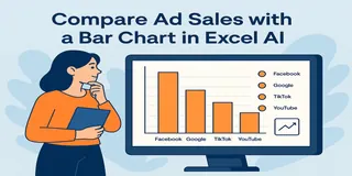
Show a Bar Chart of return rate by ad channel
Want to know which platform is secretly hurting your bottom line with high refunds? This chart compares return rates across channels like Facebook, TikTok, and Google Ads.
Compare number of orders and refunds for each traffic source
Get a clear look at both volume and refund behavior by channel. Great for campaign audits and budget reshuffling.

Display a table with total orders, refunds, and return % per channel
Sometimes you need the whole picture. This table breaks it down so you can act with clarity.
What You Might Discover
- TikTok's refund rate is 2x higher than Facebook's
- Google Ads brings fewer orders but lowest return rate
- Refunds spike after influencer campaigns on YouTube
- Instagram performs well in Fashion, but not for Electronics
That’s the kind of insight that saves you budget and headache—before the next campaign goes live.
Best Use Cases for Refund Rate Charts
- Monitor refund % for top-selling SKUs
- Track return trends over time (weekly/monthly)
- Compare refund rates by category, region, channel
- Prepare for supplier negotiations with hard data
- Set internal quality benchmarks by product type
Manual vs Excelmatic AI
| Step | Traditional Excel | Excelmatic AI |
|---|---|---|
| Group orders/refunds | Pivot tables, filters | Auto |
| Calculate refund % | Formula per row | Auto |
| Create Bar Chart | Insert + format | Instant |
| Compare across categories | Manual workarounds | Prompt-based |
| Time to generate | 40–60 mins | < 1 minute |
Pro Tips
- Use color to highlight products over 10% refund rate
- Combine return rate + product rating for deeper view
- Visualize refunds as % of revenue for high-priced items
- Filter by season or campaign to uncover refund spikes
Final Thoughts
You can’t improve what you don’t measure. Return rate charts tell you what’s working, what’s failing, and where you’re losing money.
And with Excelmatic, they’re only one smart prompt away.
If you are interested in Excel AI charts, you may also like the following articles:
Compare Ad Channel Sales with a Bar Chart in Excel AI
Track Monthly Sales Trends in Seconds with Excel AI Line Chart
Compare Brand Sales Trends with Multi-Line Chart in Excel AI
Visualize Category Sales by Region with Donut Charts in Excel AI
Compare Seasonal Sales Trends with Multi-Line Excel AI Charts


