Most marketers optimize for conversions. But the smart ones? They optimize for net revenue after refunds.
Because a sale that gets returned is worse than no sale at all.
Why Channel-Level Refund Rate Matters
Let’s say TikTok brings 1,000 sales, Facebook 700,Google 500.
At first glance, TikTok wins. But what if its refund rate is 3x higher than the others?
Suddenly, your top traffic source… is your biggest margin killer.
What Makes This Hard in Excel
- Orders and refunds are often split across different sheets
- You need to group by channel, then calculate return rate
- Then sort, chart, label, and explain
- AND clean up weird entries like “FB Ads” vs “Facebook Ads”
That’s a lot of energy to just answer:
Which ad channel has the cleanest conversion quality?
Excelmatic in Action: Prompt + Answer Visuals
Sample Dataset
Show a Bar Chart of return rate by ad channel
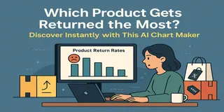
Want to know which platform is secretly hurting your bottom line with high refunds? This chart compares return rates across channels like Facebook, TikTok, and Google Ads.
Compare number of orders and refunds for each traffic source
Get a clear look at both volume and refund behavior by channel. Great for campaign audits and budget reshuffling.
Display a table with total orders, refunds, and return % per channel
Sometimes you need the whole picture. This table breaks it down so you can act with clarity.
What You Might Discover
- TikTok's refund rate is 2x higher than Facebook's
- Google Ads brings fewer orders but lowest return rate
- Refunds spike after influencer campaigns on YouTube
- Instagram performs well in Fashion, but not for Electronics
That’s the kind of insight that saves you budget and headache—before the next campaign goes live.
How You Can Use It
- Stop wasting budget on high-return traffic
- Set different expectations by platform
- Adjust ad creatives for better fit
- Back up refund complaints with real data
Manual vs Excelmatic
| Task | Traditional Excel | Excelmatic AI |
|---|---|---|
| Clean and group channels | Manual standardization | AI-assisted |
| Count orders & refunds | Formulas + filters | Automatic |
| Chart by channel | Insert + format | Instantly generated |
| Insight clarity | Moderate | Crystal clear |
Pro Tips
- Clean up channel names like “fb” vs “Facebook” first
- Visualize volume + refund % together for full picture
- Set threshold (e.g. 8%) and highlight overperformers
- Slice by week or campaign for advanced insight
Final Words
Don’t just count conversions—count consequences.
With Excelmatic, you’ll know exactly which ad platforms bring value—and which ones bring refunds.
If you are interested in Excel AI charts, you may also like the following articles:
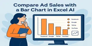
Compare Ad Channel Sales with a Bar Chart in Excel AI
Track Monthly Sales Trends in Seconds with Excel AI Line Chart
Compare Brand Sales Trends with Multi-Line Chart in Excel AI
Visualize Category Sales by Region with Donut Charts in Excel AI
Compare Seasonal Sales Trends with Multi-Line Excel AI Charts
What’s Your Best-Selling Product? Find Out Instantly with This AI Chart Maker

