Key Takeaways:
- Advanced Excel analysis—like creating complex charts or running statistical models—often requires technical expertise that goes beyond standard spreadsheet skills
- Excelmatic eliminates the coding barrier by allowing you to perform sophisticated data tasks using simple language instructions
- Compared to traditional methods or learning programming, Excelmatic delivers immediate results through intuitive conversation with your spreadsheet
- For business professionals focused on outcomes rather than technical implementation, adopting Excelmatic means faster insights and more time for strategic decision-making
If you’ve ever spent too much time wrestling with complex formulas or scrolling through endless rows of data in Excel, you’re not alone. It’s a reliable tool for everyday data work, but once your datasets get bigger and your analysis becomes more complex, Excel can start to show its limits. Performance slows down, and tasks like advanced analysis or automation get clunky.
Fortunately, modern solutions are here to break through those limits. Two powerful paths have emerged:
- Coding with Python directly in Excel: For those with programming skills, Excel now includes built-in support for Python. This opens the door to better charts, faster analysis, and more flexible automation.
- Using an AI Agent like Excelmatic: For those who want the power of advanced analysis without the code, AI agents provide instant answers, charts, and insights using plain language commands.
This article will compare both approaches, showing you how to enhance your spreadsheets whether you’re a coder or just want to get the job done fast.
Why Modern Solutions are Essential for Excel
Before we get into the "how," let’s look at why these integrations matter. You’ve probably used Excel for quick math and basic charts. But for more advanced analysis, like cleaning large datasets or modeling trends, traditional Excel falls short. This is where both Python and AI agents come in.
The Coder's Path: Python in Excel
For those comfortable with code, the Python integration is a game-changer. It comes with the Anaconda distribution by default, giving you built-in access to popular libraries like pandas, NumPy, Seaborn, Matplotlib, and scikit-learn. These tools are the gold standard for data manipulation, visualization, and machine learning.
When you use Python in Excel, the code runs in secure containers on Microsoft Azure. This means you don’t need to install Python on your computer, and performance scales with your workload. Collaboration is streamlined since the code and outputs are stored in one central workbook.
The No-Code Path: AI Agents like Excelmatic
For business users, analysts, and managers who need answers without a coding course, AI agents like Excelmatic offer a more direct route. Instead of writing code, you simply upload your spreadsheet and describe what you need in plain English.
Want to see sales trends? Need to clean up messy data? Want a complex chart? Just ask.
Excelmatic acts as your personal data analyst, handling everything from data cleaning and formula generation to chart creation and deep analysis. It delivers instant, accurate results, turning hours of manual work or complex coding into a simple conversation.
Getting Started: Two Approaches to a Solution
Let's compare how you'd begin with each method.
Activating and Setting Up Python in Excel
Python in Excel is available through Microsoft 365 subscriptions. To activate it, go to the Formulas tab and turn on the Insert Python add-in.
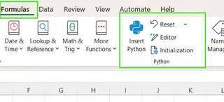
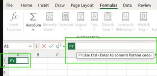
Once active, you’ll see a cell with the formula: =PY(). You can write Python code inside that function, then press Ctrl+Enter to run it.
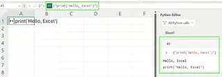
You can test the setup by running: =PY("print('Hello, Excel')"). If you’re new to Python, you might lean on AI assistants like Copilot to help generate code.
Getting Started with Excelmatic
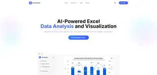
With Excelmatic, the setup is even simpler. There's no add-in to activate or code to verify. The process is:
- Upload your Excel file(s).
- Ask your question in plain language.
That's it. Excelmatic handles the rest. Instead of testing a "Hello, World" script, you can immediately ask for a meaningful insight from your data, such as "What was our total revenue last quarter?"
Advanced Analytics and Visualization: Code vs. Conversation
Here’s where the difference between the two approaches becomes crystal clear. Let's tackle a real-world analysis task.
Example 1: Advanced Visualizations
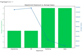
Excel’s built-in charts are fine for simple visuals. But what if you need a more complex chart, like a combination bar and line graph to show headcount and average salary by department?
The Python in Excel Method
This requires a significant amount of code using the pandas and matplotlib libraries. You need to load the data, clean it, group it, and then write several lines of code to configure and plot two different chart types on a shared axis.
import pandas as pd
import matplotlib.pyplot as plt

# Read the named range directly as a DataFrame
employee_data = xl("Employee[#All]", headers=True)

# Clean column names
employee_data.columns = employee_data.columns.str.strip()

# Convert numeric columns
employee_data["Age"] = pd.to_numeric(employee_data["Age"])
employee_data["YearsExperience"] = pd.to_numeric(employee_data["YearsExperience"])
employee_data["Salary"] = pd.to_numeric(employee_data["Salary"])

# Group by Department
grouped_data = employee_data.groupby("Department").agg({
    "Name": "count",
    "Salary": "mean"
}).rename(columns={"Name": "Headcount", "Salary": "AvgSalary"})

# Plot: Bar for headcount, Line for salary
fig, ax1 = plt.subplots(figsize=(10, 6))

# Bar chart for headcount
bars = ax1.bar(grouped_data.index, grouped_data["Headcount"], color="#00C74E", label="Headcount")
ax1.set_ylabel("Number of Employees", color="#00C74E")
ax1.set_xlabel("Department")
ax1.tick_params(axis='y', labelcolor="#00C74E")

# Line chart for average salary
ax2 = ax1.twinx()
line = ax2.plot(grouped_data.index, grouped_data["AvgSalary"], color="#0A66C2", marker="o", label="Avg Salary")
ax2.set_ylabel("Average Salary", color="#0A66C2")
ax2.tick_params(axis='y', labelcolor="#0A66C2")

# Title and layout
plt.title("Department Headcount vs. Average Salary")
fig.tight_layout()
plt.show()
The code produces the following chart, which updates automatically if the source data changes.
The Excelmatic Method
With Excelmatic, you skip the code entirely. After uploading your employee data, you simply ask:
Create a combo chart showing headcount as a bar chart and average salary as a line chart for each department.
Excelmatic analyzes your request, performs the same grouping and aggregation steps internally, and instantly generates the same professional chart. The result is identical, but the effort is a fraction of what's required for the Python method.
Example 2: Deeper Statistical and Predictive Modeling
Python's scikit-learn and statsmodels libraries are fantastic for statistical modeling. Let's see how you'd get summary statistics and correlations from employee data.
The Python in Excel Method
You would write a script to load the data, clean it, and then use pandas functions to calculate descriptive statistics and correlations.
import pandas as pd
from scipy.stats import linregress

# Read data from Excel table
employee_data = xl("Employee[#All]", headers=True)

# Clean column names
employee_data.columns = employee_data.columns.str.strip()

# Convert relevant columns to numeric
employee_data["Age"] = pd.to_numeric(employee_data["Age"])
employee_data["YearsExperience"] = pd.to_numeric(employee_data["YearsExperience"])
employee_data["Salary"] = pd.to_numeric(employee_data["Salary"])

# 1️. Summary statistics
summary = employee_data[["Age", "YearsExperience", "Salary"]].describe()
print("📊 Summary Statistics:\n", summary)

# 2️. Average salary by gender
gender_salary = employee_data.groupby("Gender")["Salary"].mean()
print("\n💰 Average Salary by Gender:\n", gender_salary)

# 3️. Correlation between experience and salary
correlation = employee_data["YearsExperience"].corr(employee_data["Salary"])
print(f"\n📈 Correlation (Experience vs Salary): {correlation:.3f}")
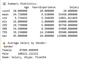
This script outputs the raw statistical data directly into your spreadsheet cells.
The Excelmatic Method
Again, Excelmatic simplifies this into a conversation. You can ask for each piece of analysis one by one or all at once:
Show me summary statistics for Age, Years Experience, and Salary. What is the average salary by gender? Also, what is the correlation between years of experience and salary?
Excelmatic processes these questions and delivers a clean, easy-to-read report with all the requested statistics. There's no need to import libraries, convert data types, or remember function names like .describe() or .corr().
Limitations and Workarounds
Each approach has its own set of constraints.
Python in Excel: The Coder's Hurdles
- Internet Required: Python code runs in the cloud, so you must be online.
- No Local File Access: The code can only work with data already in the workbook. It cannot connect to local databases or external APIs.
- Limited Custom Libraries: You are restricted to the pre-installed Anaconda libraries. You cannot install your own packages.
- Debugging: Finding errors in your Python code within an Excel cell can be tricky. Syntax errors, reference issues, and dependency problems are common.
- Steep Learning Curve: This method is inaccessible without a solid foundation in Python and its data analysis libraries.
Excelmatic: The AI's Boundaries
- Internet Required: Like the Python integration, Excelmatic is a cloud-based service and requires an internet connection.
- Focused on Outcomes: Excelmatic is designed to deliver final answers, charts, and reports. It doesn't give you the underlying code, which means it may not be suitable for developers who need to integrate the logic into a larger software project.
For most business users, the limitations of Python in Excel are significant barriers. In contrast, Excelmatic's limitations are minor, as its core purpose is to bypass the technical complexities and deliver the analytical outcome directly.
Which Path Is Right for You?
Microsoft is continuously improving Python in Excel, but the fundamental choice remains: do you want to build the solution yourself with code, or do you want an AI to build it for you?
Choose Python in Excel if: You are a data scientist, developer, or a student learning to code. You enjoy having granular control over your analysis, need to write highly custom algorithms, and are comfortable debugging Python scripts.
Choose an AI Agent like Excelmatic if: You are a business analyst, manager, marketer, or anyone who needs to make data-driven decisions quickly. Your goal is the insight, not the process of getting it. You value speed, simplicity, and the ability to ask complex questions without writing a single line of code.
While we’ve explored how to use Python directly inside Excel, the rise of AI agents like Excelmatic suggests a powerful new paradigm. For the vast majority of Excel users, the future of advanced analysis isn't about learning to code—it's about learning to ask the right questions.
Ready to transform how you work with Excel? Skip the complexity and start getting instant insights. Try Excelmatic for free today and experience the power of AI-driven data analysis.


