Key takeaways:
- Project dashboards provide a centralized view of project status, helping teams align around progress, risks, and priorities.
- Different types of project dashboards serve different needs, including tracking execution progress, managing resources, and monitoring delivery risks.
- Effective project dashboards focus on decision-driven metrics, such as timeline variance, workload balance, scope changes, and delivery confidence.
- Good project dashboard design balances clarity and depth, offering high-level visibility while allowing deeper exploration when needed.
- Modern tools like Excelmatic make it easier to build project dashboards from existing spreadsheet data, turning raw project information into decision-ready insights.
In simple terms, a project dashboard is a decision-focused interface that turns project data into shared visibility.
Project dashboards are often introduced as a way to “track progress.”
In reality, their real value is much broader: they help teams understand what is happening, why it is happening, and what needs attention next.
A well-designed project dashboard connects project data to daily decision-making. It reduces ambiguity, shortens feedback loops, and gives different stakeholders the clarity they need—without forcing everyone to read the same report.
What a Project Dashboard Is (and What It Is Not)
A project dashboard is a centralized view of project-related data that reflects the current state of work. It typically pulls from task lists, timelines, resource plans, and operational metrics.
What it is not is a static status report. Unlike weekly updates or slide decks, a project dashboard is designed to stay relevant as the project evolves. It updates continuously and supports exploration rather than one-time review.
The goal is not to document work already done, but to support decisions while the work is still in progress.
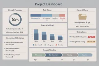
Common Types of Project Dashboards and Their Focus
Not all project dashboards serve the same purpose. In practice, teams tend to design dashboards around specific project needs rather than a single universal view.
1. Project Progress Dashboards
These dashboards focus on execution status. They help teams understand whether work is moving according to plan and where delays may be forming.
Typical indicators include task completion rates, milestone status, timeline variance, and dependency progress. Instead of listing every task, the dashboard highlights patterns — such as bottlenecks or consistently delayed phases — that require attention.
2. Resource and Workload Dashboards
Resource-focused dashboards are designed to answer a different question: Do we have the capacity to deliver this project as planned?
They often surface metrics such as team workload distribution, utilization rates, hours spent versus estimates, and role-based capacity. When designed well, these dashboards help prevent burnout and reveal hidden constraints before they affect delivery.
3. Risk and Delivery Health Dashboards
Some project dashboards are built specifically to monitor risk.
Rather than tracking progress alone, these dashboards emphasize signals such as overdue tasks, scope changes, blocked dependencies, or increasing rework. The intent is not to predict failure, but to make risk visible early enough to act.

Key Metrics That Matter Across Most Project Dashboards
While metrics vary by project type, effective project dashboards tend to share a small set of decision-oriented measurement themes. These metrics are not meant to describe everything, but to highlight where attention or action is required.
| Metric Category | Example Metrics | What It Helps Teams Decide |
|---|---|---|
| Time & Progress | Planned vs. actual progress, milestone completion rate, schedule variance | Are we on track, and where are delays forming? |
| Scope & Change | Scope change count, change impact level, reopened tasks | Is the project expanding, and are changes controlled? |
| Resource & Capacity | Workload distribution, utilization rate, hours spent vs. estimate | Do we have enough capacity, or is the team overloaded? |
| Delivery Health | Blocked tasks, dependency risk, rework frequency | Are there early signals that delivery is at risk? |
| Execution Stability | Task aging, handoff delays, cycle time consistency | Is work flowing smoothly or breaking down repeatedly? |
The most important design choice is not how many metrics appear on a dashboard, but whether each metric clearly supports a decision.
If a number cannot trigger discussion, prioritization, or action, it does not belong on a pr
Designing Project Dashboards for Different Stakeholders
One reason project dashboards fail is that they try to serve everyone in the same way.
Project managers need detailed visibility into tasks, dependencies, and risks. Team members care more about priorities and immediate next steps. Executives need a high-level summary that highlights risk and progress without operational detail.
Strong project dashboard design acknowledges these differences.
It provides a clear overview first, then allows deeper exploration when needed — rather than overwhelming all users with the same level of detail.
How Project Teams Build Dashboards with Excelmatic
In practice, most project dashboards are not built from scratch. They typically originate from existing project data—such as spreadsheets that track progress, timelines, budgets, and team assignments.
Take, for example, a growing tech company in China that needed to gain a clear overview of its multi-project portfolio. The goal was to monitor overall progress, identify resource bottlenecks, and assess project risks in one consolidated view. To achieve this, the team decided to build a project dashboard.
After evaluating several AI dashboard tools on the market, the team selected Excelmatic for its straightforward interface and efficient chart generation. They provided the following clear and structured instruction to translate their needs into a dashboard:
“Dashboard with: summary metrics, project status pie, risk per department, Gantt timeline, budget waterfall, team heatmap. Add department/quarter/risk filters.”
Within moments, Excelmatic generated a clean, well-structured dashboard that integrated all requested views into a single interactive screen. The result provided immediate visibility into project health, resource allocation, and risk exposure — enabling faster and more informed decision-making without manual design or coding.
Conclusion: Build Project Dashboards That Support Real Decisions
Project dashboards are no longer just a way to track tasks or report progress. When designed well, they become a shared decision layer — helping teams understand project status, surface risks early, and stay aligned as work evolves.
As projects grow more complex, static reports and manual updates struggle to keep up. Modern project dashboards shift the focus from reporting what happened to understanding what needs attention now.
If you want to see how AI dashboards work in practice, Excelmatic offers a range of AI-generated templates and real examples — such as Executive Dashboard, KPI Dashboard, and HR Dashboard — to help you understand how different teams design and use dashboards in real scenarios.
Frequently Asked Questions (FAQ)
Q: What is the main goal of a project dashboard?
A: The main goal of a project dashboard is to give teams a clear, shared understanding of project progress, risks, and priorities so decisions can be made quickly and confidently.
Q: What are the most common types of project dashboards?
A: Common types include project progress dashboards, resource and workload dashboards, risk and delivery health dashboards, and executive-level project dashboards.
Q: Which metrics matter most in project dashboards?
A: The most important metrics are those that support decisions, such as schedule variance, milestone status, resource utilization, scope changes, and early risk signals.
Q: How are project dashboards different from project reports?
A: Project dashboards provide continuous, real-time visibility, while project reports are static snapshots that often become outdated quickly.
Q: How do AI-powered project dashboards differ from traditional dashboards?
A: AI-powered project dashboards adapt to changing questions through conversational analysis, while traditional dashboards rely on fixed metrics and predefined views that require manual updates.

