Key Takeaways:
- Manually applying conditional formatting to PivotTables in Excel is a multi-step, menu-heavy process that slows down analysis, especially when dealing with complex or evolving data.
- Excelmatic eliminates this friction by allowing you to instantly apply visual highlights using simple language commands (e.g., "highlight top 10 sales in the pivot table"), bypassing all manual steps.
- The AI-powered approach ensures formatting is correctly scoped to your PivotTable's data fields and updates easily with new data, saving time and preventing common setup errors.
- For business analysts and decision-makers, adopting Excelmatic means transforming raw PivotTables into visually impactful reports in seconds, enabling faster insight generation.
Applying conditional formatting to PivotTables adds immense value to your data analysis. It visually highlights the most critical data points, making complex tables instantly more readable and insightful.
While Excel provides powerful built-in tools for this, the process can involve navigating multiple menus and settings. But what if you could achieve the same results in a fraction of the time, just by asking?
In this guide, we'll explore two approaches for applying conditional formatting to PivotTables. We'll start with the traditional Excel methods and then introduce a modern, AI-powered alternative that streamlines the entire process.
To demonstrate, we'll work with the PivotTable below, based on the Credit Card Spending Habits in India dataset from Kaggle.

The Traditional Approach: Manual Conditional Formatting in Excel
Excel offers two primary manual methods for this task: using predefined rules for quick formatting or the Rule Manager for more granular control.
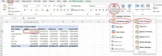
Both methods begin by selecting a cell in your PivotTable, navigating to the Home tab, and clicking the Conditional Formatting button.
Method 1: Using Predefined Rules
This is the most intuitive method for applying common formatting types.
- Select a cell in the data area of your PivotTable.
- Go to Home > Conditional Formatting.
- Choose a rule type, such as Highlight Cells Rules or Top/Bottom Rules. For example, you could select Highlight Cells Rules > Greater Than....
- Define the rule's criteria and select a format from the presets.
- After applying the format, a small Formatting Options icon appears. Click it and select the third option, "All cells showing 'Sum of Spending' values for 'City' and 'Card Type'", to apply the rule to the entire relevant data field in the PivotTable.

Method 2: Using the Conditional Formatting Rules Manager
For more advanced customization, the Rules Manager gives you full control.
- Select a cell in your PivotTable.
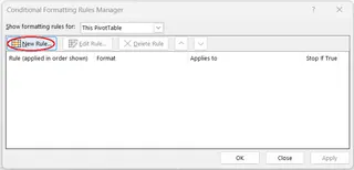
- Go to Home > Conditional Formatting > Manage Rules....
- In the Rules Manager dialog, click New Rule....
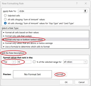
- In the "Apply Rule To:" section, select the third option to ensure the rule applies to the correct PivotTable field.
- Select a rule type (e.g., "Format only cells that contain").
- Define the rule's logic and click the Format... button to customize the font, border, or fill color.
- Click OK to confirm the format, then OK again to create the rule.
This method is powerful but requires more clicks and a clearer understanding of Excel's rule-building interface.
The AI-Powered Alternative: Instant Formatting with Excelmatic

While the manual methods work, they require you to know how to build the rule in Excel. What if you could just state what you want? That's where Excelmatic comes in.
Excelmatic is an Excel AI Agent that handles complex tasks based on plain language instructions. Instead of clicking through menus, you simply describe the outcome you want, and Excelmatic does the work for you.
Here’s how you’d apply the same conditional formatting with Excelmatic:
- Upload your file to Excelmatic.
- State your request in the chat box. For example:
In the PivotTable, apply conditional formatting to the 'Sum of Spending' column. Highlight all values greater than 500,000 in green.
Excelmatic will instantly process your request and apply the specified formatting directly to the PivotTable in your file, delivering a ready-to-use report in seconds.

Manual vs. AI: A Quick Comparison
| Feature | Traditional Excel Methods | Excelmatic (AI-Powered) |
|---|---|---|
| Speed | Slower; requires multiple clicks and menu navigation. | Instant; one command does it all. |
| Ease of Use | Moderate; requires knowledge of Excel's interface. | Extremely easy; uses natural language. |
| Learning Curve | Steeper; you need to learn where options are located. | Minimal; if you can ask, you can do it. |
| Flexibility | High, but requires manual setup for complex rules. | High; can interpret and execute complex requests. |
Things To Keep in Mind
Whether you use a manual or AI approach, a few principles remain important:
- Conditional formatting is applied directly to the PivotTable, not the source data.
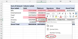
- If you change the underlying source data, you must refresh the PivotTable for the formatting to update correctly. In Excelmatic, you can simply upload the updated file and re-run your request to instantly reapply the formatting.
- Rules generally remain valid even after you rearrange, filter, or slice your PivotTable.
- If you remove a field from the PivotTable that has formatting applied, the rule will be lost.
Conclusion
Mastering conditional formatting is key to creating compelling PivotTable reports. The traditional methods in Excel provide a solid foundation and a high degree of control.
However, AI tools like Excelmatic are revolutionizing how we interact with our data. By replacing complex workflows with simple, conversational commands, they make powerful data analysis more accessible and efficient than ever before. This allows you to focus less on the "how" and more on the insights your data holds.
Ready to instantly highlight the stories in your PivotTables? Stop clicking and start asking. Try Excelmatic today and transform your data into clear, actionable insights with a single command.

