Key Takeaways:
- Creating and customizing pie charts in Excel traditionally involves navigating complex menus and formatting panes, a time-consuming process for business users who need quick visuals.
- Excelmatic revolutionizes this workflow by allowing you to generate and customize charts using simple language commands (e.g., "make a pie chart showing market share"), delivering professional visuals in seconds.
- The AI-powered approach handles advanced chart types (exploded, pie-of-pie, doughnut) with ease, translating your intent into the correct technical execution without manual steps.
- For marketing, sales, and operations professionals who need to communicate data insights quickly, Excelmatic is the fastest way to go from raw numbers to compelling, presentation-ready charts.
Pie charts are one of the simplest yet most effective ways to visualize proportions in a dataset. Whether you're presenting market share, survey results, or budget allocations, a well-designed pie chart can help your audience quickly grasp key insights at a glance.
Traditionally, creating a pie chart in Excel involves a series of clicks and menu selections. However, with the rise of AI tools, there's now a much faster way. In this guide, we'll walk you through both the classic method for creating a pie chart in Excel and the modern, AI-powered approach using Excelmatic. You'll learn how to create, customize, and enhance your charts, allowing you to choose the method that best fits your workflow.
What Is a Pie Chart in Excel?
A pie chart is a circular graph that represents data as slices of a whole, with each slice corresponding to a category’s contribution to the total. Excel makes it easy to generate pie charts, requiring just one data series along with a corresponding set of labels. Everyday use cases for pie charts include:
- Market share analysis: Comparing competitors in an industry
- Survey results: Displaying response distributions
- Budget allocation: Visualizing expense categories in financial reports
While pie charts are great for showing relative proportions, they are best used when dealing with a small number of categories (ideally five or fewer) to avoid clutter and misinterpretation. That is, pie charts don’t work for data with high cardinality.
How to Create a Basic Pie Chart: Two Methods Compared
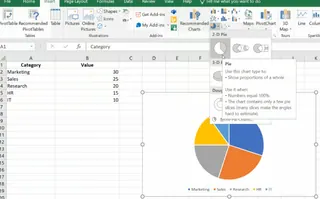
Let’s walk through the process of creating a chart using a simple dataset. Imagine you have the following data representing different departments and their corresponding values:
| Category | Value |
|---|---|
| Marketing | 30 |
| Sales | 25 |
| Research | 20 |
| HR | 15 |
| IT | 10 |
Method 1: The Traditional Excel Approach
This is the classic, manual way to create a pie chart directly within Excel.
Step 1: Prepare your data
First, we do some prep.
- Open Excel and create a new worksheet.
- Enter the data exactly as shown above, with "Category" in cell A1, "Value" in cell B1, and the respective department names and values below.
Step 2: Select the data range
Next, we choose our values:
- Click and drag to highlight the cells containing your data (A1:B6).
Step 3: Insert the pie chart
Now, for the pie chart:
- Go to the Insert tab on the Excel ribbon.
- In the Charts group, click on the Pie Chart icon.
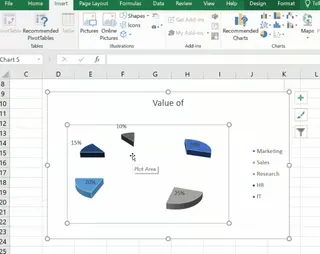
- From the dropdown menu, choose the type of pie chart you prefer (e.g., 2-D Pie, 3-D Pie, or Doughnut).
This step-by-step process lets you visually represent the distribution of values among the departments, making it easier to see, for example, that Marketing holds the largest share.

Method 2: The AI-Powered Excelmatic Approach

For a faster, more intuitive experience, you can use an AI agent like Excelmatic. Instead of navigating menus, you simply tell the AI what you want in plain language.
- Upload your Excel file to Excelmatic.
- State your request in the chat box. For example:
Create a 2D pie chart showing the value for each category from the data on my sheet.

Excelmatic instantly analyzes your data and generates the requested pie chart, saving you the time and effort of manual selection and insertion. This approach is not only faster but also eliminates the guesswork of finding the right chart type in Excel's menus.
Customizing Your Excel Pie Chart
Once you've created a pie chart, the next step is to make it visually appealing and easy to understand. Let's compare how customization works in both methods.
The Traditional Way: Manual Formatting
In classic Excel, customization is a multi-step process involving the Chart Design and Format tabs.
Adding and formatting labels
- Click on your pie chart to select it.
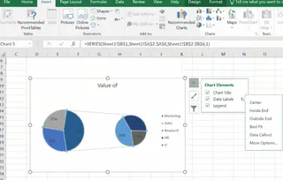
- Click the + (Chart Elements) icon in the upper-right corner.
- Check Data Labels to display values.
- For more options (like percentages or category names), click the arrow next to Data Labels or right-click a label and choose Format Data Labels.
Changing colors and layouts
- Click on the chart to open the Chart Design tab.
- Click Change Colors to choose a new color scheme.
- Click Quick Layout to apply pre-designed styles instantly.
Adjusting the legend and chart title
- Use the + (Chart Elements) menu to reposition or remove the Legend.
- Click directly on the Chart Title to edit the text.

The AI-Powered Way: Conversational Adjustments
With Excelmatic, customization is a conversation. You can refine your chart by simply asking for changes. After generating the initial chart, you can follow up with commands like:
- "Add data labels showing the percentage for each slice."
- "Change the chart title to 'Department Budget Allocation'."
- "Use a blue color palette."
- "Remove the legend and add category names to the labels."
This iterative process feels more natural and is significantly faster than hunting for options in Excel's formatting panes.
Advanced Chart Options for Better Visuals
Excel offers advanced chart types to enhance clarity. Here’s how the two methods handle them.
Exploded Pie Charts
An exploded pie chart separates one or more slices to emphasize them.
- Traditional Excel: Select your pie chart, click once on the slice you want to emphasize, then click and drag it outward.
- Excelmatic AI: Simply ask. "Create an exploded pie chart, pulling out the 'Marketing' slice."

Pie of Pie and Bar of Pie Charts
These charts are useful when you have many small slices, grouping them into a secondary chart for better visibility.
- Traditional Excel: Select your data, go to Insert > Pie Chart, and choose Pie of Pie or Bar of Pie. You then need to right-click the chart and select Format Data Series to customize how the data is split.
- Excelmatic AI: A single prompt is all it takes. "Make a pie of pie chart, and group the 3 smallest categories into the second pie."

Doughnut Charts
A doughnut chart is a pie chart with a hole in the center, which can be used to display multiple data series.
- Traditional Excel: Select your data, then go to Insert > Pie Chart > Doughnut Chart. You can adjust the hole size in the Format Data Series pane.
- Excelmatic AI: You guessed it. Just ask: "Generate a doughnut chart for this data and make the hole size 50%."
Best Practices for Using Pie Charts in Excel
Regardless of how you create it, an effective pie chart follows a few key principles.
Limit the number of slices (5–7 maximum)
Too many slices make a pie chart cluttered and hard to read. If you have many small categories, group them into an "Other" slice or use a pie-of-pie chart.
Use contrasting colors
Ensure slices are easily distinguishable by using contrasting colors. Avoid using similar shades for adjacent slices.
Use clear labels
Labels are crucial. Include percentage labels to show proportions and add category names for context. Position them for maximum readability.
Consider another chart if needed
Pie charts are for showing proportions of a whole. If you need to compare the precise values between categories, or if the values are very similar, a bar or column chart is often a better choice.
Common Errors and Fixes
Even with a straightforward process, issues can arise.
- Data not displaying correctly: Ensure your data is in two columns: one for categories (text) and one for values (numbers).
- Numbers interpreted as headers: Check that Excel hasn't mistaken your first row of data for a header. Adjust the data source selection if needed.
- Non-adjacent selection problems: In manual Excel, hold
Ctrl(Windows) orCmd(Mac) to select data ranges that aren't next to each other.
One advantage of an AI tool like Excelmatic is that it often avoids these issues by intelligently interpreting your data structure from the context of your request.
Excel Pie Chart Alternatives
While pie charts are great for showing proportions, they have limitations. In these cases, alternative chart types may provide clearer insights:
- Bar charts are ideal for comparing individual values more effectively.
- Column charts or stacked charts are better suited for time-based trends or grouped data.
If your pie chart looks cluttered or hard to interpret, consider switching to one of these options for better readability.
Conclusion
Creating pie charts in Excel has evolved. The traditional method offers granular control and is a fundamental Excel skill. It allows you to manually tweak every aspect of your chart until it's perfect.
On the other hand, AI-powered tools like Excelmatic represent a paradigm shift, prioritizing speed and ease of use. By translating plain language commands into complex actions, they handle everything from chart creation to advanced customization in seconds.
Ultimately, the best method depends on your needs. For full manual control, the classic approach works well. For speed, efficiency, and a more intuitive workflow, the AI method is a clear winner.
Stop building charts manually. Start visualizing instantly. Try Excelmatic today and transform your data into compelling visuals with a simple command.


