Key takeaways:
- A performance dashboard aligns fragmented metrics into a shared, decision-ready view of business performance.
- Effective performance dashboards explain not only what is happening, but why it is happening and what actions to take next.
- The three-layer dashboard model connects executive signals to operational root causes.**
- Strategic, tactical, and operational performance dashboards serve different decision horizons but must work together.
- Tools that integrate existing Excel data can transform silent reports into continuous performance conversations.
2 AM. Empty coffee cups. Conflicting dashboards.
You know the feeling.
Three screens stare back at you. One shows Q3 sales — green, 2% above target. Another flashes a regional customer satisfaction score, just dipped into yellow. The third is a dense Excel sheet, a log of a thousand categorized customer complaints.
Each is “reporting” performance, but together, they tell three conflicting stories. Sales is celebrating, support is sounding alarms, and you, the leader, are stuck in the middle. The data is abundant, but the true performance story is lost in the gaps between them.
This isn’t a data shortage. It’s a data communication breakdown.
This is exactly the problem performance dashboards are designed to solve: aligning fragmented metrics into a shared, decision-ready view of business performance. In modern organizations, performance dashboards act as the connective layer between data generation and executive decision-making.
What Is a Performance Dashboard?
So, what is a performance dashboard?
It’s not a report. It’s certainly not a data dump. Think of it as a strategic conversation interface. Its core job is to weave isolated data streams from sales, operations, finance, and customers into a coherent, explainable narrative about performance.
Formally, a performance dashboard is a centralized visual system that aggregates key performance indicators (KPIs) across functions to continuously monitor, explain, and improve organizational outcomes.
In other words, it makes data “talk” to each other to answer a fundamental question: How are we really doing? And more importantly, why?
A true business performance dashboard tells you: Revenue hit the target, but why is profit shrinking? New customer sign-ups are growing, but why are loyal clients leaving? It moves beyond showing the “what” to revealing the “why,” and hinting at the “what now.”
This shift — from static reporting to continuous performance interpretation — is what differentiates performance dashboards from traditional reports.
Anatomy of a Performance Dashboard: The 3-Layer Model
To support meaningful performance conversations, effective dashboards follow a layered design logic rather than a flat collection of charts.
This layered structure reflects a core performance dashboard design principle: every high-level signal must be traceable to an operational root cause.
1. Top Layer: Key Metrics and Visual Signals
This is what decision-makers see first — a focused set of KPIs such as revenue growth, churn rate, or delivery performance. These metrics act as early warning signals.
At this level, the dashboard answers the executive question: “Is something trending in the wrong direction?”
2. Middle Layer: Aggregation and Dimensional Analysis
When a signal turns yellow or red, this layer enables investigation. Metrics can be broken down by region, product, channel, or customer segment.
This layer supports diagnostic decision-making by revealing where performance deviations are concentrated.
3. Bottom Layer: Transaction-Level Evidence
Here, aggregated insights reconnect with concrete operational data — support tickets, delayed shipments, cost line items, or individual transactions.
At this level, performance metrics transform into actionable context, enabling correction rather than speculation.
Together, these layers ensure performance understanding flows seamlessly from awareness to diagnosis and action.
Types of Performance Dashboards by Management Focus
Different leadership roles require different performance conversations. Performance dashboards are therefore best classified by decision horizon and management responsibility.
1. Strategic Performance Dashboards
Used by executive leadership, these dashboards track long-term alignment with business objectives. Typical themes include profitability trends, market share, customer lifetime value, and investment efficiency. They are updated monthly or quarterly and answer the question: Are we moving in the right direction?
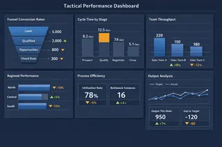
2. Tactical Performance Dashboards
Designed for department leaders, tactical dashboards focus on cross-functional efficiency. Funnel conversion rates, cycle times, and resource utilization are common. They are reviewed weekly and address: Where are processes breaking down?
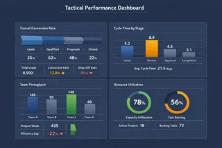
3. Operational Performance Dashboards
These dashboards support daily execution. They track real-time or near-real-time indicators such as system uptime, backlog volume, or service resolution rates. Their purpose is simple: Is today’s execution on track?
Healthy organizations operate all three dashboard types in parallel, ensuring alignment from strategy to execution.
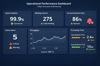
Real-World Performance Dashboard Examples
In practice, organizations rely on multiple performance dashboards simultaneously, each optimized for a specific decision context.
In weekly operations meetings, a project delivery dashboard highlights milestone progress, overdue tasks, and team capacity constraints. During quarterly reviews, leadership examines enterprise performance dashboards that combine revenue, profitability, customer retention, and talent indicators. Finance teams rely on financial performance dashboards where cash flow forecasts, cost structures, and margin trends guide budget decisions.
While their layouts differ, their purpose is the same: transforming complex performance data into actionable insight.
Key Performance Indicators: A Coordinated Dialogue
Effective performance dashboards do not optimize for metric volume, but for decision clarity. Each KPI exists to support a specific management question.
| Performance Dimension | Core Metrics | Decision Role |
|---|---|---|
| Financial Health | Gross Margin, Operating Cash Flow, CAC | Validates economic sustainability |
| Customer Performance | Retention Rate, NPS, Satisfaction Score | Confirms market response |
| Operational Efficiency | Cycle Time, Error Rate, Utilization | Evaluates process reliability |
| Team and Innovation | Attrition, Productivity, New Revenue | Signals future readiness |
Viewed in isolation, KPIs often mislead. Performance dashboards derive their value from showing how metrics reinforce — or contradict — each other.
From Fragmented Excel Files to Decision-Ready Dashboards
The challenge most teams face is not a lack of data, but fragmented data. Performance information lives across countless spreadsheets owned by different teams, updated at different times, and structured differently.
Manual consolidation leads to hours lost on data cleanup instead of insight generation.
The real challenge is orchestrating performance data into a coherent analytical workflow.
This is where tools like Excelmatic come in. Rather than forcing teams to abandon Excel, Excelmatic treats spreadsheets as inputs. Teams upload existing files, describe the performance questions they want to explore, and let the system automatically connect metrics, structure dashboards, and surface insights.
For example, a leader might ask:
“Compare profitability by product line this year versus last, highlight the three regions with the largest decline, and show the most common customer complaint in those regions.”
Excelmatic translates that intent into an interactive, multi-layer performance dashboard—without manual modeling or formula rebuilding.
It doesn’t solve a ‘no data’ problem. It solves a ‘silent data’ problem.
From Reporting Culture to Performance Conversations
Adopting performance dashboards is not just a tooling decision. It represents a shift from static reporting to continuous performance dialogue — from looking at numbers to actually understanding performance.
With Excelmatic, teams move beyond manual Excel consolidation and start having evidence-based conversations. Meetings shift from opinions to context, and decisions are grounded in connected metrics rather than isolated spreadsheets.
At its core, a performance dashboard is not a visualization project — it is a decision system. Excelmatic is built to support exactly that: turning the Excel files you already trust into decision-ready performance dashboards.
If your performance data is scattered across disconnected reports, it may already contain the full story — it just hasn’t been connected yet.
👉 Explore how Excelmatic turns Excel into a performance dashboard: Build a Performance Dashboard with Excelmatic
Frequently Asked Questions (FAQ)
Q: What is a performance dashboard?
A: A performance dashboard is a centralized visual system that tracks key performance indicators to help leaders monitor, explain, and improve business performance.
Q: What is the difference between a performance dashboard and a report?
A: Reports show static data, while performance dashboards continuously interpret metrics to support real-time decision-making.
Q: What are the main types of performance dashboards?
A: The three main types are strategic dashboards, tactical dashboards, and operational dashboards, each supporting different management levels.
Q: What KPIs are used in a performance dashboard?
A: Common KPIs include revenue, profit margin, customer retention, operational efficiency, and employee productivity.
Q: Why are performance dashboards important for decision making?
A: They connect fragmented metrics into context, helping leaders understand trends, causes, and next actions faster.

