Key takeaways:
- No-code dashboard tools focus on decision speed by reducing the gap between data and insight.
- Excelmatic enables non-technical teams to build dashboards directly from Excel using natural language.
- Different no-code tools serve different intents, from quick analysis to operational execution.
- Simplicity and long-term ownership matter more than feature depth when choosing a dashboard tool.
Most organizations today are not short on data. They are short on clarity.
Operational data lives in Excel. Customer behavior sits inside CRM systems. Marketing performance is scattered across ad platforms and analytics tools. Each system works well on its own, yet together they create a familiar problem: data silos that slow decision-making.
For years, teams tried to solve this with dashboards. Traditional BI tools promised a "single source of truth," but in reality, they often introduced new friction. Heavy setup, long implementation cycles, and constant maintenance made insight something you waited for, not something you acted on.
As we move into 2026, the real challenge is no longer how much data you have, but how fast you can get answers from your data. This shift explains why interest in AI dashboards, quick analysis tools, and no-code data visualization is accelerating across industries.
The market is clearly moving away from static reporting and toward AI-driven, real-time analysis, where insight is generated in seconds rather than hours.
No-Code Dashboard Tools, Categorized by Real Usage Scenarios
Rather than ranking tools by popularity, it makes more sense to evaluate them by intent. Different teams use dashboards for very different reasons, and the best tool depends on what you need to achieve.
The AI Mavericks: Fast Insight Without Technical Overhead
These tools focus on speed, accessibility, and natural language interaction. They are built for teams who want insight first, configuration second.
1. Excelmatic
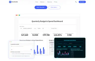
Excelmatic approaches dashboards from a perspective most teams already live in: spreadsheets are still the center of daily work. Instead of asking users to learn a new BI system or analytical language, Excelmatic builds intelligence directly on top of Excel.
What sets Excelmatic apart is how little analytical expertise it demands. Users do not need to understand data modeling, chart logic, or visualization best practices in advance. They work the way they always have — by asking questions in plain language. Excelmatic understands spreadsheet structure, formulas, and context, then translates intent into analysis and AI-powered charts automatically.
This simplicity matters most for teams that need insights but are not trained analysts. Managers, operators, and business teams often know what they want to understand, but not how to technically express it. Excelmatic removes that gap. Data cleaning, format fixing, and preparation happen quietly in the background, even when the source comes from PDF to Excel or image to Excel conversions.
For teams handling massive data inside spreadsheets, this approach changes the workflow entirely. Data visualization no longer feels like a separate task or a technical hurdle. It becomes a natural extension of thinking through the data. Excelmatic fits especially well for organizations exploring AI data analysis, predictive analytics, and management dashboards, but who value speed, clarity, and ease of use over technical complexity.
2. Zite
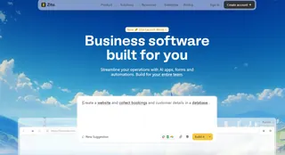
Zite takes the no-code idea in a different direction. Rather than focusing on analysis simplicity, it emphasizes building functional internal tools. A single prompt can generate dashboards, workflows, and permission-controlled applications designed for operational use.
This makes Zite appealing to operations teams and internal product builders who need dashboards to actively drive execution. When the goal is not just understanding performance but embedding dashboards into daily processes, Zite's prompt-to-app model becomes a strong differentiator.
3. Julius AI
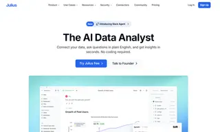
Julius AI prioritizes reasoning over presentation. Its strength lies in explaining patterns, trends, and causes behind performance changes. Instead of optimizing for ease of use, it optimizes for analytical depth.
For analysts and teams focused on AI analytics, statistical interpretation, or customer segmentation analysis, Julius AI provides strong narrative insight. It is less about making dashboards accessible to everyone, and more about helping experienced users understand why the numbers behave the way they do.
The Ecosystem Kings: Stability and Scale for Large Organizations
Some companies optimize for consistency rather than experimentation. For them, ecosystem alignment matters more than flexibility.
1. Power BI
Power BI remains dominant inside Microsoft environments. Its integration with Excel, Azure, and Microsoft 365 gives it unmatched reach at the enterprise level. It supports predictive modeling, advanced analytics, and large-scale management dashboards.
However, Power BI sits closer to the low-code end of the spectrum. Teams often need SQL knowledge or data modeling skills to fully unlock its potential.

2. Looker Studio
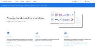
For teams centered around Google Analytics, Google Ads, and marketing dashboards, Looker Studio remains an attractive option. It is free, relatively easy to deploy, and well-suited for marketing performance tracking, even if it lacks advanced AI dashboard capabilities.
Operational Dashboards: Built for Daily Business Execution
Some dashboards are less about exploration and more about keeping teams aligned.
1. Databox
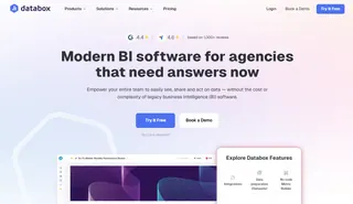
Databox focuses on speed and standardization. With thousands of prebuilt templates, it allows marketing teams to create dashboards quickly without worrying about data structure. It is especially useful for recurring reporting and KPI dashboards.
2. Softr
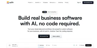
Softr bridges data and interface. By transforming Airtable or Google Sheets into client-facing portals, it enables dashboards to become part of customer experience rather than internal reporting only.
No-Code vs Low-Code: Understanding the Real Difference
Not all "no-code" tools remove complexity in the same way.
Some platforms, like Excelmatic and Zite, are 100% no-code, driven by natural language. Users focus on questions and outcomes rather than configuration.
Others rely on visual no-code logic. Tools like Databox and Softr require an understanding of data structure, even if no programming is involved.
Finally, tools like Power BI and Metabase offer low-code flexibility, allowing deeper customization at the cost of technical involvement.
The key question is not whether a tool supports code, but who owns the dashboard over time. The more technical the tool, the more maintenance it demands.
A Practical Decision Framework Before You Choose
Before selecting a no-code dashboard tool, three questions clarify most decisions.
Where does your data live?
Local Excel files, PDFs, and images favor tools that excel at format cleaning and AI-assisted conversion. Cloud APIs and SaaS platforms may lean toward ecosystem tools.
Who is the audience?
Executive dashboards prioritize clarity and speed. Client-facing dashboards require access control and polish. Technical teams may value analytical depth.
How do you define budget?
Free tools often cost time. Subscription tools buy speed. Enterprise tools buy governance.
From Zero to Dashboard: A No-Code Workflow in Action
Using Excelmatic as an example, the workflow reflects how no-code dashboards are evolving.
Data connection happens first, whether from Excel files, converted PDFs, or images turned into structured tables. Excelmatic handles format inconsistencies automatically.
Next comes analysis through conversation. Instead of writing formulas or configuring charts, users ask for insights. Monthly growth by region, performance anomalies, or predictive trends appear as visual answers.
Finally, dashboards are published and shared. What used to take days now happens in minutes, aligning teams around the same real-time view.
Common Pitfalls Teams Should Not Ignore
No-code does not eliminate responsibility.
Data security remains critical. SOC 2 compliance is increasingly non-negotiable for Western enterprises.
AI-generated insights must also be validated. While AI analytics accelerate understanding, key financial and operational decisions should always be cross-checked against source data.
The most effective teams treat AI dashboards as accelerators, not replacements for judgment.
Conclusion: No-Code Dashboards Are Becoming Core Infrastructure
No-code dashboards are no longer experimental tools. They are becoming foundational to how organizations operate, analyze, and decide.
As AI dashboard generators mature, the competitive advantage shifts toward teams that can move from question to insight faster than everyone else.
Explore Excelmatic with a free trial and turn everyday data into instant insights.
Frequently Asked Questions (FAQ)
Q: What are no-code dashboard tools?
A: No-code dashboard tools allow users to analyze and visualize data without writing code, often using natural language or visual interfaces.
Q: Who should use no-code dashboards?
A: They are ideal for managers and business teams who need insights but lack technical or analytical training.
Q: How are no-code dashboards different from BI tools?
A: BI tools prioritize flexibility and depth, while no-code dashboards prioritize speed, ease of use, and faster insight generation.
Q: Can no-code dashboard tools work with Excel data?
A: Yes. Tools like Excelmatic are designed to work directly with Excel and handle data preparation automatically.
Q: Are no-code dashboards suitable for business use?
A: Yes, as long as the platform meets security and compliance standards such as SOC 2.


