Key Takeaways:
- Creating combo charts in Excel traditionally requires navigating complex menus and mastering multiple formatting steps
- Excelmatic eliminates the technical process by letting you create combo charts using simple language commands
- Compared to manual methods, Excelmatic instantly generates perfectly formatted charts with secondary axes and appropriate chart types
- For business professionals, adopting AI tools means faster data visualization and more time for analysis rather than technical chart-building
Data analysts often need to show different types of data on the same chart to compare them and reveal hidden trends and patterns. In this guide, we'll explore a special type of chart that is perfect for such cases: the combo chart. We'll cover its features, uses, and strengths, but most importantly, we'll compare two powerful methods for creating them: the traditional, manual process in Excel and a modern, AI-driven approach using Excelmatic.
What Is a Combo Chart?
A combo chart, also known as a combination chart, refers to charts that combine two or more chart types—such as line, bar, or area charts—into a single visual. Most often, a combo chart displays an evolution of different types of data over the same period, which makes this kind of visualization particularly helpful for identifying essential discrepancies, tendencies, trends, and patterns.
Key Features of a Combo Chart
What distinguishes a combo chart? While some of its features may be readily apparent, others are more subtle. Let's delve into its key characteristics.
- Multiple Chart Types in One Visual: The defining feature of a combo chart is the inclusion of more than one (different) chart type within the same visual, such as combining a line chart with a bar chart.
- Multiple Data Series: Combo charts display multiple data series in the chart legend and when interacting with the chart area, similar to stacked bar charts and multi-line charts.
- Secondary Axis: Combo charts often feature a secondary axis for different data series with varying scales, which is also common in multi-line charts.
- Differentiation by Colors and Labels: Data series in combo charts are easily distinguishable by different colors, transparencies, or data labels, a feature shared with other charts like stacked bar and area charts.
Why Create a Combo Chart in Excel?
Combo charts offer a lot of advantages and are very helpful for a number of reasons. In this section, we will outline the main reasons in favor of creating combo charts in Excel.
- Comparing Different Data Series: A combo chart allows us to trace the evolution of multiple data series simultaneously. Different chart types in the same visual facilitate effective comparisons, such as a line chart for price changes alongside a bar chart for product sales.
- Highlighting Specific Trends and Patterns: Combo charts help capture major trends and patterns by comparing multiple data series. These insights are more informed and sometimes unique to combo charts, as they cannot be seen in single data type plots.
- Enhancing Data Presentation: Combo charts improve the data-ink ratio, leading to clearer and more effective visualizations by reducing unnecessary elements. They combine multiple chart types into one visual, maximizing information within a single view and utilizing Excel's features to enhance appearance and readability.
- Improving Decision-Making: The comprehensive view provided by combo charts supports well-grounded, data-driven decisions. This aids in planning sound business strategies and offers a broader vision for future market changes.
Popular Chart Combinations
Let's see now what kind of charts we can combine on a combo chart. We'll use a publicly available Kaggle dataset, Lamborghini Sales and Stocks. For now, we are not interested in the real meaning and actual values of the data series. Rather, we are practicing creating different chart-type combinations.
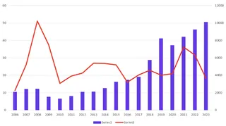
Line chart + bar chart
Combining a line chart with a bar chart is great for showing a trend alongside individual values.
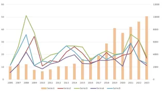
Multiple line chart + bar chart
Combining multiple line charts with a bar chart is useful for comparing several trends against a backdrop of individual values.
Area chart + bar chart
Combining an area chart with a bar chart can emphasize the cumulative total and discrete data points.

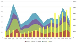
Stacked area chart + bar chart
Combining a stacked area chart with a bar chart highlights the composition of values while also showing individual bar values.
Line chart + grouped bar chart
Combining a line chart with a grouped bar chart is effective for comparing trends across multiple categories.

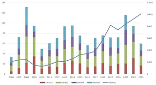
Line chart + stacked bar chart
Combining a line chart with a stacked bar chart is useful for displaying the trend line while also showing the breakdown of stacked categories.
Line chart + 100% stacked bar chart
Combining a line chart with a 100% stacked bar chart is ideal for showing the trend while emphasizing the proportion of categories that make up the whole.

Best use cases table
Using the right chart combination in a combo chart can greatly enhance data interpretation. Here's a heuristic to help you decide which chart combination to use:
| Chart Combination | Best Use Case | Example |
|---|---|---|
| Line and bar chart | Trend (line) with individual values (bars) | Monthly revenue (bars) and growth trend (line) |
| Multiple line and bar chart | Multiple trends (lines) with values (bars) | Product sales trends (lines) with monthly sales (bars) |
| Area and bar chart | Cumulative totals (area) with discrete values (bars) | Cumulative sales (area) and monthly sales (bars) |
| Stacked area and bar chart | Composition (stacked area) with values (bars) | Sales by region (stacked area) and total sales (bars) |
| Line and grouped bar chart | Trends (line) across categories (grouped bars) | Annual revenue (line) by department (grouped bars) |
| Line and stacked bar chart | Trend (line) with category breakdown (stacked bars) | Total revenue (line) by product (stacked bars) |
| Line and 100% stacked bar chart | Trends (line) with proportion (100% stacked bars) | Market share trend (line) by company (100% stacked bars) |
Combo chart best use cases table.
Two Approaches to Creating Combo Charts in Excel
Now for the practical part. How do you actually build one? We'll compare the classic, manual method within Excel against the fast, conversational approach of an AI tool like Excelmatic.
Method 1: The Traditional Way in Excel
Creating a combo chart in Excel's interface is a multi-step process that gives you granular control.
- Select the data in your Excel worksheet.
- Open the Insert tab and go to the Charts group.
- Click on the Recommended Charts button.
- Open the All Charts tab.
- Select the Combo option at the end of the list.
- Select a chart type for each data series. You will likely need to select a secondary axis for one of them.
- Press OK.


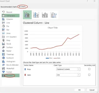

This method works reliably but requires navigating several menus and dialog boxes. For complex charts or frequent reporting, this can become time-consuming.
Method 2: The AI-Powered Way with Excelmatic

Excelmatic, an Excel AI Agent, streamlines this entire process. Instead of clicking through menus, you simply state your request in plain language.
Here's how it works:
- Upload your Excel file to Excelmatic.
- State your request in the chat interface.
For example, to create a line and bar combo chart from our Lamborghini data, you could type:
Create a combo chart. Show 'Sales' as a clustered column chart and 'Stock' as a line chart with markers. Use the 'Year' column for the x-axis and add a secondary axis for the 'Stock' data.
Excelmatic interprets your request, analyzes the data, and generates the complete, correctly configured combo chart instantly.
The Excelmatic Advantage:
- Speed: What takes multiple clicks in Excel is done in a single command.
- Simplicity: No need to remember which menu hides the combo chart option or how to add a secondary axis. You just describe the chart you want.
- Intelligence: Excelmatic understands the context of your data, often making smart defaults for chart types and axes, reducing the need for manual configuration.
How to Format a Combo Chart
A chart is only as good as its clarity. Let's see how formatting compares between the two methods.
Traditional Formatting in Excel
Once your chart is created, Excel offers a suite of formatting tools, accessed by clicking on the chart and using the icons that appear or by right-clicking on specific elements.
- Add/Remove Elements: Use the Chart Elements (+) button to add or remove axes, titles, data labels, and legends.
- Change Style/Color: Use the Chart Styles (brush) button to apply predefined styles and color palettes.
- Filter Data: Use the Chart Filters (funnel) button to show or hide specific data series or categories.
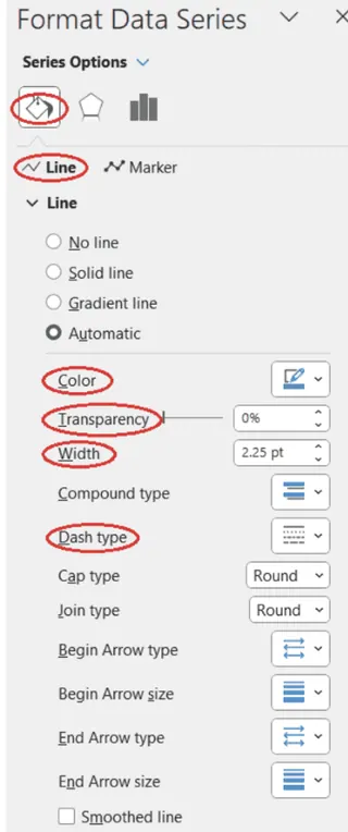
- Format Specific Series: Right-click a data series (like the line or the bars) and select Format Data Series to open a detailed pane where you can adjust colors, line widths, gap widths, markers, and more.
This process is powerful but involves a lot of clicking and navigating through different panes and options, as shown below.

Conversational Formatting with Excelmatic
With Excelmatic, formatting is a continuation of the conversation. Instead of searching for menus, you simply ask for changes.
After generating the initial chart, you can refine it with follow-up commands:
Change the line color to orange and make it a dashed line.
Add data labels to the columns.
Move the legend to the bottom.
Change the chart title to 'Lamborghini Sales vs. Stock (2010-2023)'.
Each command is executed instantly, allowing for rapid, iterative design without ever leaving the chat interface. This conversational approach makes formatting more intuitive and significantly faster than the manual point-and-click method.
Considerations When Using Combo Charts
While a combo chart in Excel has numerous advantages, it also has some intrinsic weaknesses that we should consider, regardless of the creation method.
- Scale/Magnitude Differences: The use of a secondary axis can cause discrepancies in the perceived impact of data series. A change in one scale may not correspond to a similar magnitude change in the second scale, leading to potential misinterpretation of the data.
- Information Overabundance: Combining more than two chart types in a combo chart can result in a cluttered and visually overwhelming presentation. This makes the chart difficult to interpret and reduces its effectiveness.
- Restricted Choice of Chart Types: While Excel offers many chart types for building combo charts, it does not include every possible chart type. This limitation can sometimes necessitate the use of other software or tools for more specialized charting needs.
Conclusion
In this guide, we've seen that combo charts are a powerful tool for comparing diverse data series in a single visual. We explored two distinct paths to creating them: the traditional, manual method in Excel and the modern, AI-powered approach with Excelmatic.
The classic Excel method provides deep, granular control but requires a series of precise clicks and menu navigation. In contrast, Excelmatic offers a revolutionary leap in efficiency, translating plain language commands into perfectly formatted charts in seconds. By handling the "how," AI tools let you focus on the "what"—the story your data is telling.
Ready to transform how you create charts in Excel? Try Excelmatic today and experience the power of conversational data visualization. Simply upload your file, describe the chart you need in simple language, and get instant, professional results - no menus to navigate, no formatting to struggle with, just beautiful charts that communicate your insights clearly..
FAQ
What is a combo chart?
A combo chart, or a combination chart, is a chart that combines two or more chart types, each representing a different type of data, into a single visual. Commonly, a combo chart displays an evolution of different data series over the same period.
What are the key features of a combo chart?
Key features of a combo chart include having more than one chart type on the same visual, more than one data series on the chart legend, a secondary axis with its own label and values, and different colors, transparencies, or data labels for clarity.
What kind of charts can be combined on a combo chart?
Some of the most common chart type combinations in a combo chart are line chart and bar chart, multiple line chart and bar chart, area chart and bar chart, stacked area chart and bar chart, line chart and grouped bar chart, and line chart and stacked bar chart.
What chart types for creating a combo chart are available in Excel?
Column, bar, line, area, pie, scatter, and radar chart types, each including its variations. In Excel, column chart types refer to vertical bar chart types, while bar chart types refer to horizontal bar chart types.
Is it possible to combine three or more chart types on a combo chart in Excel?
Technically, it's possible. However, the best practice is to combine two chart types on a combo chart, to avoid making the resulting visual cumbersome, overwhelming, and difficult to interpret.
What are the advantages of combo charts in Excel?
The advantages of combo charts in Excel include easy comparison of different data series, efficient highlighting of specific trends and patterns, enhanced data presentation, and improved decision-making.
What are some weaknesses of combo charts in Excel?
Some weaknesses of combo charts in Excel are scale and magnitude differences in the presence of the secondary axis, information overabundance specifically when having more than two chart types on the same combo chart, and a restricted choice of chart types.


