In the middle of a meeting, your boss asks, "My gut tells me Product A is still doing okay in Germany, but are we losing ground to Product B in the US?" Can you answer that instantly with data, or do you have to say, "I'll need to get back to you on that"?
Key Takeaways:
- The Challenge: Making decisions based on gut-feel and isolated data leads to missed opportunities and hidden risks.
- The Old Way: Creating separate charts in Excel for each combination is inefficient and makes direct comparison impossible.
- The AI Solution: Use plain English to consolidate multi-dimensional data into a single chart for instant insight.
To answer that one question about products and markets, you're forced into a repetitive cycle in Excel: filter, summarize, and chart.
First, a chart for Product A in the USA. Then, another for Product A in Germany. Then you start over for Product B…
You end up with a pile of separate charts that have no direct connection to each other. With inconsistent axes and data ranges, effective side-by-side comparison is nearly impossible. You can't see if one product's decline coincides with another's rise.
This approach makes you see the trees, but not the forest. Your time is spent on mechanical chart-building, not strategic thinking.
Ask Questions, Don't Manually Build Charts
Now, this tedious and error-prone workflow can be replaced by AI. You no longer need to tell the machine how to build a chart step-by-step; you simply ask what you want to know. A new generation of AI tools understands your business questions and automates complex comparative analysis.
Excelmatic is the AI data analysis tool built for this. It frees you from repetitive tasks so you can focus on the business itself.

| Dimension | Traditional Excel Charting | Excelmatic |
|---|---|---|
| How You Operate | Filter, pivot, configure charts | Ask a complete question in one sentence |
| Learning Curve | Steep; requires PivotTable mastery | Near-zero |
| Perspective | Isolated, siloed views | Integrated, comprehensive view |
| Insight Velocity | Slow; insights are buried in charts | High; relationships and trends are obvious |
Excelmatic turns you from a chart builder into a strategic analyst.
Three Steps to Multi-Dimensional Analysis
Now, let's use Excelmatic to answer that question from the meeting.
Step 1: Upload Your Raw Data
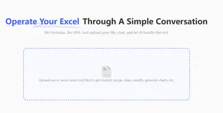
Directly upload your master sales sheet containing all countries and products. No pre-processing is needed.

Step 2: Ask a Single Question
In the chat box, type your analysis request clearly:
“Create a line chart comparing the monthly sales of 'Product A' and 'Product B' in the 'USA' and 'Germany'”

The AI instantly understands this multi-dimensional query and generates a single line chart with all four trend lines.
Step 3: Interpret the Signals from One Chart
From this single multi-line chart, you can immediately interpret:
- Growth Rate: Which line is the steepest, representing the fastest-growing business unit?
- Crossover Points: Do any lines cross? This often signals a shift in market leadership.
- Trend Divergence: Is the gap between two lines widening or narrowing? This reflects the effectiveness of your strategy.
All these insights, from just one question and one chart.
Frequently Asked Questions (FAQ)
1. How is this different from a BI dashboard? BI dashboards are typically pre-configured and lack flexibility. Excelmatic allows you to ask ad-hoc, novel comparison questions at any time and get immediate answers, making it ideal for exploratory analysis.
2. Is my data secure? Absolutely. We offer on-premise deployment, which allows Excelmatic to be installed inside your company's private network. Your data never leaves your infrastructure, eliminating any risk of exposure.
3. What if I want to compare more dimensions? The AI can handle more complex queries. However, the best practice is to start with your most critical dimensions. After getting initial insights, you can drill down with new questions, like "Show me the performance of all products in the US market only."
Your Value Is in Interpretation, Not Chart Creation
Great business decisions come from a deep understanding of market dynamics. Let AI draw the strategic map for you, so you can focus on reading the signals and seizing the opportunity.
It's time to graduate from chart builder to-strategist.
Try Excelmatic now. Upload your sales data and find your next market opportunity in 5 minutes.


