Key takeaways:
- Management Dashboards provide a unified visual language to end data silos and align decisions across departments.
- The system is built on three connected tiers: operational dashboards (by department), executive dashboards (for strategy), and KPI dashboards (for alignment).
- Traditional manual reporting is slow and error-prone, often leading to outdated, static insights.
- Tools like Excelmatic enable teams to quickly transform scattered Excel data into dynamic, real-time dashboards without technical expertise.
- Implementing this dashboard framework turns fragmented data into coordinated action, supporting faster, fact-based decision-making.
Every department in a company is moving: marketing brings in leads, sales closes deals, finance manages cash, and HR builds teams. Executives need to look at the big picture and make sure all departments move in the same direction. At the same time, every person and team has their own goals and KPIs to hit.
The problem is that this data usually lives in separate reports, spreadsheets, and systems. When people debate based on different "facts," decision-making becomes slow and full of disagreement.
How do you fix it? The key is to create a single, shared "management language." That's the core value of the Management Dashboards — it turns department and level-specific data into clear, connected visual views so everyone sees the same, accurate picture of how the company is running and can act in service of the organization's goals.
What are Management Dashboards?
Put simply, it's a data presentation system that mirrors your company's management structure. It ensures:
- Each core department can monitor its core performance in real time.
- Leadership can see through departmental silos to the integrated progress of strategic initiatives.
- Every individual can clearly track personal or team KPIs that align with company objectives.
It ends data silos and makes collaboration and decision-making based on facts possible.
Build your data-driven backbone: three core tiers
This system is built from three closely connected tiers.
Tier 1: Four core operational dashboards — managing departmental performance
This is the foundation of daily operations. Every department needs a clear data center.
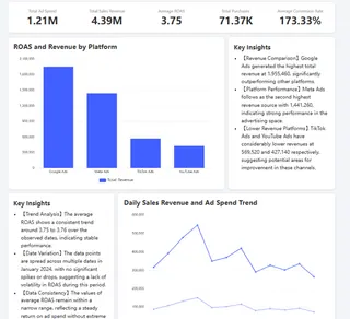
1. Marketing dashboard — track acquisition performance and efficiency.
Its core is analyzing which marketing channels bring leads, the quality of those leads, and the final cost to convert them. That ensures marketing budgets are spent effectively. A good dashboard can answer: which channel brings the most valuable customers? You can dive deeper into how to build a marketing dashboard or explore smartsheet dashboard examples.
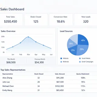
2. Sales dashboard — manage pipeline and revenue performance.
It covers the full journey from lead to cash, including conversion rates at each funnel stage, deal cycle times, and team and individual goal attainment. Its job is to forecast revenue and surface bottlenecks in the sales process. Improving sales performance starts with a clear sales dashboard.
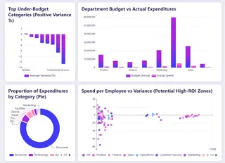
3. Finance dashboard — monitor financial health.
It provides real-time views of cash flow, profit, expenses, and budget variance. This is key to ensuring business growth is financially sustainable. Financial visualization is the foundation of sound operations; our finance dashboard guide lays out a framework.
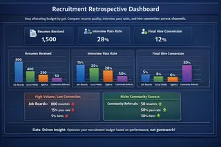
4. HR dashboard — quantify talent and organizational effectiveness.
It tracks hiring efficiency, turnover, time-to-fill for key roles, and people costs, turning talent management from intuition into informed decisions. Use data to drive people strategy — see our HR dashboard essentials.
Tier 2: Executive strategy dashboard — control the company's direction
Executives need to rise above detail and focus on outcomes.
The Executive Dashboard is built for that. It aggregates and distills the key result indicators from the core departmental dashboards, focusing on the 3-5 strategic metrics that most directly determine success — overall revenue growth rate, market share, customer satisfaction, or progress on new business lines.
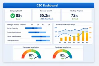
This is the unified view that supports top-level strategic decisions. Learn how to build an effective executive dashboard.
Tier 3: KPI management dashboard — align and measure progress
How do you ensure work from department to individual aligns with strategy?
The KPI dashboard is the alignment engine. It systematically defines and tracks the most critical success indicators. Whether it's "qualified leads" in marketing, "new contract value" in sales, or "user engagement" in product, every KPI should map up to company-level goals and be tracked continuously and transparently. For project-level tracking, consider project manager dashboard excel templates.

Mastering KPI dashboard design is essential to turning strategy into execution.
Traditional challenges and modern solutions
In reality, building a coherent dashboard system is hard. It usually means manually collecting, reconciling, and consolidating data from dozens of Excel sheets and different business systems. That process is time-consuming, error-prone, and often produces stale, static "historical reports" that can't support fast decisions.
Now, for teams whose business data lives mainly in Excel, there's a more direct solution. Using Excelmatic, you can quickly turn scattered Excel data into clear, dynamic dashboards.
| Comparison | Traditional manual approach | Using Excelmatic |
|---|---|---|
| Data preparation | Manually merge and reconcile multiple sheets — tedious and error-prone | Upload Excel files directly; the system auto-integrates and cleans the data |
| Creation process | Requires complex tools or advanced skills; long learning curve | Create dashboards quickly via conversational prompts or simple clicks |
| Updates & maintenance | Every update requires repeating the manual process | Upload a new file and refresh to sync the latest data with one click |
| Final output | Inconsistent chart styles or time-consuming design; ends up as "historical reports" | Clean, focused designs suited for real-time analysis and communication |
Now, for teams whose business data lives mainly in Excel, there's a more direct solution. Using Excelmatic, you can make the efficiency and experience shown on the right-hand side a reality and quickly turn scattered Excel files into clear, dynamic dashboards.
Excelmatic's core strengths are:
1. Built for Excel data:
It's designed for the most common data carrier — Excel. Whether files are scattered on colleagues' machines or updated via uploads, Excelmatic efficiently handles them so you're freed from manual consolidation.
2. Conversational dashboard creation, one step to results:
No need to learn programming or complex BI tools. After uploading an Excel file, you can generate a professional, attractive dashboard through simple conversational interactions or an intuitive interface. This is ideal for teams and individuals who need rapid insights and polished reports.
3. Clean, effective visualizations:
Dashboards created by Excelmatic are uncluttered, with core metrics front and center, avoiding unnecessary visual distractions. That makes them perfect for communicating insights and for laying a solid foundation for deeper analysis.
This means you don't have to be a technical expert to build a unified, real-time, actionable data decision system for your company.
From scattered to unified, starting now
The Management Dashboards are the blueprint for turning fragmented departmental data into coordinated company action. It starts with a clear plan across the three levels: operational dashboards, strategic integration, and KPI measurement.
It's time to stop wasting time arguing over different versions of the truth.
What's the next step?
Start by assessing where you are: are your most important datasets still trapped in Excel? Can data flow smoothly between departments? Are company strategic goals mapped to clear, tracked KPIs?
If you want to skip manual consolidation and quickly build this kind of Management Dashboards system at low cost, try Excelmatic today. It's designed for teams starting from Excel that want efficient, collaborative data work so you can focus on data-driven decisions instead of data wrangling.
Frequently Asked Questions (FAQ)
Q: What's the main difference between a regular report and a management dashboard?
A: Reports are often static, historical, and descriptive (showing what happened). Dashboards are dynamic, real-time, and prescriptive—they visualize key metrics to drive immediate action and future decisions.
Q: Do all three dashboard tiers need to be built at once?
A: No. Start with the operational tier (department-level dashboards) to solve immediate visibility needs, then expand to strategic and KPI tiers as alignment and reporting maturity grow.
Q: Who should own the management dashboard system in a company?
A: Ideally, it’s a cross-functional effort: leadership sets the strategic metrics, department heads define operational KPIs, and a central role (e.g., in operations, finance, or IT) ensures data consistency and tool management.

