You're pouring a significant budget into marketing, but is that spend actually moving the needle on sales? Is the correlation powerful or just a coincidence? Too often, you're left running on gut feeling.
Key Takeaways:
- The Blind Spot: Proving the link between two key metrics (like ad spend and revenue) is nearly impossible with basic tables or line charts.
- The Old Way: Creating a scatter plot in Excel is a multi-step chore, and interpreting the critical "R-squared" metric is a roadblock for non-statisticians.
- The AI Way: Use plain English to instantly generate a scatter plot and trendline, then get a simple, clear explanation of what it all means.
Why Are You Still Guessing at Data Relationships?
To answer the "Is it working?" question, you pull your monthly ad spend and sales data into Excel. This is where the headache begins.
Sure, months with higher ad spend seem to have higher sales, but it’s not a clear-cut pattern. You want to see the relationship visually, so you start wrestling with Excel's menus:
- Select your data, hunt for "Scatter" under the "Insert Chart" maze.
- Once the chart appears, you have to manually figure out how to add a "Trendline."
- To get a real answer, you check the box to "Display R-squared value," and a cryptic number pops up: "R² = 0.87."
Now what? What does "R² = 0.87" actually tell you? Is that strong? Is it weak? Without a stats degree, this number is just noise. You’re right back where you started: relying on guesswork.
Ask Questions, Get Answers.
That entire manual process is a relic of the past. Now, you can hand it all off to AI.
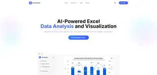
Excelmatic is designed to skip the tedious steps and confusing jargon, taking you straight to the answer. It’s not just a chart generator; it's your on-demand data analyst.
| Comparison | Traditional Excel Scatter Plot | Excelmatic |
|---|---|---|
| Your Workflow | A maze of clicks and manual formatting | A single, clear question |
| The Barrier | High; requires a stats background | Zero; AI explains the results for you |
| Analysis Speed | Slow; a cycle of building and Googling | Instant; ask a question, get an answer |
| The Outcome | A chart you have to decipher yourself | A chart and a clear, written conclusion |
Excelmatic transforms you from a report builder into a strategist.
See the Story Behind Your Data in Three Steps
Let's use the "ad spend vs. sales" example to see Excelmatic in action.
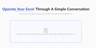
Step 1: Upload Your Data
Drag and drop your data file with metrics like "Monthly Ad Spend" and "Monthly Sales."
Step 2: Ask Your Question in Plain English
In the chat box, state your goal:
“Create a scatter plot to analyze the relationship between 'Ad Spend' and 'Sales', add a trendline, and show the R-squared value.”

Step 3: Get the Chart—and the Crystal-Clear Conclusion
Excelmatic instantly generates the scatter plot. But the real power is the plain-English summary that appears right below it:
Chart generated. The R-squared value is 0.97.
Here's what this means: There is a strong, positive link between your ad spend and sales. In fact, 97% of the changes in your sales can be directly explained by your ad budget. Put simply: your advertising is working.
No more a mystery. You have a definitive, data-backed answer.
Frequently Asked Questions (FAQ)
1. What else can I analyze besides marketing spend? Almost any two numbers you suspect have a connection. This isn't just for sales. Think about:
- HR & People Ops: "Employee Training Hours" vs. "Performance Scores" to measure training ROI.
- Product & Engineering: "Website Load Time" vs. "User Conversion Rate" to justify performance improvements.
- Personal Health: "Daily Exercise Minutes" vs. "Weight" to track the real impact of your fitness plan.
2. Can I trust the AI's interpretation? Absolutely. The interpretation isn't magic; it's math translated into plain English. R-squared is a universal standard for measuring correlation, and Excelmatic simply acts as your expert translator.
3. How is this different from our BI dashboard? BI dashboards are typically static and pre-configured. Excelmatic is built for curiosity. It empowers you to instantly explore new questions and test any hypothesis on the fly, without waiting for an analyst.
Your Value Is in Strategy, Not Spreadsheets
Great decisions aren't built on guesswork; they're built on clarity. Let AI handle the mechanics of finding correlation, so you can focus on the most important part: deciding what to do next.
It’s time to prove your business instincts with data.
Try Excelmatic now and uncover the hidden drivers in your business in 5 minutes!

