Key takeaways:
Key From Fragmentation to Clarity: A KPI dashboard solves the core problem of disconnected departmental data by integrating key metrics into a single, interactive visual interface, providing a unified strategic view.
Defined by Three Key Traits: Modern dashboards are characterized by real-time data updates, interactive exploration (drill-down, filtering), and connectedness that shows relationships between metrics.
Four Types for Four Needs: Dashboards are specialized: Executive (strategic overview), Tactical (departmental performance), Operational (real-time monitoring), and Analytical (deep-dive insights).
AI Simplifies Creation: Tools like Excelmatic use AI to automate the build process based on a simple description of your business problem, making professional dashboards accessible without technical hurdles.
Setting a strategic goal like “improve customer satisfaction” or “grow market share” is always energizing. But a more practical question follows quickly: how do we know we're on the right track? The marketing team watches social media volume, sales clings to deal velocity, and support guards satisfaction scores... When every team holds its own “report card,” leadership often sees not a coherent strategy map but a pile of puzzle pieces that need laborious assembly.
The crux of the problem is translating a big strategy into a shared language that everyone can track and act on. That's the value of key performance indicators (KPIs) — they turn direction into measurable scales. But the story doesn't end there: when dozens of KPIs live across different reports and systems, the scales themselves can cause confusion. What we need is a navigator that aligns all those scales toward the organization's strategic North Star.
Definition and core functions of a KPI dashboard
A KPI dashboard is a visualization tool that presents key performance indicators as interactive charts, enabling users to quickly and systematically view and analyze data. KPIs quantify performance against specific strategic goals over time. The core value of modern KPI dashboards is letting users easily explore the data behind the KPIs, extract actionable insights, and turn large organizational datasets into data-driven decisions.
Unlike traditional static reports, KPI dashboards have three defining traits: real-time updates (dynamic data), interactivity (support for drilling, filtering, and exploration), and connectedness (showing logical relationships between metrics).
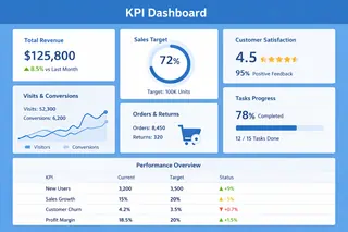
Four core KPI dashboard types
Depending on user groups and decision needs, KPI dashboards generally fall into four specialized types:
1. Executive dashboards
Designed for company leaders, they provide a strategic view of overall company health. They focus on macro metrics like revenue, margins, market share, and customer satisfaction. These dashboards usually have a clean design that highlights trends and key variances and are updated daily or weekly.
2. Tactical dashboards
Serves department managers and business owners, focusing on cross-functional processes and mid-term goals. They cover metrics like sales funnel efficiency, marketing ROI, and portfolio progress. Emphasizing comparative analysis and goal attainment, they are typically updated daily.
3. Operational dashboards
Support frontline staff and team leads in day-to-day decision-making by monitoring the real-time status of specific business activities. Examples include call volume in a support center, production-line output quality, and live website traffic. These dashboards require near-real-time updates and often include alerting mechanisms.
4. Analytical dashboards
Aimed at data analysts and business experts, they provide deep exploration capabilities. They support complex data slicing, drilling, and predictive analysis to help understand root causes and future trends. These dashboards typically handle large volumes of historical data and include advanced statistical functions.
KPI dashboard metric framework
A complete KPI dashboard should balance multiple business dimensions. The framework below provides a basic structure for selecting metrics:
| Business dimension | Core metric type | Examples | Applicable dashboard types |
|---|---|---|---|
| Financial performance | Profitability metrics | Gross margin, operating margin, return on investment | Executive, Tactical |
| Customer relations | Customer value metrics | Customer acquisition cost, customer lifetime value, Net Promoter Score | Executive, Tactical, Operational |
| Operational efficiency | Process efficiency metrics | Order fulfillment cycle, inventory turnover, resource utilization | Tactical, Operational |
| Market performance | Competitive positioning metrics | Market share, brand awareness, channel coverage | Executive, Tactical |
| Organizational capability | Development potential metrics | Employee productivity, share of investment in innovation, skills development progress | Executive, Analytical |
Five practical steps to build an effective KPI dashboard
In the age of data-driven decision-making, Excelmatic is an intelligent tool designed to transform how organizations use data. It makes building professional, interactive KPI dashboards as simple as describing your business problem.
Let’s put that knowledge into practice with a real-world example. We’ll walk through how to build a clear, dynamic KPI performance dashboard step-by-step using Excelmatic, based on two years of operational data from a tech company.
Step 1: Define business goals and use cases
Before designing, clarify the dashboard's core mission. What problem should it solve? Is it to help leadership monitor strategy execution, or to support operations in optimizing daily processes? Talk in depth with key decision-makers and end users to understand the information gaps they face when making decisions.
Through conversations with department leads, you can determine the dashboard's main functional direction: real-time anomaly monitoring, deep trend analysis, or alerting? Clarifying these questions will give you clear navigation for the design that follows.
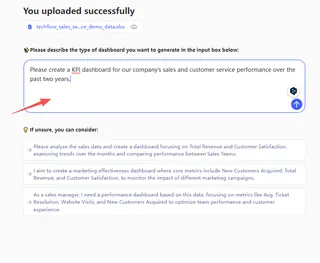
Excelmatic application support: Once you've clarified your needs, describe your use case and goals to Excelmatic in detail. For example, “Please create a KPI dashboard for our company’s sales and customer service performance over the past two years.” and the system will understand what kind of data presentation you need.
Step 2: Select and design core metrics
More metrics do not equal better insight. The key is precision. Based on the business goals defined in step one, reverse-engineer the metrics that truly affect outcomes. Classic frameworks like the Balanced Scorecard can help you think across finance, customers, internal processes, and learning & growth to avoid blind spots.
Keep the number of core metrics on each dashboard to about 5-9. Too many metrics scatter attention; too few might not reflect the business fully. Each metric should link directly to business outcomes you can influence — avoid measuring for the sake of measuring.
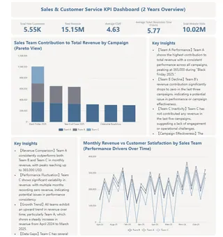
Excelmatic application support: The system can use the business needs you describe to intelligently suggest relevant metrics when building a dashboard. For example, if you're focused on “The relationship between sales and customer service performance,” the generated dashboard might include customer satisfaction scores, complaint resolution time, monthly revenue,sales team contribution and similar metrics. You can then adjust or add to these to make the metric set fully aligned with your business logic.
Step 3: Design intuitive visualizations and interactions
Data needs to be presented in the right format to deliver value. Use line charts for trends, pie or donut charts for composition, and bar charts for comparisons. Also consider interactive needs: do users need to drill down into details? Filter by dimensions? Compare different time periods?
Good visualization lets users grasp the business in under a minute. Rich interactions let users explore the story behind the numbers. Place the most important metrics in the visual center or top-left — where the eye naturally goes first.
Excelmatic application support: The system will automatically generate the most appropriate chart types based on your data and analysis goals. If you want to change something, just click a chart and select your preferred visualization from the dialog — switch a bar chart to a line, or update the color theme to match your brand. No code or complex steps required.
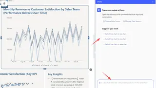
Step 4: Personalize and enable team collaboration
After an initial dashboard is generated, the real value comes from embedding it into your workflows. This stage focuses on customization and establishing a sustainable collaboration and feedback loop.
In practice, you can deeply tweak AI-generated dashboards: add custom calculated metrics that reflect your business logic, or remove redundant information that doesn't help current decisions.
Excelmatic application support: This process is simple and direct within Excelmatic. You can drag and drop, add new data modules, or use intuitive dialogs to modify existing elements.
The system provides templates optimized for different business scenarios that you can apply with one click.
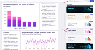
Step 5: Deploy and iterate
A dashboard is not a one-time project but an evolving tool. Deploy it to the intended users, gather feedback on its usability and the relevance of its insights, and be prepared to make adjustments. Regularly review whether the metrics still align with changing business goals.
Excelmatic application support: With Excelmatic, iteration is effortless. You can return to your project at any time, update the original description with new requirements (e.g., “now also need to compare performance across regions”), and the system will intelligently adjust the dashboard. This allows your data views to grow and adapt with your business.
Start a new era of agile, data-driven decisions
From identifying strategic pain points, to choosing key metrics, to building interactive views, we've explored how KPI dashboards turn scattered data into clear action plans.
Whether you're an executive who needs a high-level view, a department head optimizing processes, or a data expert digging deep, a well-designed dashboard is the foundation for faster, more accurate decisions.
Yet the technical barriers, long timelines, and high costs of traditional approaches keep many teams from getting there. It's time to change that.
We invite you to try Excelmatic now and see how simple conversation can replace lengthy development.
Click here to start your first intelligent dashboard project. Say goodbye to data puzzles. Embrace decision clarity.
Frequently Asked Questions (FAQ)
Q1: What's the main difference between a KPI dashboard and a regular report?
A: A traditional report is a static, historical document. A KPI dashboard is a dynamic, interactive tool focused on the present and near future. It updates in real-time, allows you to drill down into data, and connects related metrics to show the full story behind the numbers, enabling proactive decision-making.
Q2: When is the right time to implement a KPI dashboard for my team?
A: Consider building one when you face these signs: decision-making feels slow due to data-gathering; team meetings are spent debating whose data is correct; you have a strategic goal (like improving customer retention but no clear, shared way to track progress toward it. It's a tool for creating alignment and speed.
Q3: What's the biggest mistake people make when creating their first dashboard?
A: The most common pitfall is tracking everything that's easy to measure, rather than what matters. This leads to cluttered, confusing dashboards. Start by defining the one key business question the dashboard must answer, and ruthlessly exclude metrics that don't directly relate to it.
Q4: Why should we move from traditional Excel dashboards to an AI-powered one?
A: Traditional Excel dashboards are static, manual, and isolated. They are time-consuming to build, prone to errors, and lock insights in outdated, hard-to-share files. An AI-powered dashboard solves this by being dynamic and intelligent. You simply describe your goal in plain language, and it automatically builds a live, interactive dashboard connected to your data. It goes beyond just showing numbers.

