Have you ever stared at a dense Excel sheet, knowing there's a vital trend hidden within, but dreading the clunky process of creating a chart? Or maybe you've spent ages crafting the "perfect" visual, only to be flooded with questions like, "What was the exact number for March?"
As part of the team at Excelmatic, I've seen firsthand how we help users escape this struggle every day. We're liberating people from the "Excel grind" and letting them enjoy the "aha!" moments of data discovery. We believe your talent should be spent on insights, not on endlessly tweaking chart axes.
With Excelmatic, you get:
- A brand-new way to create charts: Just upload a file and ask for what you want, like you're having a conversation.
- 90% of your time back: The AI handles all the tedious work, freeing you up to focus on insights.
- More persuasive reports: Generate beautiful, interactive visuals that let your data tell the story.
What Exactly is "Conversational AI Chart Generation"?
Think of it as having a 24/7 data analyst assistant. You no longer need to remember chart types or complex Excel functions. You simply tell the AI your goal in your own words, and it understands your data and your request to generate the perfect interactive visualization for you.
In Excelmatic, this revolutionary experience means three things:
- Natural Language Interaction: You're not clicking menus. You're typing: "Create a bar chart for user growth and add an average line."
- AI-Powered Execution: The AI automatically identifies data columns, understands your intent (trends, comparisons, composition), and creates the best visual representation.
- Live, Interactive Output: The result isn't a static image. You can hover over data points for details and even refine the chart with follow-up conversations.
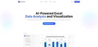
Real-World Scenarios
Here are a few of the most common ways our users leverage Excelmatic to transform their workflows.
1. Creating Weekly Marketing Reports in Seconds
- Where it helps: Marketing teams needing to update reports with the latest campaign data.
- User Testimonial: "I used to spend over an hour every Monday morning wrangling Google Ads data into Excel charts. Now, I just upload the CSV to Excelmatic and type, 'Show me the daily trend of cost and clicks.' The chart is ready in seconds. My team gets the link, and they can hover to see any day's numbers. No one asks me for specifics anymore." - Sarah, a Marketing Manager
Why it works: It completely automates a repetitive, low-value task, turning it into a simple, one-sentence command. The interactive output preemptively answers most follow-up questions, slashing communication overhead.
2. Answering Live Questions in a Sales Meeting
- Where it helps: A Sales Director presenting performance results to the team.
- User Testimonial: "In a meeting, my CEO suddenly asked, 'What if we only look at the EMEA region's trend?' I used to freeze and promise to 'get back to them.' Last time, I just typed 'Filter for the EMEA region' into Excelmatic, and the chart updated instantly. The sense of control was incredible." - David, a Sales Director
Why it works: It brings an unprecedented level of flexibility and immediacy to data presentations. In a dynamic setting like a meeting, the ability to respond and adapt in real-time dramatically boosts credibility and focus.
3. Reporting Project Progress to Non-Technical Stakeholders
- Where it helps: A project manager reporting on milestone completion to leadership.
- User Testimonial: "My boss isn't a numbers person; complex tables are meaningless to him. I uploaded our project data to Excelmatic and typed, 'Show the completion percentage for each phase as a bar chart, sorted descending.' He clicked the link, the visual was self-explanatory, and he could hover over each bar to see 'Tasks Completed/Total.' It was my most effective update ever." - Mike, a Project Manager
Why it works: It translates complex data into an intuitive visual language. The ability to sort and filter via conversation allows you to quickly guide the audience to the most critical insights.
Why Choose Conversational AI Over Manual Charting
- Zero Learning Curve: If you can type, you can make a chart. No complex software to learn.
- Thought to Visual: What you think is what you say, and what you say is what you get.
- Instant Interactive Insight: Hover-tooltips seamlessly blend numbers with visuals.
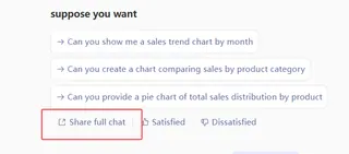
- Dynamic Showcase & Collaboration: Share the entire conversation link so others can see your analysis process.
- Effortless Aesthetics: The AI automatically designs clean, professional-looking visuals.
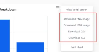
- Multiple Export Options: Easily download the final chart as an image to use in your presentations or reports.
Create Your First AI Chart with Excelmatic
- Upload Your Data: Drag & drop or click to upload your Excel or CSV file.
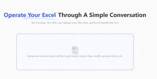
- Give Your Command: In the chat box, type what you want to see. e.g., "Use chart to create a monthly breakdown of total sales."

- Get Your Chart: The AI instantly generates your interactive visualization.
- Share or Download: Copy the conversation link to collaborate with teammates, or directly download the chart image for your reports.
Average time from upload to a shareable chart: under 30 seconds.
Frequently Asked Questions (F.A.Q.)
Q: Is my data secure? A: Absolutely. We have a strict no-storage policy for your raw data. All processing is done in-memory and momentarily, ensuring your data privacy.
Q: How complex can my requests be? A: Excelmatic currently handles the vast majority of business charting needs, including trend analysis, multi-variable comparisons, and breakdowns. Just try asking it like you would ask a colleague.
Q: Do I need to install anything? A: Not at all. Excelmatic is a web-based tool. Just open it in your browser and you're ready to go.
It's time to let AI do the work.
These scenarios aren't theoretical—they are happening for our users every single day.
If you're still wrestling with Excel's Chart Wizard, it's time to experience a smarter, faster way to work. I can't wait to see what stories your data will tell.
Start a free trial of Excelmatic today and turn your next boring spreadsheet into an engaging, interactive dashboard.


