Key takeaways:
- AI dashboard generators automate the entire process of turning raw data into professional, interactive dashboards in minutes, not days.
- The core 3-step workflow is: upload your data, ask questions in plain language, and instantly receive and customize your visual dashboard.
- The technology works by intelligently analyzing data structure, identifying key metrics, and selecting the best charts to build a coherent data story.
- This tool is valuable for multiple roles, empowering marketing, sales, product, and executive teams to make faster, data-driven decisions without technical skills.
- Excelmatic stands out by offering extreme simplicity, a true zero-learning-curve through natural conversation, and AI-driven editing for continuous refinement.
You're staring at your screen, with last week's sales figures, user growth reports, and channel analyses at your side. The boss wants a presentation this afternoon, and your dashboard is still a blank canvas. Sound familiar?
I remember preparing last year's annual business review — I spent three full days on it. Day one was gathering data sources. Day two was bouncing between Excel and Tableau trying different chart types. Day three was tweaking colors, layout, and formatting. My colleague Mark, meanwhile, handed in his market analysis in an hour.
“What magic did you use?” I asked, surprised. Mark smiled and said, “Try an AI dashboard generator. It totally changed my workflow.”
From three days to three minutes — when data visualization meets AI
Imagine the traditional process for making data reports: collect data, clean it, choose chart types, design the layout, adjust formatting, add annotations. Even experienced analysts can spend hours or days on this.
It's not just about time. Subjective choices — what chart best shows a trend, how to organize the information flow, which color scheme is clearest — often differ based on the creator's experience and taste.
More importantly, when business requirements change, the whole dashboard may need a redesign. That repetitive work and high skill barrier stop many non-technical business people from even trying.
Now a new class of tools is changing that: the AI dashboard generator. It compresses days of work into minutes and hands complex decisions over to algorithms, so anyone can quickly create professional-grade visualizations.
What is an AI dashboard generator?
Put simply, an AI dashboard generator uses artificial intelligence to automatically turn raw data into interactive visual dashboards.
A true AI dashboard generator should have three core capabilities:
First, semantic understanding. It needs to understand questions posed in natural language, like “show quarterly sales by region” or “the relationship between user activity and marketing campaigns.”
Second, data-intelligent parsing. The system should automatically recognize data types (time series, categorical, numeric, etc.), detect key metrics, and surface patterns and anomalies.
Third, visualization-matching intelligence. Based on the data's characteristics and the analysis goal, it should pick the most suitable chart types and layouts to build a logical, coherent data narrative.
Core principles: how does AI generate a dashboard?
What happens inside an AI dashboard generator after you upload a file and ask a question? The process is more complex than it appears.
1. A thorough data diagnosis.
It identifies column data types (dates, text, numbers), detects missing or anomalous values, and analyzes distributions and statistical characteristics. This mirrors what an experienced analyst does on first contact with a dataset.
2. Identifying key metrics and dimensions.
By analyzing relationships between columns and the business context, the system determines what's a metric (like revenue or user count) and what's a dimension (like time, region, or product category). This step is critical for later visualization choices.
3. Visualization selection.
The AI applies a set of best-practice rules based on data type and analysis goals: time series usually use line charts for trends; categorical comparisons use bar charts; part-to-whole relationships suit pie or stacked charts.
4. Layout and narrative building.
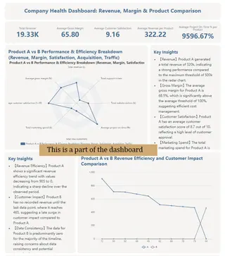
The AI arranges visual components according to the logic of the data story to ensure a clear reading path. Key metrics are placed prominently, related charts are grouped, and color schemes stay consistent to enhance readability.
How to use it? Three steps to generate your dashboard
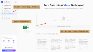
1. Upload your data
Most AI dashboard generators accept common file formats: Excel, CSV, Google Sheets links, and can even connect directly to databases. The system parses the structure automatically — no need to manually define each column.
2. Ask your question
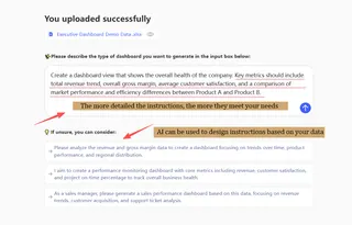
This is the biggest difference from traditional tools. You don't need to know how to “design” a dashboard. Just describe what you want in natural language: “Compare revenues and profit margins by product line over the past six months,” “show customer satisfaction versus support response time,” or “analyze campaign performance by region.”
3. Back-end analysis
The system runs multiple tasks at once: it analyzes structure, identifies key metrics, picks visualizations, and constructs a coherent dashboard. This usually takes seconds to a minute.
4. Customize and export
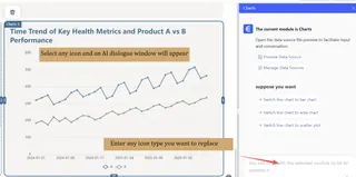
The generated result isn't fixed. You can adjust color themes, change chart types, rearrange components, or add new analysis angles. When satisfied, export to PDF, PNG, or interactive HTML.
Three reasons Excelmatic stands out
There are already several AI dashboard tools on the market. Why give Excelmatic special attention?
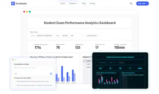
1. Extreme simplicity
From interface design to workflow, Excelmatic follows a “less is more” philosophy. No complicated menus, no overwhelming options — just a clear data upload area and a simple conversation input. Behind that design is a deep understanding of user experience: the tool should solve problems, not create new ones.
2. A real zero learning curve
Many tools claim to be user-friendly but still require an adjustment period. Excelmatic fully embraces natural language interaction to deliver a true zero learning curve. Ask it like you would a colleague: “Show me the ROI of recent marketing campaigns,” or “Help me find possible causes for the sales drop.” No special syntax, nothing to memorize.
3. AI-driven intelligent edits
Most AI dashboard tools fall back to manual editing after the initial generation. Excelmatic's difference is that edits remain AI-driven. If you're not happy with a chart, continue the conversation: “Change the bar chart to a line chart,” “highlight anomalies,” “break this trend down by product category.” The system understands and adjusts.
Use cases: who needs an AI dashboard?
AI dashboard generators are useful in far more places than you might expect. They cover almost any field that relies on data.
Marketing teams can quickly analyze campaign performance, track key metrics in real time, and optimize ad spend. No more waiting for engineering — marketers can explore data and uncover insights themselves.
Sales teams can build dynamic performance trackers to monitor team and individual results in real time, spot trends, and find opportunities. Regional managers can quickly compare markets and set targeted strategies.
Product teams can visualize user behavior, analyze feature usage, and track core product metrics. Rapid dashboard creation and iteration speed up data-driven product decisions.
Executives gain a consolidated business overview, monitor organizational health, and spot potential issues early. Customized executive dashboards provide the key information needed for decisions — without diving into technical detail.
Startups and small teams benefit especially. They often don't have dedicated analysts but still need data to guide decisions. AI dashboard generators fill that gap and help make data accessible to everyone.
Start intelligent data analysis now
We're seeing a fundamental change in how we work. Creating professional data visualizations used to require expertise, expensive software, and a lot of time. Now the process is simplified to three steps: upload, ask, get.
This isn't about replacing analysts. It's about amplifying human capability. AI handles the tedious technical details so people can focus on higher-level thinking: asking the right questions, interpreting results, and turning insights into action.
Excelmatic sits at the forefront of this shift. It's more than a tool — it's a new data workflow.
Today you can try it with your own data. Maybe last week's sales, recent web analytics, or a project status sheet. Ask a question in natural language and see what happens.
Try Excelmatic now to experience your first AI-generated dashboard.
The data world has changed, and you hold the key.
Frequently Asked Questions (FAQ)
Q: How does an AI dashboard generator save time compared to manual methods?
A: It compresses the multi-day process of data cleaning, chart selection, and layout design into minutes by automating all steps after you upload data and ask a question.
Q: What are the three core capabilities of a true AI dashboard generator?
A: Semantic understanding (processes natural language questions), data-intelligent parsing (identifies metrics and patterns), and visualization-matching intelligence (selects optimal charts).
Q: Can I use it if my data is messy or unstructured?
A: The AI will diagnose data types and detect anomalies, but for best results, clean, structured data (like spreadsheets) helps it generate accurate dashboards faster.
Q: How does the AI decide which charts to use?
A: It follows rules like using line charts for trends over time, bar charts for comparisons, and pie charts for proportions, based on your data's characteristics.

