Key takeaways:
- Move beyond speed. AI's real value in data visualization is as a conversation partner, not just a faster chart generator.
- Start with questions, not data. Frame your analysis with a specific business question to guide the AI effectively.
- Follow a 5-step workflow: Ask → Prepare (with AI) → Design (with AI) → Assemble (into dashboards) → Act (on AI insights).
- AI plays three key roles: an Intelligent Assistant, an Insight Engine, and a Natural Language Interface.
- Tools fall into two camps: AI-enhanced platforms (like Power BI Copilot) and AI-native tools (like Excelmatic for a direct start).
When you think about using AI to help visualize data, what's your first reaction?
"Oh, it might do it a bit faster than I can." — If that's all you think, you're likely underestimating this new partner.
Sure, it can get charts out faster, but that's the most obvious, basic capability. The real change is that AI is turning visualization and dashboarding from a technically complex task into a smooth, deep, even inspiring conversation between people and data.
The 3 Essential AI Roles in Visualization
1. Intelligent assistant
This is AI's basic function. It can quickly carry out your instructions — connect data, generate charts, and adjust formatting — reducing repetitive work.
2. Insight engine
AI can proactively analyze data and surface hidden patterns, outliers, and correlations. For example, it might automatically annotate a chart with: "The sales drop at this point likely coincides with a supply-chain disruption."
3. Natural language interface
You can speak to your data directly. Ask "Which region had the fastest profit growth last quarter?" or follow up with "Compare it to the same period," and the AI will understand and respond instantly, supporting multi-turn interaction.
Your 5‑Step AI‑Powered Visualization Workflow
Bringing AI into your work isn't about swapping one tool for another; it's about optimizing the whole workflow. Here are five concrete, actionable steps.
Step 1: Start by asking specific questions — not by opening the dataset
The traditional flow is tool-first: you get a dataset, think about which chart to use (line? bar?), then manually drag dimensions and measures into place.
An AI-enhanced flow is question-first: you define a clear business question in natural language and let the AI understand your analysis intent. The more specific the question, the more effective the AI's assistance.
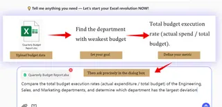
Example comparison:
- Weak question: "Analyze the budget data." (Too broad — AI can't give precise guidance.)
- Strong question: "Compare the total budget execution rates (actual expenditure / total budget) of the Engineering, Sales, and Marketing departments, and determine which department has the largest deviation"
How AI works: Based on your strong question, the AI will:
- Recommend which tables to join (sales table, product table, region table).
- Suggest initial visualization approaches (for example, use grouped bar charts for comparison, or small multiples to show each region separately).
- Even generate calculated fields containing key metrics, like "gross margin."
Step 2: Use AI to speed up data preparation
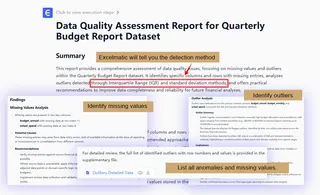
Data prep (cleaning, transforming, enriching) usually takes over 70% of an analytics project and is tedious and error-prone. Import raw data into an AI-powered data-prep tool or module instead.
What AI can do for you:
- Auto-detect data quality issues: highlight missing values, possible outliers, and suggest fixes.
- Auto-parse data types: correctly recognize dates, categorical text, numeric fields—no
- Suggest and create derived fields: AI will analyze existing fields and propose useful new metrics. For example, if you have "revenue" and "cost," the AI might proactively ask, "Do you want to create a 'profit margin' field?" You just click confirm.
Step 3: Collaborate with AI to design and refine charts
This isn't about letting AI take over. It's a collaboration of smart suggestions and rapid iteration. After selecting your base data and question, use the AI's chart-recommendation feature, or tell the AI what type of chart you want.
How AI acts as a design partner:
- Smart chart recommendations: AI suggests the most effective chart types (line, stacked bar, heatmap) based on the fields you've chosen and explains when to use each.
- Auto-generate narrative text: after a chart is created, AI can write a short blurb summarizing the key findings.
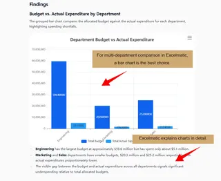 3. Format and style optimization: give commands like "switch the chart theme to a clean style," "highlight the most important series in deep blue," or "add a trend line," and the AI will apply those visual tweaks quickly.
Step 4: Combine views to build clear, intuitive dashboards
A single chart often shows only a slice of the story. By combining multiple related visuals into a single dashboard, you can quickly grasp the business at a glance and speed up analysis.
AI can group visuals by analytical logic—placing macro-trend charts at the top and detail breakdowns below to create a top-down reading flow.
Dashboards also support unified filters and interactions. For example, clicking "East China" will focus all other charts on that region, maintaining context across the board.
By integrating multiple perspectives, dashboards systematize scattered insights and let you compare, drill down, and correlate within the same interface, making complex data easier and faster to interpret.
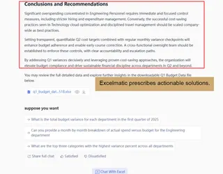
Step 5: Connect insights directly to action recommendations
The goal of visualization isn't just to "look at charts," it's to make decisions. Next to key diagnostic visuals, AI can provide prescriptive analysis.
That closes the loop: from "what did we find?" straight to "what can we do about it?"
AI Visualization Tools: Two Paths Forward
Mainstream tools today fall into two categories:
1. Traditional BI + AI
Examples include Power BI Copilot and Tableau GPT. They add AI conversational features to existing BI platforms and suit teams already using those tools.
2. AI-native tools
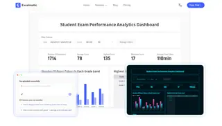
Represented by Excelmatic. These tools are built around conversation and require no complex learning. Type a question like "Analyze this quarter's regional sales performance," and it will automatically create charts and deliver key conclusions. The whole process happens in a single conversational interface — ideal for people who want fast insights without learning complex software.
How to choose simply:
- If you're already using a traditional BI tool, try its AI features.
- If you want to start analyzing as quickly as possible, AI-native tools like Excelmatic are the most direct choice.
Turn Data into Dialogue with AI
AI has turned data visualization from a specialist skill into a conversation everyone can join. You no longer need to master complex tools—ask a question and get clear charts and deep insights.
Start with a precise business question. AI will help prepare data, design charts, build dashboards, and finally turn analysis into actionable recommendations. The whole process becomes smoother and more efficient.
Want to try this new way of working?
Starting with Excelmatic is the easiest route. No steep learning curve—use natural conversation to go from data to insight. Whether analyzing sales trends or evaluating operations, just type your request and let it handle the rest.
It's time to upgrade how you analyze data. Rather than spending time learning tools, get the answers you need.
Frequently Asked Questions (FAQ)
Q1: Can AI understand my specific business terms and metrics?
A: Yes, advanced AI tools can learn your company's context. You can define terms like "qualified lead" or "churn rate" once, and the AI will apply them correctly in future analyses.
Q2: How accurate are AI-generated insights and recommendations?
A: They are highly accurate for pattern recognition in your provided data. However, always apply business judgment. Treat AI as a expert advisor whose suggestions should be validated against your domain knowledge.
Q3: What's the biggest time-saving step using AI?
A: Data preparation is where AI saves the most time—automating cleaning, formatting, and creating calculated fields. This typically cuts 50-70% off the initial analysis setup time.
Q4: Can I customize the visual style of AI-generated charts?
A: Absolutely. You retain full control. After AI suggests a chart, you can easily modify colors, fonts, and layouts to match your brand guidelines or presentation needs with simple commands.

