Key Takeaways:
- Creating Gantt charts in Excel manually requires complex formatting, hidden data series, and multiple steps that are challenging for non-technical users
- Excelmatic's AI approach eliminates technical complexity by generating professional Gantt charts through simple language commands
- Compared to manual methods, Excelmatic handles task dependencies, date calculations, and formatting automatically, reducing errors and saving time
- For project managers and business teams, adopting Excelmatic means faster project visualization and more focus on execution rather than technical setup
Excel can help you manage and visualize project schedules without needing additional software. A Gantt chart is a simple yet powerful way to track tasks, deadlines, and dependencies over time, providing a structured approach to project management that helps teams and individuals stay organized.
But creating one can be a complex, multi-step process.
In this guide, we'll explore two powerful methods for building a Gantt chart. First, we'll cover the traditional, manual way in Excel. Then, we'll show you a modern, AI-powered approach using Excelmatic that can deliver the same result in seconds. Whether you're a seasoned project manager or just starting, you'll discover the best method for your needs.
What is a Gantt Chart?
A Gantt chart is a visual timeline that helps in tracking project tasks over time. It consists of horizontal bars that represent different tasks, with their positions indicating the start and end dates. This format makes it easy to see dependencies, track deadlines, and identify potential delays.
These charts are commonly used in project management, task scheduling, and workflow planning. For example, a marketing team might use a Gantt chart to track campaign launches, a construction company can use it to plan building phases, and a student can organize assignments leading up to an exam.

How to Create a Gantt Chart in Excel: Two Approaches
You can create a Gantt chart in Excel using the classic manual method or by leveraging a smart AI assistant. Let's compare the two.
Method 1: The Traditional Way (Manual Creation)
This method uses Excel's built-in charting tools to construct a Gantt chart from scratch. While it offers full control, it requires several precise steps.
Step 1: Setting up the data
First, structure your project data in a table. You'll need columns for Task Name, Start Date, Duration (e.g., in days), and End Date. You can calculate the End Date with a simple formula.
For instance, if your data is in Excel with:
- Start Date in column B
- Duration (in days) in column C
- End Date in column D
Then in D2, the formula would be: =B2 + C2
Here is an example dataset. Note the "Adjusted Length" column, which represents the duration.
| Tasks | Start Date | Days Needed | Completion Date | Adjusted Length |
|---|---|---|---|---|
| Book venue | 5/25/2024 | 17 | 7/24/2024 | 23 |
| Hire catering service | 5/29/2024 | 19 | 8/1/2024 | 27 |
| Send invitations | 6/4/2024 | 15 | 7/31/2024 | 21 |
| Prepare promotional materials | 6/9/2024 | 17 | 8/7/2024 | 23 |
| Set up event website | 6/14/2024 | 16 | 8/12/2024 | 23 |
| Coordinate logistics | 6/26/2024 | 19 | 8/28/2024 | 27 |
| Event execution | 7/10/2024 | 8 | 8/27/2024 | 12 |
Step 2: Creating a stacked bar chart
The core of the manual method is to transform a stacked bar chart into a Gantt chart.
Select the Start Date column and change its format from "Date" to "General" (Press
CTRL + 1). This is a necessary trick for Excel to plot the data correctly.
Select the Tasks, Start Date, and Adjusted Length columns (hold
CTRLorCMDto select non-adjacent columns).
Go to Insert > Recommended Charts > All Charts > Bar > Stacked Bar.
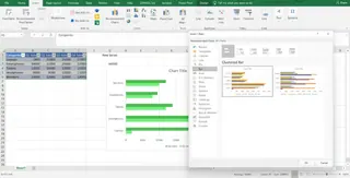 Recommended Charts > All Charts > Bar > Stacked Bar 4" title="Insert > Recommended Charts > All Charts > Bar > Stacked Bar 4" />
Select the horizontal date axis on the chart and change its format back to "Date".

Step 3: Formatting the Gantt chart
Now, format the chart to make it look like a real Gantt chart.
Click on the first data series (the blue bars representing the start dates). In the "Format Data Series" pane, select "No Fill" to make them invisible.

Double-click the vertical axis (the task list). In the "Format Axis" pane, check the box for "Categories in reverse order" to list tasks from top to bottom chronologically.

Adjust the date range on the horizontal axis by setting the minimum and maximum bounds to fit your project timeline.

Finally, add a title, adjust label formatting, and remove unnecessary gridlines to clean up the chart.

As you can see, this process is detailed and can be time-consuming.
Method 2: The Instant Way with an AI Assistant
What if you could skip all those steps? With Excelmatic, you can generate charts instantly using simple language commands. Excelmatic analyzes your data and creates professional visualizations without technical complexity.
Here’s how you would create the exact same Gantt chart:
- Upload your file: Start with the same simple data table (Tasks, Start Date, Duration). Upload the Excel file to Excelmatic.
- Ask in your preferred language: Type a simple request, such as:
Create a Gantt chart based on the tasks, start dates, and days needed.
- Get Your Chart: Excelmatic instantly analyzes your data and generates a perfectly formatted Gantt chart. No manual formatting, no hidden series, no axis reversals.
Manual vs. AI: A Quick Comparison
| Feature | Traditional Excel Method | Excelmatic (AI Method) |
|---|---|---|
| Speed | 10-15 minutes | Under 1 minute |
| Complexity | High (9+ steps, formatting, formulas) | Low (One plain language command) |
| Skills Required | Intermediate Excel knowledge | Basic language skill |
| Customization | Manual adjustments for every change | Ask AI to make changes (e.g., "Change the bar colors to green") |
| Error-Proneness | High (formula errors, incorrect formatting) | Low (AI handles all technical details) |
Making a Gantt Chart with Dependencies
A key feature of project management is handling dependencies, where one task cannot start until another is finished.
The Traditional Way
In Excel, you can automate start dates based on dependencies using formulas. Add a "Depends On" column and use a function like WORKDAY to calculate the new start date, ensuring you skip weekends. For example:
=WORKDAY(B2, C2)
This makes your schedule dynamic but adds another layer of complexity to your spreadsheet.

The Excelmatic Way

With Excelmatic, you simply state the dependencies in your request:
Create a Gantt chart. The 'Send invitations' task should start one day after the 'Hire catering service' task is completed.
Excelmatic understands the relationship and adjusts the timeline automatically, without you needing to write or debug any formulas.
Using a Simple Gantt Chart Template in Excel
If building a chart from scratch feels overwhelming but you don't want to use an AI tool, templates are a middle ground. Many free templates are available online.
Templates come with pre-formatted bars and formulas, saving you setup time. However, they can be rigid. Customizing a template to fit your specific project needs can often be as difficult as starting from scratch.

Gantt Chart Example: A Real-World Use Case
Consider a construction company planning a new office building. The project is broken down into phases: design, permitting, site preparation, foundation work, framing, and final inspections. Each phase depends on the completion of the previous one.
A Gantt chart is perfect for managing these dependencies and avoiding delays. With the project tasks and timelines laid out, the project manager can coordinate subcontractors and suppliers efficiently.
Whether created manually or with AI, the resulting chart serves as the single source of truth for the project's schedule.
Regular updates help in tracking progress, adjusting deadlines, and ensuring everything stays on schedule.
Conclusion
In this guide, we explored two ways to create a Gantt chart in Excel. The traditional method provides a deep understanding of how Excel charts work, but it's complex and time-consuming.
For modern professionals who value speed and efficiency, Excelmatic is a game-changer. It eliminates the tedious manual steps, reduces errors, and allows you to focus on what truly matters: managing your project.
While knowing the manual process is valuable, applying modern tools like Excelmatic is what will ultimately enhance your project planning and keep everything on track.
Ready to Revolutionize Your Project Management?Start Using Excelmatic Today and transform how you manage projects in Excel. No more struggling with stacked bars and hidden series - just tell Excelmatic what you need!
Excel Gantt Chart FAQs
What is a Gantt chart used for?
A Gantt chart is a project management tool to visualize tasks over time. It helps track deadlines, dependencies, and progress, making managing projects easier and ensuring tasks are completed on schedule.
How do I create a Gantt chart in Excel?
You can create a Gantt chart in two ways. The traditional method involves using a stacked bar chart and manually formatting it to hide the start date series. A faster, modern method is to use an AI assistant like Excelmatic, where you simply upload your data and ask for a Gantt chart in plain language commands.
Can I make a Gantt chart in Excel with task dependencies?
Yes. Manually, you can use formulas like WORKDAY to link task start dates. With Excelmatic, you can simply describe the dependencies in your request, and the tool will automatically adjust the timeline.
What are the benefits of using Excelmatic for Gantt charts compared to specialized project management software?
Excelmatic combines Excel's accessibility with AI-powered automation, giving you the speed and power of specialized software without needing to purchase or learn a new platform. You get professional results instantly using simple language commands.


