Key Takeaways
- Creating bar graphs in Excel manually is time-consuming and requires navigating complex menus, which is challenging for non-technical business users.
- Excelmatic simplifies the process by using AI to generate charts instantly through plain language commands, eliminating data prep and manual steps.
- With Excelmatic, you can customize charts dynamically, troubleshoot common errors automatically, and focus on insights rather than technical details.
- For market, sales, and operations teams, Excelmatic offers a faster, more efficient way to produce reports and visualizations, boosting productivity.
Bar graphs are one of the clearest ways to present comparisons across categories like monthly expenses or product sales. At a glance, they help you spot patterns, outliers, and shifts across groups.
Traditionally, creating these charts in Excel involves a series of manual steps: preparing your data, selecting it, navigating menus, and then fine-tuning every element. While this method offers granular control, it can be time-consuming.
Today, there's a smarter, faster way. AI tools like Excelmatic are revolutionizing how we work with data, turning complex tasks into simple conversations. This guide will walk you through both methods—the classic manual process and the instant AI-powered approach—so you can choose the best workflow for your needs.
Creating a Bar Graph: Two Approaches
Making a bar graph that is well-structured and easy to understand requires organized data and thoughtful formatting. Let's compare the classic Excel way with the modern AI-driven solution.
Method 1: The Traditional Way in Excel
This is the step-by-step process that most Excel users are familiar with. It requires careful attention to detail at each stage.
1. Data Preparation
Excel works best when your data is laid out like a table: one column for categories, one or more for values.
Here are a few setup tips:
- Put your category labels (like months, regions, or products) in the first column.
- Place the corresponding numeric values in the next column(s).
- Avoid merged cells or blank rows within your data range.
- Use clear headers so anyone can quickly tell what they’re looking at.
If you want your chart to update as your data changes, press Ctrl + T to turn your dataset into an Excel Table.
2. Inserting a Basic Bar Graph
Once your data is ready:
- Select the entire data range (including the headers).
- Click the Insert tab in the ribbon.
- In the Charts group, choose the Bar Chart icon.
- Choose Clustered Bar, Stacked Bar, or another layout that fits your needs.
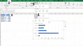
Excel will place the chart on your sheet, and from here, you can begin the manual process of customizing it.
Method 2: The AI-Powered Way with Excelmatic

What if you could skip the data prep, menu navigation, and manual selection? With an AI agent like Excelmatic, you can. It streamlines the entire process into a single step.
Excelmatic works like a data analyst you can talk to. You upload your file and simply state what you need in plain lanaguge.
Here’s how you’d create the same bar graph:
- Upload your Excel file to Excelmatic.
- Type your request: "Create a bar graph showing the sales for each product."

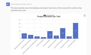
That's it. Excelmatic analyzes your data, identifies the categories and values, and instantly generates a clean, well-formatted bar graph. There's no need to worry about selecting the right range or finding the right chart icon.
The advantage is clear: What took multiple clicks and checks in Excel becomes a single, intuitive command in Excelmatic, delivering accurate results in seconds.
Advanced Customization: Manual vs. AI
A basic chart is just the start. Both methods allow for customization, but the experience is vastly different.
Configuring Data Series and Layout
In traditional Excel, managing multiple data series or changing the layout requires navigating complex dialog boxes.
The Traditional Way:
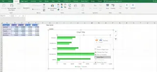
To add, edit, or remove a data series (like comparing Q1 and Q2 sales), you have to:
- Right-click the chart and choose Select Data.
- In the Select Data Source window, manually click Add, Edit, or Remove.
- Select the new data ranges from the spreadsheet for each series.
- To adjust spacing, right-click a bar, choose Format Data Series, and tweak the Series Overlap and Gap Width sliders.
The Excelmatic Way:
With Excelmatic, you just refine your request.
- To add a series: "Add Q2 sales to the chart."
- To remove a series: "Remove Q1 sales."
- To highlight data: "On the chart, highlight the 'Smartphones' category."
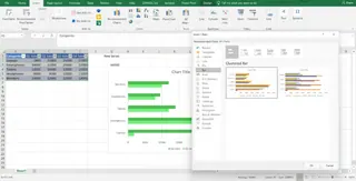
- To change chart type: "Change this to a stacked bar chart."
Each command is executed instantly. There are no dialog boxes, no range selections, and no sliders. You simply describe the change you want, and the AI handles the rest.
Formatting Axes, Labels, and Titles
A great chart is easy to read. This often comes down to formatting labels, titles, and axes.
The Traditional Way:
- Axis Formatting: Right-click an axis, select Format Axis, and manually set bounds, units, or number formats.
- Data Labels: Click the Chart Elements (+) button, check Data Labels, then right-click a label to format its font, position, or content.
- Dynamic Titles: To make a title update automatically, you must click the title, type
=in the formula bar, and link it to a specific cell.

The Excelmatic Way:
Again, just ask.
- "Add data labels to each bar."
- "Change the chart title to '2025 Product Sales'."
- "Format the vertical axis as currency."
- "Reverse the order of the categories so the highest value is at the top."
Excelmatic understands context, so it applies formatting intelligently, saving you from hunting through menus.
Making Charts Dynamic and Accessible
The Traditional Way:
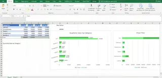
To ensure a chart updates when new data is added, you must format your source data as an Excel Table (Ctrl + T) or create complex dynamic named ranges using formulas like OFFSET and COUNTA. For accessibility, you need to manually select colorblind-friendly palettes and add alt text.
The Excelmatic Way:
Excelmatic simplifies this. If your data file changes, you can either re-upload it and ask the same question or, in many cases, just upload the new version and tell the AI to update the analysis. There are no formulas to manage. Furthermore, Excelmatic is designed with best practices in mind, often choosing accessible color palettes and clear layouts by default.
Troubleshooting Common Issues
Common Problems in Manual Charting
- Data Not Showing: Often caused by text formatted as numbers, blank rows, or incorrect range selection.
- Visual Glitches: Axis labels overlap, bars are too thin or thick, or formatting won't apply correctly. This requires manual adjustments of label angles or gap widths.
- Performance Issues: Heavy charts with 3D effects or volatile formulas like
OFFSET()can slow down your workbook.
How Excelmatic Avoids These Problems
Because Excelmatic is an AI agent, it handles data interpretation automatically, significantly reducing the chance of errors.
- It correctly identifies numeric values and categories, preventing "data not showing" errors.
- It applies smart defaults for layout and spacing, avoiding most visual glitches.
- Since the chart generation happens on a powerful platform, it remains fast and responsive, even with large datasets.
Conclusion
Creating a bar graph in Excel is a fundamental skill. The traditional, manual method gives you ultimate control over every pixel, but it demands time and a good understanding of Excel's many menus and options.
For those who need to move faster and focus on insights rather than process, an AI-powered tool like Excelmatic offers a clear advantage. By using plain language commands, you can generate, customize, and analyze charts in a fraction of the time. It turns a tedious, multi-step task into a simple conversation, empowering you to get accurate reports and visualizations instantly.
The right method depends on your goal. For deep, granular design work, the classic approach still holds value. But for fast, efficient, and intelligent data visualization, the future is AI.
Ready to Transform Your Data Visualization Workflow?Try Excelmatic Now and experience the future of data visualization. Stop wrestling with Excel menus and start creating impactful charts today!
FAQ
How do I choose between the manual method and an AI tool like Excelmatic?
Use the manual method when you need precise, artistic control over every chart element or are working within strict corporate templates. Use an AI tool like Excelmatic when your priority is speed, efficiency, and getting quick insights without getting bogged down in the process.
Can an AI tool create complex charts like a stacked bar graph?
Yes. With Excelmatic, you can simply ask, "Create a stacked bar graph showing the quarterly sales contribution for each product." The AI understands different chart types and when to use them.
What’s the best way to highlight one specific bar in a chart?
In Excel, you need to create a helper column and add a new data series. With Excelmatic, you can just say, "In the bar chart, make the bar for 'Smartphones' a different color."
Why are my bars not showing up in my manual Excel chart?
This usually happens when the data contains text instead of numbers or when the selected range is incomplete. Excelmatic helps avoid this by intelligently parsing your data file, distinguishing between text and numbers automatically.
Are charts made with AI tools accessible?
Modern AI tools are often designed with accessibility in mind, using high-contrast color palettes and clear labeling by default. You can also request specific accessibility improvements, like "Use a colorblind-friendly palette."

