Key takeaways:
- A Sales Dashboard centralizes key metrics to provide a real-time, visual overview of your sales performance and pipeline health.
- Focus on tracking core metrics like quota attainment, pipeline value, and conversion rates to diagnose issues and forecast accurately.
- Different sale dashboard types (performance, productivity, customer analytics) serve specific roles from leadership to frontline reps.
- Modern tools enable sales teams to build effective dashboards in minutes by automating data consolidation and visualization.
- The ultimate goal is to move from passive data viewing to proactive, data-driven decision-making and action.
Business management guru Peter Drucker famously said:
The purpose of business is to create and keep a customer.
In today's era where data is a core competitive asset, achieving that depends on one thing: you must truly understand your sales process and your customers.
However, a Gartner survey shows most sales leaders are still stuck in a data bind: on average they spend more than 20% of their work time manually compiling sales data from CRMs, Excel files and emails — time that could be spent coaching teams or shaping strategy.
That's exactly the problem modern sales dashboards are designed to solve. By automating data collection and visualizing results, they turn that management maxim into efficient day-to-day practice, making measurement and management real-time and transparent.
What is a sales dashboard?
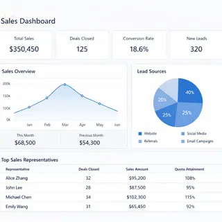
A sales dashboard is a visual tool that centralizes and displays key sales metrics and data. It pulls information automatically from multiple sources (like CRM systems, finance software, and marketing platforms) and presents it as charts, graphs and lists.
It's not a full-blown business intelligence system; it's a decision-support interface tailored for sales teams. Its goal is to let sales directors, managers and reps quickly see the real-time state of performance, spot issues, and take action.
What concrete value does a sales dashboard deliver?
- Faster, more accurate decisions: No need to wait for periodic reports. Managers can act on real-time or near-real-time data.
- A single source of truth: Everyone — from frontline reps to senior leaders — discusses the same facts and numbers, reducing disputes.
- Focus on what matters: Dashboards place core metrics front and center, helping teams stay focused on the drivers that actually move performance.
- Spot problems and opportunities: Trend analysis and comparisons make it quick to see which regions are lagging, which products suddenly gain traction, or where pipeline stages bottleneck.
Which key metrics should a sales dashboard track?
Picking the right metrics matters. Too many metrics scatter attention; too few leave blind spots. Here are some core examples:
| Metric | Definition | Why it matters |
|---|---|---|
| Cumulative sales revenue | Total confirmed order revenue for a period (e.g., this month, this quarter). | The most direct measure of sales results; used to compare against targets. |
| Quota attainment (%) | (Actual sales revenue / Planned sales revenue) * 100%. | Shows performance versus plan --- a core management yardstick. |
| Pipeline value | Sum of estimated amounts for opportunities at different stages. | Helps forecast future revenue and assess whether the pipeline is sufficient to meet targets. |
| Average deal cycle | Average days from a lead becoming an opportunity to closing. | Measures sales efficiency; shorter cycles usually mean higher efficiency. |
| Customer acquisition cost | Total marketing and sales cost to acquire one new customer. | Evaluates the efficiency of spend and its impact on profitability. |
| Funnel stage conversion rate | Percentage of opportunities that move from one stage to the next (by count or value). | Pinpoints weak spots in the sales process for targeted improvement. |
What are the main types of sales dashboards?
Depending on the focus, practical sales dashboards typically fall into these categories:
1. Sales performance dashboard
This is the core scoreboard. It shows outcome metrics like revenue, quota attainment and quarterly forecasts. Every team member can quickly see "how are we doing right now."
2. Sales productivity dashboard
This type focuses on activity and process. It tracks indicators such as customer visits, funnel conversion rates, and average opportunity dwell time. Managers use it to diagnose efficiency gaps and optimize workflows.
3. Customer analytics dashboard
Focused on customer insight. By combining purchase history and interaction records, it provides customer health scores and contribution analysis by segments, helping identify key customers and churn risk.
4. Regional / team comparison dashboard
Used primarily for management. It compares performance, growth rates and market penetration across teams or regions to guide resource allocation and performance reviews.
How to create an effective sales dashboard — using Excelmatic as an example
You might think building this kind of dashboard requires IT. Today, tools like Excelmatic let sales teams build them themselves. The core idea is simple: turn the raw data you already have into clear, interactive visualizations. Here are the basic steps:
Step 1: Consolidate and prepare your data sources
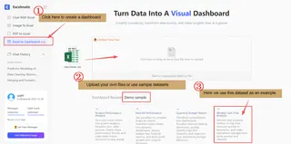
This is the starting point. Your data may come in many formats: an opportunity list in Excel, invoices from finance delivered as PDFs, even handwritten sales reports. One of Excelmatic's core strengths is helping you unify these scattered, unstructured sources.
- You can upload local Excel files directly.
- You can also use Excelmatic's image-to-Excel or PDF-to-Excel features to quickly convert tables from paper, scanned documents or electronic reports into analyzable data, making previously hard-to-use information usable and clear.
Step 2: Define the questions, then issue the build command
Once data is ready, don't rush to design charts. First ask: "What three business questions do I most need answered?" For example,
Will we hit our quarterly target?
Which product line contributes the most profit?
Where is new-customer growth coming from?
After defining the questions, describe your needs in natural language inside Excelmatic. For example, you could type:
Based on the uploaded sales data, generate a dashboard showing sales by region for this quarter, monthly sales trends, and revenue share by major products.
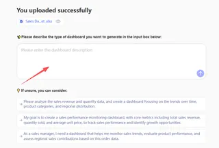
Excelmatic interprets the intent and automatically creates an initial dashboard with the relevant metrics and charts.
Step 3: Refine the visual layout and charts
After Excelmatic generates the initial visuals, you can review and tweak them quickly. If a chart type doesn't convey the data best, continue the conversation to adjust it.
For example, you might say:
Change the regional sales comparison from a pie chart to a bar chart — it's easier to read.

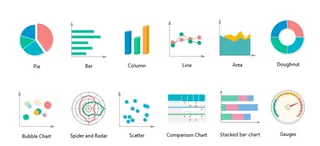
Remember a few basic chart rules:
Use line charts for trends (e.g., monthly changes);
Use pie charts or stacked bars to show composition (e.g., product share);
Use bar or column charts for comparisons (e.g., regional ranking).
Simple instructions let you shape the layout to fit your analysis and reporting style.
Step 4: Apply themes and share
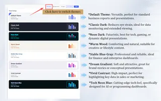
To make the dashboard look polished, Excelmatic offers a variety of themes you can switch between. With one click you can change a dashboard from a clean, corporate look to a more colorful style that matches your company branding or presentation context.
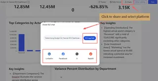
Once the layout is finalized, you can share the finished dashboard directly with team members or managers. They can view the clear data view via a shared link without complex logins and quickly grasp the sales picture.
Step 5: Save, reuse and keep it updated
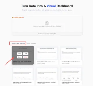
Every dashboard you create can be saved in Excelmatic as a draft or a project. That means when you need updated data next week or next month, you don't start from scratch. Open the saved dashboard project and upload new data files — the system will update charts based on the existing analysis framework. This builds a reusable analysis template and greatly improves efficiency for ongoing tracking and analysis.
Through these five steps you'll see that building a professional sales dashboard is no longer a multi-week IT project. With tools like Excelmatic, it becomes a sales-led, fast process from data to insight.
If you want to learn more about how to generate dashboards for Excelmatic, you can click here for further reading.
Start now — let data drive your sales team
The era of waiting for the perfect monthly report is over. In a competitive market, the companies that see and act quickly get the advantage.
A sales dashboard shouldn't be a "numbers display" for executives to admire. It should be the sales team's daily command center. It removes guesswork and makes fact-based conversations and decisions possible.
You don't have to build a perfect, all-encompassing system at once. Start by solving one pressing pain point — for example, real-time pipeline tracking, or clearly showing each rep's quarter-to-date progress.
Tools like Excelmatic lower the technical barrier so you can focus on sales logic instead of coding or complex formulas. Spend a few hours connecting your data and building that first chart. You'll find having data work for you is far more efficient than working for the data.
There's no better time to start than now.
Frequently Asked Questions (FAQ)
Q: What's the biggest mistake teams make when first building a dashboard?
A: Tracking too many metrics. Start with 3-5 core KPIs that directly answer your most critical business questions (e.g., "Are we on track to hit quota?"). Too much data creates noise, not insight.
Q: Can a Sales Dashboard help with forecasting, or is it just for past results?
A: A good dashboard is crucial for forecasting. By visualizing your current sales pipeline value, weighted by stage conversion rates, it provides a data-driven projection of future revenue, moving beyond gut-feel guesses.
Q: How is a Sales Dashboard different from a Marketing or Financial Dashboard?
A: The core difference is the data focus and objective. A Sales Dashboard tracks the revenue engine: leads, opportunities, pipeline, conversions, and quotas. A Marketing Dashboard focuses on top-of-funnel metrics like website traffic, campaign ROI, and lead generation cost. A Financial Dashboard analyzes profitability, cash flow, and P&L statements. While they may share some data, each serves a distinct strategic function.

