Key Takeaways:
- Creating line graphs in Excel traditionally requires navigating complex menus, selecting data ranges, and multiple formatting steps that frustrate business users
- Excelmatic eliminates the manual chart creation process by allowing you to generate professional line graphs using simple language commands
- Compared to Excel's built-in tools, Excelmatic automatically handles complex customizations like multiple data series, axis formatting, and reference lines without technical steps
- For professionals needing quick data visualization for reports and presentations, the AI approach delivers publication-ready line graphs in seconds
Excel makes it simple to visualize data, and one of the most effective ways to display trends over time is with a line graph. Whether you're tracking sales, monitoring performance metrics, or analyzing scientific data, a well-designed line graph helps make patterns clear and insights easier to understand.
But creating that "perfect" chart can often feel like a chore. Manually scanning rows of numbers is overwhelming, and navigating Excel's menus to get your chart just right can be a multi-step, time-consuming process.
This guide walks you through two powerful approaches to creating line graphs. First, we'll cover the traditional, step-by-step method using Excel’s built-in tools. Then, we'll introduce a smarter, faster way using an AI agent like Excelmatic, where you can get the same professional-looking chart with a single sentence.
By the end, you'll be able to choose the best method for your needs and create compelling graphs that make your data easy to interpret and share.
Preparing Your Data
Before creating a graph with any method, your data needs to be structured correctly. A clean, well-organized table is the foundation of any accurate visualization. Each column should have a clear header, and your data should be arranged logically.
For a line graph tracking a value over time, the first column should typically list the time periods (like dates or months), while subsequent columns contain the numerical values you want to plot.
Example dataset:
Date	Daily Rainfall	Particulate
1/1/2007	4.1	122
1/2/2007	4.3	117
1/3/2007	5.7	112
1/4/2007	5.4	114
1/5/2007	5.9	110
1/6/2007	5	114
1/7/2007	3.6	128
1/8/2007	1.9	137
1/9/2007	7.3	104
Creating a Line Graph: Two Methods Compared
With your data ready, let's explore how to turn it into a line graph.
Method 1: The Traditional Way in Excel
The classic method gives you full manual control over every element of your chart. It involves a series of clicks and menu selections.
Head to the Insert tab and insert a blank line chart. This creates an empty canvas.
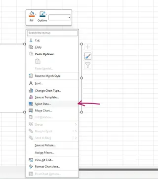
Right-click on the blank chart canvas and choose Select Data.
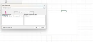
Under Legend Entries (Series), click Add.
For Series name, you can type the name of the column, like "Daily Rainfall", or click the cell containing the header.
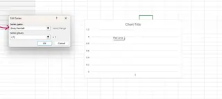
For Series values, delete the default entry and select the range of numerical values in your data column (e.g., the values under "Daily Rainfall").
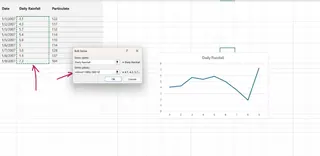
Next, under Horizontal (Category) Axis Labels, click Edit.
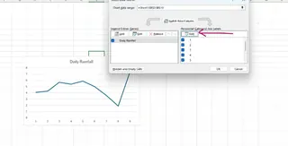
Select the range of values for your horizontal axis, in this case, the Date column. Click OK on both windows.
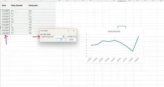
You now have a basic line graph. While effective, this process involves at least seven steps and can be tedious, especially for beginners.
Method 2: The Instant AI-Powered Way with Excelmatic

What if you could skip all those steps? With an AI agent like Excelmatic, you can. The process is as simple as asking a question in plain language.
- Upload your Excel file to Excelmatic.
- Type your request in the chat box.
For the same graph, you would simply type:
Create a line graph showing Daily Rainfall by Date.
Excelmatic analyzes your data, understands your intent, and generates the complete, correctly labeled line graph instantly. There are no menus to navigate or data ranges to select manually. The AI handles everything.
Customizing Your Excel Line Graph
A basic graph is a good start, but customization is key to making it clear and professional. Let's see how both methods handle this.
Changing the Graph Title and Axis Labels
The Traditional Way: Click on the default "Chart Title" and type your new title. To add axis labels, click the chart, press the green plus (+) button that appears, check the box for Axis Titles, and then edit the placeholder text on the chart.
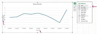
The Excelmatic Way: You can include these details in your initial request or add them as a follow-up.
Create a line graph of Daily Rainfall by Date. Title it 'Daily Rainfall Measurements in January 2007'.
Or, if the chart is already created:
Change the chart title to 'Daily Rainfall Measurements' and label the Y-axis 'Rainfall (mm)'.
Adding Multiple Lines to the Graph
Comparing multiple datasets on a single graph is a common need.
The Traditional Way:
- Right-click the chart and choose Select Data.
- Under Legend Entries (Series), click Add.
- For Series name, select the header of the new data (e.g., "Particulate").
- For Series values, select the numerical data for the new series. The horizontal axis should already be set correctly.
- Click OK.
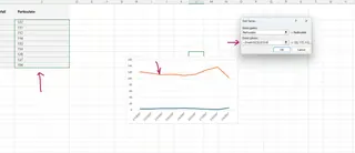
The Excelmatic Way: Simply state what you want to compare in one go.
Plot Daily Rainfall and Particulate on the same line graph against the date.
The AI automatically understands you want two lines and plots them accordingly, saving you the hassle of re-opening the "Select Data" window.
Other Customizations (Formatting Axes, Adding Lines)
Need to make your axis labels more readable or add a reference line?
The Traditional Way:
Tilt Axis Labels: Right-click the horizontal axis, choose Format Axis, go to the Size & Properties tab, and select a Text direction.
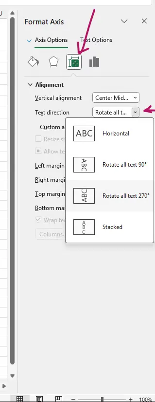
Add a Vertical Line: This is a complex task in Excel, often requiring workarounds like adding error bars or a secondary scatter plot series. For example, to use error bars, you'd go to Add Chart Element > Error Bars > More Error Bars Options.
The Excelmatic Way: Again, just ask. The AI handles the complex backend steps for you.
Tilt the x-axis labels by 45 degrees.
Add a vertical reference line on January 9, 2007 and label it 'Heavy Rainfall'.
Enhancing Excel Line Graphs for Better Visualization
Once your graph is structured, you can refine its appearance. Both methods produce a native Excel chart, so you can always use Excel's built-in formatting tools for final touches.
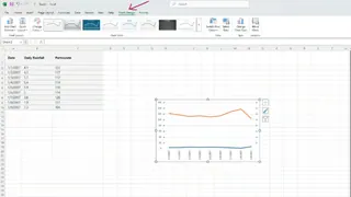
You can click on any chart element to format it. Double-click a line to change its color, add markers, or adjust its thickness. Modify gridlines and background colors for a cleaner look that works well in reports and presentations.
Saving and Exporting the Graph from Excel
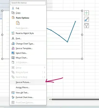
Once your graph is complete, you can easily save or export it. Right-click the chart and choose Save as Picture to create a PNG or JPEG file. Alternatively, simply copy the chart (Ctrl+C) and paste it directly into PowerPoint, Word, or other applications.
A well-designed line graph helps present data in a way that is easy to understand. By mastering either the traditional or the AI-powered method, you can create clear and professional-looking charts that make trends and patterns stand out.
Conclusion
Throughout this article, we've explored two paths to the same goal: creating a powerful line graph in Excel.
The traditional method offers granular, hands-on control, which is great for Excel experts who know exactly what they want and how to get it. However, it requires navigating multiple menus and can be slow and repetitive.
The AI-powered method with Excelmatic revolutionizes this process. By translating plain language commands into perfectly formatted charts, it eliminates the manual work, saves significant time, and makes powerful data visualization accessible to everyone, regardless of their Excel expertise. You can focus on the insights, not the clicks.
Ready to transform your data visualization workflow? Try Excelmatic today and experience the ease of creating professional charts with simple language commands.
Whether you prefer the control of the classic approach or the speed of AI, mastering Excel's charting tools is essential for effective data communication.
Excel Line Graph FAQs
Which method is better for creating line graphs: manual or AI?
It depends on your needs. The manual method is good for users who want precise, step-by-step control over every chart element. The AI method (using a tool like Excelmatic) is far superior for speed, efficiency, and ease of use, delivering the same results in a fraction of the time with simple commands.
How do I fix my Excel line graph if the data is plotted incorrectly?
Manually: Check your data structure. Ensure the X-axis values (like dates) are in the first column and Y-axis values (numbers) are in the second. You can right-click the graph, select "Select Data", and manually re-assign the data ranges for the horizontal and vertical axes. With Excelmatic: Simply clarify your request. For example: "Plot Daily Rainfall on the Y-axis and Date on the X-axis." The AI will correct the chart for you.
How can I add multiple lines to a single line graph?
Manually: Go to "Select Data", click "Add" to create a new series, and then select the name and values for the additional dataset. With Excelmatic: Just ask for both lines in your prompt, like: "Create a line graph showing Daily Rainfall and Particulate over time."
Can I add a vertical reference line to my line graph?
Manually: Yes, but it's complex. You typically need to use workarounds like adding a custom-formatted error bar or creating a combination chart with a scatter plot to place the line. With Excelmatic: Yes, and it's simple. Just ask: "Add a vertical line on January 9, 2007."
What’s the best way to export my Excel graph for reports?
Both methods produce a standard Excel chart. The best way to export is to right-click the chart and choose "Save as Picture" for a high-quality image file (PNG, JPEG). You can also copy and paste the chart directly into Word or PowerPoint, where it can remain editable.


