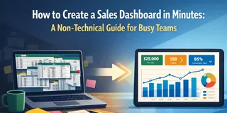
Key takeaways:
Choosing the correct dashboard type is foundational. It directly determines the right KPIs, layout, and value for your intended user, moving from cluttered data to clear communication.
Dashboards serve distinct roles. The eight core types — Strategic, Financial, Operational, Tactical, Project, Sales, Marketing, and HR — each address specific user questions and time horizons.
Start with the user and their key question. The two questions, "Who is this for?" and "What is their one most important question?" are the essential blueprint for any effective dashboard.
Modern, AI-driven tools like Excelmatic transform creation. They streamline the process by automating data integration, suggesting intelligent designs, and generating narrative insights, removing technical barriers.
You have the data. Spreadsheets are full, CRM reports are generated, and analytics platforms are collecting streams of information. Yet, when it's time to report progress, plan a campaign, or make a strategic decision, a fundamental uncertainty arises: How should this information actually be presented?
The challenge for most professionals today is not a lack of data, but a lack of a clear framework to harness it. You might find yourself asking:
- "Should this be a high-level summary for leadership or a detailed view for my team?"
- "What are the right metrics to include, and which ones are just noise?"
- "How do I organize this on one screen so it tells a compelling, actionable story?"
This confusion often leads to dashboards that are cluttered, misaligned with their audience, or beautiful yet useless — visualizations that are viewed but never truly used to drive decisions.
The root of the problem is usually a mismatch between the business need and the type of dashboard designed to meet it. Just as you wouldn't use a detailed topographic map to navigate a city by subway, you shouldn't use an operational live-tracker to present a five-year strategic vision. Choosing the correct dashboard type provides the essential blueprint: it dictates the core KPIs, informs the logical layout, and ensures the final product delivers specific value to its intended user.
The following guide breaks down the essential dashboard archetypes used in modern business, providing you with the clarity needed to match your goal with the right framework, select the pivotal metrics, and communicate with powerful focus.
Beyond the Data Blur: Choosing the Dashboard That Drives Your Business Forward
At the highest level, leaders need clarity on direction and health. These dashboards provide that panoramic view.
The Executive Lens: Strategic & Financial Dashboards
1. The Strategic Dashboard
This is the organization's true north. Designed for the C-suite, VPs, and directors, its sole purpose is to track progress against long-term business objectives.
It answers fundamental questions like, "Are we growing sustainably?" and "Are we gaining or losing market ground?" Its importance cannot be overstated; it aligns leadership, informs billion-dollar investment decisions, and shapes company strategy.
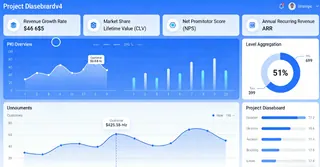
You'll find high-level, aggregated metrics here: Revenue Growth Rate, Market Share, Customer Lifetime Value (CLV), Net Promoter Score (NPS), and Annual Recurring Revenue (ARR).
2. The Financial Dashboard
Cash is king, and this dashboard is its throne room. Used by CFOs, finance teams, and executives, it provides a consolidated, real-time view of the company's fiscal health.
It moves beyond profit and loss to offer a comprehensive picture of stability and efficiency. Its critical role is to ensure liquidity, control costs, and guarantee financial reporting accuracy for stakeholders.
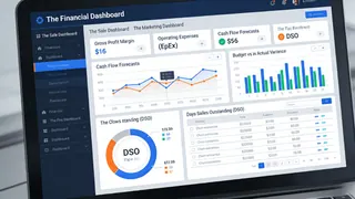
Key indicators include Gross Profit Margin, Operating Expenses (OpEx), Cash Flow Forecasts, Budget vs. Actual Variance, and Days Sales Outstanding (DSO).
The Engine Room: Operational, Tactical & Project Dashboards
This is where strategy meets execution. These dashboards are for the managers and teams who keep the business running day-to-day and quarter-to-quarter.
3. The Operational Dashboard
This is the real-time pulse of the business. Used by customer support, logistics, IT, and warehouse teams, it monitors the efficiency of daily processes.
Its importance lies in its immediacy — it allows teams to spot and react to bottlenecks, outages, or surges as they happen, ensuring smooth service delivery and operational continuity.
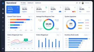
Common metrics are live and urgent: Current Ticket Volume, Average First Response Time, System Uptime Percentage, Orders Shipped per Hour, and Inventory Stock Levels.
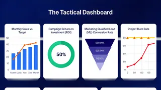
4. The Tactical Dashboard
Acting as the crucial bridge between high-level strategy and daily operations, this dashboard is the weapon of choice for department heads, marketing managers, and product leads.
It focuses on the mid-term cycle, tracking the performance of specific initiatives, campaigns, or quarterly goals. Its value is in measuring effectiveness and guiding tactical adjustments.
You'll track metrics like Monthly Sales vs. Target, Campaign Return on Investment (ROI), Marketing Qualified Lead (MQL) Conversion Rate, and Project Burn Rate.
5. The Project Dashboard
For project managers and team leads, this is the mission control center. It visualizes the progress, health, and resource allocation of a project or an entire portfolio.
Its importance is in creating transparency, managing risks, and keeping complex initiatives on time and on budget.
It revolves around progress and capacity: Project Timeline (Gantt charts), Milestone Completion Percentage, Budget Utilization, Resource Allocation, and Critical Issue Count.

The Growth Drivers: Sales, Marketing & HR Dashboards
These specialized dashboards focus on the core functions that drive revenue and build the organization's capacity.
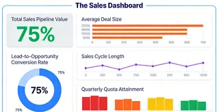
6. The Sales Dashboard
This is the scoreboard for the revenue team. Used by sales directors, reps, and the CRO, it provides a clear view of the pipeline, performance, and forecasting. It is vital for motivating teams, predicting revenue, and identifying where deals are getting stuck.
Key metrics are forward-looking and activity-based: Total Sales Pipeline Value, Lead-to-Opportunity Conversion Rate, Average Deal Size, Sales Cycle Length, and Quarterly Quota Attainment
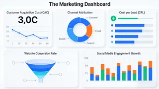
7. The Marketing Dashboard
In the complex world of digital campaigns, this dashboard cuts through the noise for marketing managers and the CMO.
It measures the effectiveness and efficiency of attracting and engaging customers. Its importance lies in proving ROI, optimizing spend, and understanding what truly resonates with the audience.
Core indicators include Customer Acquisition Cost (CAC), Cost per Lead (CPL), Channel Attribution, Website Conversion Rate, and Social Media Engagement Growth.
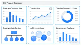
8. The HR / People Dashboard
An organization's greatest asset is its people, and this dashboard helps manage that asset strategically. For HR directors and people managers, it tracks workforce health, talent effectiveness, and cultural indicators. It's crucial for improving retention, boosting productivity, and making data-driven decisions about hiring and development.
It focuses on people metrics: Employee Turnover Rate, Time-to-Hire, Training Completion Rates, Employee Satisfaction (eNPS), and Revenue per Employee.
From Insight to Action with the Right Tool
Understanding these blueprints is the first step. The next — and often most challenging — step is building them without getting lost in complex coding, fragile spreadsheet formulas, or inaccessible BI tools.
This is where a modern, AI-driven platform like Excelmatic becomes indispensable. It is designed for professionals who need strategic depth but demand intuitive simplicity. By leveraging AI, Excelmatic transforms the dashboard creation process:
- Connect seamlessly to live data sources, where AI can help map and prepare data, ensuring your Financial and Strategic dashboards are not only accurate but intelligently organized.
- Build interactive views effortlessly. Describe your goal, and AI can suggest optimal visual layouts and real-time components for Operational or Tactical dashboards, eliminating manual design work.
- Create tailored, shareable dashboards for any team. AI assists in selecting and explaining the key KPIs for Sales, Marketing, or HR, turning raw data into clear, narrative-driven insights in minutes.
In essence, Excelmatic's AI removes the technical barrier and the guesswork. It allows you to focus on what truly matters: making faster, smarter decisions with dashboards that are not just built, but intelligently crafted to drive action.
Finding Your Starting Point
The journey to a better dashboard begins with two simple questions: "Who am I building this for?" and "What is their one most important question?"
Start there, match the need to the dashboard type, and focus on the 3-5 metrics that answer that question directly. When you're ready to bring that focused vision to life efficiently, exploring a purpose-built tool is your logical next step.
Ready to build a dashboard that works as hard as you do?
Discover how Excelmatic can help you design and deploy the exact dashboard your team needs. Explore Excelmatic Today
Frequently Asked Questions (FAQ)
Q: How does AI simplify the process of creating these dashboards?
A: AI, like that in Excelmatic, removes the manual heavy lifting. Instead of building from scratch, you can describe your goal, and the AI suggests the layout and key metrics for that dashboard type. It also connects and prepares data automatically, turning your blueprint into a functional dashboard faster.
Q: What's the most important factor in choosing a dashboard type?
A: It depends entirely on the primary user's role and key question. Start by asking: "Who is this for, and what is their one critical daily or strategic question?" The answer directly points you to the right type, from operational to strategic.
Q: How does the AI actually help me choose charts and layout?
A: Instead of starting from a blank screen, you can describe your goal (e.g., "Show quarterly sales performance by region"). The AI analyzes this intent and your data structure to recommend the most effective chart types (like a map or bar chart) and propose a clean, logical layout that highlights key insights, eliminating design guesswork.

