Key takeaways:
Shift from Static to Real-Time: Financial dashboards transform traditional periodic reporting into dynamic, real-time visual platforms that enable proactive financial management and faster decision-making.
Four Core Capabilities: Effective dashboards offer holistic monitoring with alerts, multi-dimensional drill-down analysis, budget and forecast integration, and standardized collaborative outputs.
Specialized by User Need: Four main dashboard types serve different roles: operational performance (executives), budget execution (managers), cash flow monitoring (treasury), and receivables/payables management (operations).
Practical 5-Step Framework: Successful implementation requires defining clear goals, integrating and governing data, designing intuitive visualizations, selecting appropriate tools, and embedding continuous iteration into management habits.
In traditional financial management, decision-makers often rely on periodic, static financial reports. While these reports can be detailed, they are inherently lagging, making it difficult for companies to get real-time guidance when responding to market shifts or adjusting operational strategies. Financial dashboards aim to shift the finance function from a recorder of the past to a real-time navigator. By integrating and visualizing key financial data, they provide leadership with a continuously updated panoramic view of financial health.
The Core Value of a Financial Dashboard: Real-Time Insight and Proactive Management
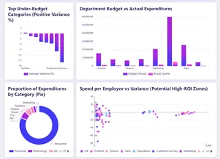
A financial dashboard is a centralized platform for data visualization and analysis. It automatically connects to multiple internal systems — ERP, CRM, banking platforms, and more — transforming raw, fragmented financial data into clear charts, graphics, and key performance indicators. Its core value lies in enhancing the readability, timeliness, and contextual linkage of information, enabling managers to quickly spot trends, identify issues, and trace root causes, thereby supporting more proactive and accurate financial and business decisions.
Key Capabilities: Going Beyond Static Reports
An effective financial dashboard typically includes the following layers of functionality:
1. Holistic monitoring and instant alerts:
Continuously track cash flows, major P&L items, and significant changes in the balance sheet. The system can predefine thresholds and automatically alert users to abnormal deviations (for example, a sudden spike in an expense or cash falling below a safety level), shifting the approach from passive review to active management.
2. Multi-dimensional drill-down analysis:
Allow users to drill into aggregated figures. For example, clicking on total revenue can break it down by product line, region, or channel; examining gross margin changes can link them to specific cost components. This drill-down capability is key to pinpointing the root cause of issues.
3. Budget and forecast linkage:
Compare actuals to budgets and forecasts in real time. Advanced dashboards can integrate forecasting models that roll forward based on the latest data or run scenario "what-if" analyses to evaluate the potential financial impact of decisions.
4. Collaboration and standardized outputs:
Ensure managers at different levels discuss the same data. Dashboards can generate standardized analytical views or briefings, reducing time spent preparing data and improving meeting efficiency.
Core Metrics for the Dashboard: Building a Financial Health Metric System
Metric selection should align directly with the company's strategic goals. A balanced metric set typically covers:
- Liquidity health: Focus on operating cash flow, cash conversion cycle, and current ratio. These metrics directly reflect the company's ability to meet short-term obligations and sustain operations.
- Profitability analysis: Core metrics include gross margin, operating margin, and net margin. Trend analysis and industry benchmarking help assess pricing power and cost control.
- Operational efficiency: Use metrics like days sales outstanding (DSO), inventory turnover, and days payable outstanding (DPO) to measure asset management and supply chain efficiency.
- Growth and return on investment: Track revenue growth rate, customer lifetime value to customer acquisition cost ratio, and return on investment to judge the quality and sustainability of growth.
Dashboard Types for Different Users
Based on core financial functions and management focus, modern financial dashboards generally fall into four specialized types:
1. Operational performance dashboard:
Shows overall company revenue, profit, and cost structure to assess profitability and business health. Key metrics include total revenue, net income, gross margin, contributions by business line, and cost composition. This dashboard mainly serves executives, the board, and the CFO to support strategic decisions.
2. Budget execution dashboard:
Monitors actuals versus budget to control costs and optimize resource allocation. It dynamically displays budget burn rates, variance analysis, and detailed spend by department or project. Primary users are finance teams, department heads, and project managers.
3. Cash flow dashboard:
Monitors cash inflows, outflows, and balances in real time with the goal of ensuring liquidity and flagging funding risks. Key metrics include operating cash flow, cash balances, and short-term forecasts. This is an essential tool for CFOs, treasury teams, and cash managers for daily cash allocation and risk control.
4. Receivables & payables dashboard:
Manages customer receivables and vendor payables to accelerate cash collection, optimize payment processes, and control credit risk. It focuses on aging of receivables, overdue items, and payable terms. Main users include sales, procurement, and finance operations.
Implementation Path: A Five-Step Framework
Building a successful dashboard is an iterative process, not a one-time project.
Step 1: Define goals and requirements:
This is the most critical step. Engage core users to clarify the specific decision scenarios the dashboard needs to support (for example: "Do we need weekly cash monitoring to avoid a cash shortfall?"). Avoid trying to be all things to all people; prioritize the most urgent pain points.
Step 2: Integrate and govern data:
Identify all required data sources and create stable, reliable automated data pipelines. Ensure consistent definitions across the company (for example, how "revenue" is defined) — this is the foundation for trust in your data.
Step 3: Design intuitive visualizations:
Follow visualization best practices. Use appropriate chart types (lines for trends, pie or stacked bars for composition), keep the interface simple, and avoid information overload. Layout should be logical, typically following a "top-level overview first, details after" principle.
Step 4: Select and implement the right tools:
Choose a platform based on your company's technical capability, budget, and integration complexity. Common tools like Excelmatic, Power BI, and Tableau offer powerful visualization features and relatively gentle learning curves.
Step 5:Embed usage habits and iterate continuously:
After launch, train users and integrate the dashboard into regular management routines (e.g., weekly meetings). Collect feedback regularly and adjust metrics and views as the business evolves to keep the dashboard relevant and effective.
Why I Recommend Using AI Tools to Build Your Financial Dashboard
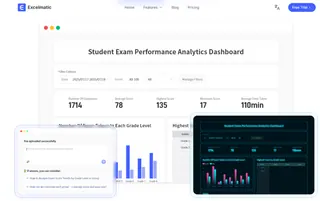
Once you've defined the core dashboard types, the next challenge is building them efficiently and accurately. Traditionally, this depended on finance staff mastering complex Excel functions, pivot tables, and charting tools — processes that are time-consuming and error-prone. Today, I strongly recommend trying AI-powered analytics tools (for example, Excelmatic to do this work. This doesn't replace professional judgment; it frees you from tedious technical tasks so you can focus on higher-value financial analysis and strategic decisions.
AI Tools vs. Traditional Manual Methods
| Comparison Dimension | Traditional Manual Method | AI-assisted Generation | Core Advantage |
|---|---|---|---|
| Speed | Slow, requires step-by-step operation | Extremely fast, conversation-based generation | Minute-level response, agile response to needs |
| Ease of Use | High barrier, requires professional skills | Low barrier, can be described in natural language | Business users can conduct independent analysis without relying on technical experts |
| Flexibility | Rigid, high cost for modifications | Flexible, can be iteratively optimized through conversation | Supports continuous exploration, analyzing data like having a conversation |
| Accuracy | Relies on manual work, prone to errors | Automated, reduces human errors | Consistently reliable results, enhances decision-making foundation |
Using Excelmatic as an Example: How AI Simplifies Dashboard Creation
Tools like Excelmatic work by turning your data "intentions" directly into finished outputs. The process is highly streamlined:
- Upload data:
Upload your financial datasets (for example, detailed P&L, departmental expense reports).
- Describe your needs in natural language:
Type your analytic intent into a chat box. Examples:
Create a margin dashboard for each product line for this month.
Analyze receivables aging and list major customers with receivables overdue by more than 90 days.
Compare annual budgeted cash flow to actual cash flow and calculate variance rates.
- Receive and iteratively refine:
The AI generates an initial set of charts and tables immediately. If you're not satisfied, you can continue instructing it like you would a colleague: "Change the bar chart to a line chart" or "Add a KPI summary card at the top."
- Export and apply:
Export the finished dashboard to standard file formats and embed it into your financial reports or presentations.
Embrace Smart Tools to Make Dashboard Building Faster and More Professional
This article systematically explained the core value, functions, metric systems, and specialized types of financial dashboards. A well-designed financial dashboard is the infrastructure that enables data-driven decisions and proactive financial management.
However, from design to deployment, construction is often hampered by technical complexity and lengthy lead times. That's precisely why I recommend trying AI-driven tools like Excelmatic.
They can translate your analysis intent into precise visualizations via natural language, reducing build and iteration time from hours to minutes, lowering technical barriers and human error, and letting you focus on higher-value insights and business decisions.
Try Excelmatic today and experience this efficient approach for yourself. Make professional, dynamic financial insights an everyday, accessible part of your business management.
Frequently Asked Questions (FAQ)
Q: How much does building a financial dashboard typically cost?
A: Costs vary based on tools and complexity. Using AI tools like Excelmatic can be very affordable or even free to start, while enterprise BI platforms involve licensing fees and potential setup costs. The biggest investment is usually in data preparation and governance.
Q: What are the most common mistakes when creating a financial dashboard for the first time?
A: The top three are: 1) Including too many metrics (information overload), 2) Not aligning with actual decision-making needs, and 3) Neglecting data quality and consistency checks before building.
Q: How often should financial dashboards be updated?
A: It depends on the dashboard type. Cash flow dashboards might update daily, while operational performance dashboards could be weekly. What matters most is that the update frequency matches your decision-making cycle.

