Key takeaways:
- Excel dashboards help users turn raw Excel data into clear, actionable insights in one view.
- Building dashboards manually requires structured data, Pivot Tables, formulas, and careful layout, which can be time-consuming and error-prone.
- Excelmatic automates analysis and visualization, creating professional dashboards in minutes without complex setup.
- Using Excelmatic reduces maintenance effort, prevents errors, and ensures consistent, high-quality dashboard design.
- Dashboards, whether manual or automated, allow teams to quickly spot trends, track performance, and make informed decisions.
Let's be honest. You're not just managing data in Excel; you're drowning in it. Rows and rows of sales figures, weekly marketing metrics, customer logs... it's all there, but what does it mean? Finding the story in a static spreadsheet is like trying to hear a whisper in a storm.
That's where an Excel dashboard comes in. Think of it as your data's command center. A single, visual snapshot that turns numbers into insights. You see trends at a glance, spot problems before they blow up, and make decisions based on a clear picture, not a gut feeling.
In this article, I'll first explain what an Excel dashboard really is from a professional perspective. Then I'll walk through the traditional way of building one in Excel, including why it often becomes painful in practice. Finally, I'll show how Excelmatic offers a much simpler and more practical alternative for turning Excel data into dashboards.
What Is an Excel Dashboard?
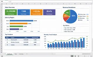
An Excel dashboard is a centralized visual interface built inside Excel, using Excel data as its foundation. Through data analysis (such as aggregation, comparison, and calculation) and data visualization (charts, tables, and KPIs), an Excel dashboard brings scattered data together into a single, clear view.
From a professional perspective, the core purpose of an Excel dashboard is not to create charts for presentation, but to help users quickly understand results, spot trends, identify problems, and support decision-making.
In practice, an Excel dashboard typically:
- Uses Excel tables or raw datasets as the data source
- Relies on data analysis tools such as Pivot Tables, formulas, and calculations
- Visualizes key metrics through charts, KPI cards, and summary tables
- Presents all critical insights on one screen, so users can understand performance at a glance
In essence, an Excel dashboard is about clarity and efficiency. Instead of scrolling through multiple worksheets or rows of raw data, users can immediately see what is working, what is not, and where attention is needed.
Part 1: How to Create an Excel Dashboard Manually (Traditional Way)
Most Excel dashboards are built through a fairly standard workflow. While the details may vary, the core steps below reflect how dashboards are typically created in real business settings.
Step 1: Prepare and Structure Your Data
A reliable Excel dashboard always starts with well-structured source data. Your dataset should follow a simple table format: each column represents one field (such as date, product, or revenue), and each row represents one record.
In practice, this means removing merged cells, empty rows, and manual subtotals. Converting the dataset into an Excel Table (Ctrl + T) is considered best practice, as it keeps ranges consistent and makes updates more stable when new data is added.
Step 2: Define the Dashboard Objective
Before creating any charts, clarify what the dashboard is meant to show. Professional dashboards are designed around decisions, not visuals.
At this stage, it helps to identify who the dashboard is for, which questions it should answer, and which KPIs actually matter. This prevents unnecessary charts and keeps the dashboard focused on insights rather than decoration.
Step 3: Build Pivot Tables for Analysis
Pivot Tables are the analytical foundation of most Excel dashboards. They allow large datasets to be summarized by time, category, or region without relying on complex formulas.
Typically, multiple Pivot Tables are created — each supporting a specific view of the data. These are usually placed on a separate worksheet that serves as the calculation layer behind the dashboard.
Step 4: Create Charts from Pivot Tables
Charts are built directly on top of Pivot Tables to visualize trends and comparisons. Line charts are commonly used for time-based trends, while column or bar charts work well for category comparisons.
At this stage, clarity matters more than variety. Each chart should answer one clear question and be easy to understand without additional explanation.
Step 5: Add Filters and Slicers
Slicers and timeline controls are used to add interactivity to the dashboard. They allow users to filter views by time period, product, or region without changing the underlying structure.
While useful, slicers also increase dependency between Pivot Tables, which can make dashboards harder to maintain as complexity grows.
Step 6: Assemble the Dashboard Layout
The final step is arranging charts and KPIs into a single dashboard view. Key metrics are usually placed at the top, with supporting charts grouped logically below.
A well-designed Excel dashboard should be understandable within a few seconds, allowing users to quickly grasp performance and identify issues.
Step 7: Ongoing Maintenance
Traditional Excel dashboards require reqgular updates. Pivot Tables must be refreshed, formulas checked, and layouts adjusted when data changes.
As dashboards become more complex, maintenance effort increases — often becoming a limiting factor for long-term use.
Why Traditional Excel Dashboards Become Hard to Maintain
Over time, traditional Excel dashboards tend to become fragile. New data needs to be added, Pivot Tables refreshed, formulas adjusted, and layouts fixed. The more complex the dashboard, the more effort it takes to keep it working.
This is why many teams end up with dashboards that are rarely updated, or spreadsheets that only one person fully understands. Excel is powerful, but dashboards built this way don't scale well in fast-moving environments.
Part 2: Why Excelmatic Is a More Practical Approach to Build Dashboard
Excelmatic starts from a different assumption: most people don't want to build dashboards — they want answers.
Instead of asking users to manually design Pivot Tables, write formulas, and figure out layouts, Excelmatic focuses on automatically turning Excel data into clear dashboards.
When you upload an Excel file, Excelmatic analyzes the structure of your data and identifies key metrics automatically. The analysis that normally happens through multiple Pivot Tables and formulas is handled behind the scenes.
Just as importantly, Excelmatic removes the design burden. Dashboards are generated with clean layouts and consistent visuals, so users don't need to worry about alignment, formatting, or chart selection.
Traditional Excel vs. Excelmatic: A Practical Comparison
The difference between traditional Excel dashboards and Excelmatic is not about capability — it's about usability.
| Aspect | Traditional Excel | Excelmatic |
|---|---|---|
| Setup effort | High and manual | Minimal and automated |
| Risk of errors | Easy to introduce | Greatly reduced |
| Time to first dashboard | Hours or days | Minutes |
| Design quality | Depends on user skill | Consistent and professional |
| Ongoing maintenance | Tedious | Simple refresh |
In practice, this means Excelmatic allows teams to spend less time building dashboards and more time actually using them.
Dashboards You Probably Already Rely On
In practice, dashboards are already widely used across different business functions. The difference lies mainly in what is being monitored and how frequently decisions are made. The table below shows some of the most common dashboard types and their typical focus areas.
| Dashboard Type | What It Usually Shows | Typical Use Case |
|---|---|---|
| Marketing Dashboard | Traffic, conversions, channel performance, campaign ROI | Evaluating marketing effectiveness and optimizing spend |
| Sales Dashboard | Pipeline status, revenue, deal stages, forecasts | Tracking sales performance and prioritizing follow-ups |
| Operations Dashboard | Inventory levels, order status, fulfillment or support tickets | Identifying bottlenecks and operational risks |
| Financial Dashboard | Cash flow, expenses, profit margins, budget vs. actuals | Monitoring financial health and cost control |
| Management Dashboard | High-level KPIs, growth metrics, key risks | Quick executive-level performance review |
These dashboards are often checked daily or weekly and are designed to answer very practical questions: Are we on track? Where are the problems? What needs attention right now?
If you regularly open Excel files to review numbers, track performance, or report results, you are already relying on dashboards — whether they are formally designed or not.
Final Thoughts
Building an Excel dashboard the traditional way can work, especially for experienced Excel users. But it comes with hidden costs: time, complexity, and ongoing maintenance.
Excelmatic offers a more modern approach. By automating analysis and visualization, it allows Excel data to be transformed into dashboards without the usual friction.
If your goal is clarity rather than complexity, and insight rather than spreadsheet mechanics, Excelmatic provides a simpler and more sustainable way to build dashboards from Excel data.
Starting today, try Excelmatic and turn your Excel data into dashboards in a simpler, faster way.
Frequently Asked Questions (FAQ)
Q1: What is an Excel dashboard?
A1: An Excel dashboard is a centralized interface that turns Excel data into clear insights using tables, Pivot Tables, charts, and KPIs for fast decision-making.
Q2: Why is building dashboards manually in Excel difficult?
A2: Manual dashboards require clean data, multiple Pivot Tables, formulas, and careful layout, making them time-consuming, error-prone, and hard to maintain.
Q3: How does Excelmatic simplify dashboard creation?
A3: Excelmatic automatically analyzes Excel data, identifies key metrics, and generates professional dashboards in minutes without manual formulas or design work.
Q4: Who should use Excelmatic?
A4: Professionals who rely on Excel dashboards daily but want faster, accurate, and easy-to-maintain insights will benefit most from Excelmatic.
Q5: Can Excelmatic handle complex Excel datasets?
A5: Yes, Excelmatic can process large and complex Excel files, automatically summarizing key metrics and creating interactive dashboards efficiently.

