Key takeaways:
- Apply Business Intelligence to Your Life: A Report Dashboard isn't just for work. You can use the same system of KPIs and visuals to get a clear, objective overview of your personal year.
- Measure What Matters: Track key dimensions like Health, Wealth, Career, and Relationships with specific metrics (e.g., sleep hours, net worth) to move from vague feelings to concrete data.
- Start Simple, Then Build: Begin by piloting one area (like fitness) with 1-2 metrics. Consolidate data from apps, logs, and even paper records using tools like OCR.
- Visualize with the Right Tools: Use AI-driven tools (like Excelmatic) for effortless insight generation or traditional tools (Excel, Tableau) for hands-on control to create your dashboard.
- Create a Dynamic Management System: Turn your static annual summary into an ongoing feedback loop by updating data monthly, allowing for early course correction and data-driven life decisions.
The New Year's bell is about to ring. You flip through your phone photos and your planner, trying to piece together a year-end summary that feels truly yours. Sound familiar? It's a lot like a Monday morning: you're at your desk, staring at a pile of scattered sales data and project updates, trying to make sense of the business as a whole.
But at work you have a secret weapon — the Report Dashboard. It turns key metrics into clear charts so you can tell at a glance whether the business is "healthy" or flashing red. That raises a more personal question: why not use the same approach to review and navigate the most important and complex "project" of all — our lives?
Understanding the Core: What is a Report Dashboard?
Before we dig into a "life dashboard," it's worth returning to the source.
A Report Dashboard is a business-intelligence tool that automatically aggregates key performance indicators (KPIs) from multiple data sources and turns them into unified visual charts displayed on a single interface. Its core function is to provide real-time or near-real-time status monitoring, helping decision‑makers quickly spot trends, anomalies, and issues so they can make efficient, data-driven decisions.

When we apply this proven decision-support system to personal life management, we get a "personal annual dashboard." It's not a cold stack of numbers. It translates your fuzzy sense of the year into clear, measurable insights.
From Business Intelligence to Personal Intelligence: What can it solve?
When you migrate a report dashboard from business intelligence to personal management, its core value centers on three things:
1. Subjective feelings made objective.
It converts "anxiety" into a record of emotional swings, and breaks "progress" down into concrete skill milestones, giving measurable definitions to vague states.
2. Makes growth visible.
Visuals like a net-worth curve or a chart of books read turn abstract effort into an upward line. That concrete view provides positive feedback for continued action.
3. Pinpoints where to optimize.
If a spending-category chart shows too much on takeout, or a time distribution chart reveals meetings are eating your days, the path to improvement becomes obvious. You can focus on the highest-impact fixes.
Essentially, this system builds a clear feedback interface between you and your life.
Real-world example: How can your life be "measured"?
Imagine you could inspect your life the way you review a project report. Here's a concrete blueprint of metrics and visuals you can mix and match to define your own KPIs:
| Core Dimension | Sample Key Metrics | Example Visuals |
|---|---|---|
| Physical Health | Average sleep duration, workout frequency, weight/BMI trend, resting heart rate | Sleep-duration donut chart, workout calendar heatmap, weight trend line chart |
| Mental Health & Growth | Mindfulness/meditation time, mood index, number of books read, study time | Mood fluctuation line chart, book-category pie chart, cumulative study-time bar chart |
| Financial Wealth | Net worth changes, savings rate, investment returns, budget vs. spending | Net-worth growth curve, spending-category sunburst, budget-completion dashboard |
| Career & Skills | Key projects completed, certifications/milestones, deep work vs. meeting time | Project-completion Gantt, skills radar chart, time-allocation pie chart |
| Relationships | Interaction frequency with family/close friends, number of new meaningful connections | Important-relationship contact frequency chart, social-network map |
| Hobbies & Experiences | Number of travel destinations, films/performances seen, newly developed hobbies | Travel map footprints, movie-rating scatter plot |
How to build your first personal dashboard
Step 1: Pick a pilot area.
Don't try to track everything at once. Choose one area and 1-2 key metrics. For example, for "Physical Health," just track "weekly workouts" and "average sleep duration."
Step 2: Gather and consolidate your data
Data is the foundation of any dashboard. It's usually scattered across a few key sources that you'll need to merge:
Structured exports from apps: These are the cleanest sources. You can export CSV or Excel files from Apple Health, fitness-band apps, or bank statements to get sleep, step count, and spending records.
Your own digital logs: Things like monthly expense sheets you keep in Excel or project notes in Notion. These are already in digital form and easy to work with.
Paper or image-based unstructured records: Planner check-ins or screenshots from other apps. This is the crucial integration step: you can use tools like Excelmatic's image-to-Excel feature to convert tables in images into editable, analyzable spreadsheet data via OCR.

Once you've consolidated and structured these three types of data, you have a clean, unified dataset — the prerequisite for an effective dashboard.
Step 3: Choose the tools that turn data into insights
With data ready, next choose the tools to visualize it. The goal: the clearest insights with the lowest learning curve.
- AI-driven analysis (recommended):
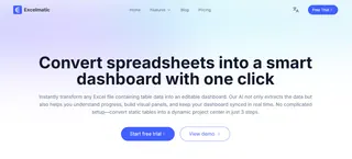
This is currently the most effortless option. Take Excelmatic as an example — an AI data-analysis tool. Upload your cleaned Excel file, then ask for what you need in plain language. In under a minute you can generate an interactive data dashboard with multiple charts.
- Traditional visualization tools:
If you prefer hands-on control, you can use Microsoft Excel / Google Sheets: They have rich charting features and suit users comfortable building visuals manually.
- Professional BI tools:
Tools like Tableau or Power BI are very powerful and can create highly customized, interactive dashboards. They have a steeper learning curve and are better for users with ongoing, deep visualization needs.
Step 4: Read the dashboard and complete your annual narrative
When the dashboard is generated, spend time reading it carefully. You're not just looking at charts — you're interpreting the story of your past year.
Which tool you choose depends on how much time you want to spend on the process itself. For individuals who want a quick start and to focus on insights, AI-driven approaches are currently the most efficient.
Step 5: From an annual summary to dynamic life management
At this point you have an excellent personal annual data report. But a dashboard's true power is that it can evolve from a static summary into a dynamic life-management system.
Turn it into a dynamic life-management system.
In the new year, you can periodically (for example, at the start of each month) update your data sources and rerun the analysis. Your dashboard will refresh accordingly.
This creates a continuous feedback loop so you can spot issues early, adjust strategies, and genuinely use data to drive decisions. Personal growth becomes a trackable, optimizable process.
Ultimately, from insight to action
Building a personal annual dashboard isn't about self‑quantification for its own sake. It's about achieving a clear self‑clarification.
At year's end you'll see more than a report. You'll have a life map you drew yourself — clearly marked with where you grew and where you can improve.
Now it's time to turn the idea into reality. Whether you want a personal annual report or a team workboard, Excelmatic can help you do it with ease. Upload your data, ask in plain language, and generate clear, professional visual analysis with one click.
This New Year, instead of repeating vague resolutions, start by creating a real data dashboard.

