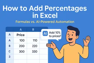
Let's be real - staring at rows of marketing data in Excel can feel overwhelming. But what if I told you those numbers hold the secrets to crushing your next campaign? As a growth manager who's analyzed thousands of spreadsheets, I'll show you exactly how to turn raw data into actionable insights.
Pro tip: While Excel works, I'll also share how our team uses Excelmatic to automate 80% of this process. Because let's face it - you'd rather be optimizing campaigns than wrestling with pivot tables.
Step 1: Clean Your Data Like a Pro
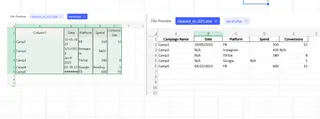
Messy data = misleading insights. Before any analysis, follow this checklist:
- Headers that actually make sense (not "Column1")
- Consistent formatting (all dates as MM/DD/YYYY)
- No blank cells - use "N/A" for missing data
- One data type per column (no numbers mixed with text)
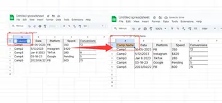
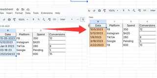
Excelmatic shortcut: Our AI automatically detects and fixes formatting issues as soon as you upload data. No more manual cleanup.
Step 2: Sort and Filter Like a Growth Hacker
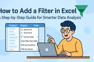
These basic tools help spot trends instantly:
Sorting example:
Want to see top-performing campaigns? Sort your "Conversions" column descending.
Filtering example:
Only want Q3 Facebook ad data? Filter by date range and platform.
Why this matters: Last month, filtering revealed our underperforming ad sets - we reallocated that budget to 2X ROAS.
Step 3: Pivot Tables (Your New Best Friend)
Pivot tables transform chaos into clarity:
- Select your data
- Insert > PivotTable
- Drag fields to analyze (e.g., "Campaign" to rows, "Spend" to values)
Game-changing insight: We discovered our blog content drove 60% of signups - now it gets 80% of our content budget.
Excelmatic advantage: Describe what you need ("show spend by channel") and our AI builds the perfect pivot table instantly.
Step 4: Visuals That Actually Tell a Story
The right chart makes insights pop:
- Bar charts: Compare campaign performance
- Line graphs: Spot monthly trends
- Pie charts: Show budget allocation
Pro tip: Always add clear titles and axis labels. No one should need to decode your chart.
In Excelmatic: Our AI suggests the best chart type based on your data. One click and it's done.
Step 5: Must-Know Formulas for Marketers
These formulas saved me hours last quarter:
- =SUMIFS() - Total conversions for specific campaigns
- =AVERAGE() - Find typical CTR across ads
- =VLOOKUP() - Match customer IDs to their LTV
Excelmatic does this better: Just type "what's the average conversion rate for paid search" and get the answer instantly.
Level Up: From Spreadsheets to Smart Insights
While Excel works, our team switched to Excelmatic because:
✅ AI analyzes data in plain English - no formulas needed
✅ Auto-generates dashboards in seconds
✅ Detects trends we might miss
✅ Collaborates in real-time with stakeholders
Last month, Excelmatic spotted an underperforming geo-targeting setting we'd missed for weeks. That fix alone paid for the tool.
Ready to Work Smarter?
You now have two paths:
- The manual way: Follow these Excel steps (it works)
- The growth hacker way: Try Excelmatic free and let AI do the heavy lifting
Either way, you're now equipped to turn marketing data into growth. What insight will you uncover first?
About the author:
As Excelmatic's Growth Manager, I've analyzed over 10,000 marketing datasets. My mission? Help teams spend less time in spreadsheets and more time driving results.


