Ever stared at your spreadsheet data wishing you could magically transform those numbers into clear visual insights? That's exactly what plotting y=mx+b equations can do for you. As a growth manager at Excelmatic, I use this simple yet powerful technique daily to spot trends and make data-driven decisions.
Why Y=MX+B Matters for Your Business Data
Before we dive into the how-to, let's talk about why this matters. The y=mx+b equation represents a straight line where:
- y is your outcome (like sales numbers)
- m is the rate of change (how fast sales are growing)
- x is your input (like time)
- b is your starting point
At Excelmatic, we've found this is the perfect starting point for:
- Predicting future sales trends
- Analyzing marketing campaign performance
- Understanding customer growth patterns
Setting Up Your Google Sheets for Success
First, let's get your data organized:
- Open a new Google Sheet
- Label column A as "X" (your independent variable)
- Label column B as "Y" (we'll calculate this)
Pro tip: If you're using Excelmatic, our AI can automatically suggest the best variables to use as X and Y based on your data patterns.
Calculating Your Y Values Made Simple
Here's where the magic happens. Let's say you want to model a scenario where:
- Slope (m) = 2
- Y-intercept (b) = 1
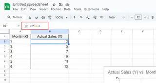
In cell B2, enter:
=2*A2+1

Drag this formula down, and voilà! You've just transformed your X values into meaningful Y predictions.
Visualizing Your Linear Relationship
Now let's make this data come alive:
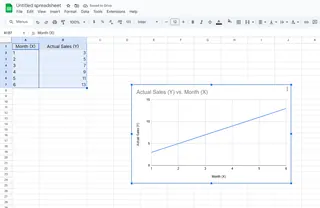
- Highlight both columns
- Click Insert > Chart
- Choose "Line chart" from the Chart Editor

Excelmatic users: Our platform automatically recommends the best chart type and even suggests optimal slope/intercept values based on your historical data.
Common Pitfalls (And How to Avoid Them)
From helping hundreds of users, here are the top mistakes we see:
🔴 Formula errors: Double-check your =m*A2+b format
🔴 Wrong chart type: Stick with line charts for linear relationships
🔴 Misinterpreted slope: Remember, steeper slope = faster change
Taking It to the Next Level
Want to go beyond basic linear models? With Excelmatic, you can:
- Automatically calculate optimal slope/intercept
- Compare multiple linear models side-by-side
- Generate predictive forecasts with confidence intervals
Why Stop at Google Sheets?
While Google Sheets gets the job done, tools like Excelmatic transform this process with:
✅ AI-powered slope suggestions
✅ Automatic error detection
✅ One-click visualization
✅ Collaborative dashboards
Next time you're analyzing linear relationships, remember: y=mx+b is just the beginning. With the right tools, you can turn simple spreadsheets into powerful business insights.
Ready to supercharge your data analysis? Excelmatic helps you go from raw numbers to actionable insights in minutes, not hours. Try it free today and see the difference AI-powered analysis can make!


