We've all been there - you spend hours crunching numbers in Google Sheets, only to end up with a chart that looks like abstract art. Those unlabeled axes leave everyone scratching their heads. Let's fix that.
At Excelmatic, we help teams turn raw data into actionable insights daily. Adding clear X-axis labels is one of those small but mighty steps that separates amateur spreadsheets from pro-level data visualizations.
Why X-Axis Labels Matter More Than You Think
Picture this: you're presenting quarterly sales data to your boss. Your beautiful line chart shows peaks and valleys... but without month labels? You might as well be showing them a Rorschach test.
X-axis labels:
- Give context to your data points
- Prevent misinterpretations
- Make your charts instantly understandable
- Help tell your data's story
Pro tip: In Excelmatic, our AI automatically suggests optimal label placements based on your data type. No more guessing games.
Setting Up Your Data for Success
Before we dive into labeling, let's get your data house in order:
- Organize your X-axis data in one column (dates, categories, etc.)
- Put corresponding values in adjacent columns
- Keep it clean - no merged cells or random blanks
Example of well-structured data:
Month       | Revenue
------------|---------
January     | $15,000
February    | $18,000
March       | $22,000
Creating Your Chart (The Right Way)
Here's how to build a chart that's ready for labels:
- Highlight your data range (including headers!)
- Click Insert > Chart
- In the Chart Editor, pick your chart type (line, bar, etc.)
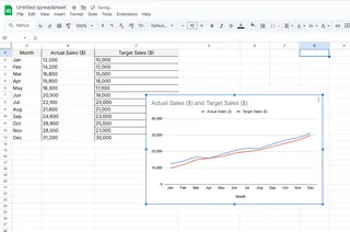
Common mistake alert: Many people select just the numbers, forgetting to include the label column. Don't be that person.
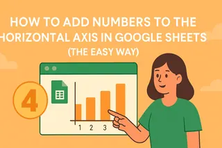
Adding X-Axis Labels in 3 Simple Steps
Now for the main event - making your chart actually readable:
- Click your chart > Edit chart (three-dot menu)
- Go to Customize tab > Chart & axis titles
- Under "Horizontal axis title," enter your label (e.g., "Months")
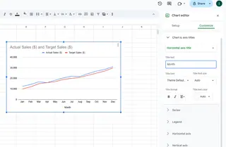
Bonus: In Excelmatic, our AI suggests smart label names based on your column headers. One less thing to worry about.
Pro-Level Customization Tricks
Want to take your labels from basic to brilliant?
- Font tweaks: Make labels stand out with bold or color
- Angle them: Rotate labels for better fit on crowded charts
- Add formatting: Include units ($, %, etc.) when relevant
- Dynamic updates: Use named ranges so labels auto-update
Common Labeling Pitfalls (And How to Avoid Them)
From our experience helping thousands of users, these are the top mistakes:
- Label overload: Too many labels = visual noise. Show every 2nd or 3rd label if needed
- Microscopic text: If people need a magnifying glass, your labels are too small
- Inconsistent formatting: Keep label styling uniform across all charts
- Forgetting the Y-axis: While we focused on X today, don't neglect the other axis!
Beyond Google Sheets: Next-Level Data Viz
While Google Sheets gets the job done, tools like Excelmatic take visualization further with:
- AI-powered automatic labeling
- Smart chart type recommendations
- One-click professional styling
- Real-time collaboration features
Why spend hours manually tweaking charts when AI can do it in seconds?
Your Turn to Shine
Now you've got the know-how to transform those label-less charts into data storytelling masterpieces. Remember - great visualizations aren't about fancy effects, they're about clear communication.
Ready to take your data game to the next level? Excelmatic helps you create presentation-ready charts in minutes, not hours. Our AI handles the formatting so you can focus on insights. Why not give it a try today?

