Let's be real - raw numbers don't always tell the full story. That's where uncertainty bars come in clutch. As a growth manager at Excelmatic, I've seen how visualizing data variability can transform dry spreadsheets into compelling business insights.
Why Uncertainty Bars Matter
Think of uncertainty bars as your data's "maybe zone." They show how much your numbers might wiggle - crucial when presenting:
- Market research findings
- Product performance metrics
- Scientific experiment results
- Financial projections
At Excelmatic, we use them daily to add context to our growth metrics. A 15% conversion rate looks very different when you see it could realistically be 12-18%.
Excelmatic's Recommended Approach
While Excel can handle uncertainty bars, Excelmatic makes it effortless. Our AI instantly calculates and visualizes data variability while you focus on insights. But if you're working in traditional Excel, here's how to do it manually:
Step 1: Set Up Your Base Chart
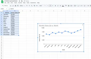
- Enter your data (say, monthly sales figures)
- Select the data range
- Insert > Charts > Choose column or line chart

Step 2: Choose Your Uncertainty Type
- Standard Deviation: Shows data spread
- Standard Error: Indicates sampling accuracy
- Confidence Intervals: Predicts population range
Pro tip: For business reports, confidence intervals often make the most sense.
Step 3: Add the Bars
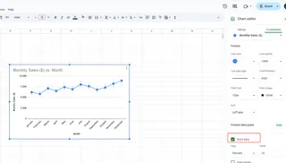
- Click your chart > Chart Design > Add Chart Element
- Select Error Bars > More Options
- Choose "Custom" and specify your range
- Format for clarity (we recommend subtle gray bars)

Common Pitfalls to Avoid
From our experience helping clients, watch out for:
- Overcrowding: Too many bars obscure your message
- Wrong calculation: Using STDEV when you need STDEVP
- Static bars: Forgetting to update when data changes
Why Excelmatic Does It Better
Manually adding uncertainty bars works, but it's time-consuming. Excelmatic automates the entire process:
- Upload your dataset
- Our AI detects variability patterns
- Generates optimized visualizations
- Allows real-time adjustments
The result? Presentation-ready charts in seconds, not hours.
Pro Visualization Tips
- Use consistent scaling across comparison charts
- Label bars clearly (e.g., "± 5% confidence")
- Match bar colors to your brand palette
- Keep designs minimalist - let the data speak
When to Upgrade from Basic Excel
If you find yourself:
- Spending hours on error calculations
- Creating the same charts repeatedly
- Needing to share live data views
...it's time to try Excelmatic. Our users report cutting their reporting time by 80% while improving data clarity.
The Future of Data Visualization
Static charts are so 2020. Modern teams need:
- Interactive dashboards
- AI-powered insights
- Real-time collaboration
- Automated updates
That's exactly what we've built at Excelmatic - the next evolution of data presentation tools.
Your Turn to Shine
Now that you know how to add uncertainty bars, you're ready to create more nuanced reports. Whether you stick with manual Excel methods or upgrade to Excelmatic's automated solution, your data storytelling just leveled up.
Remember: Great data visualization isn't about hiding uncertainty - it's about presenting it clearly so stakeholders can make informed decisions. That's the Excelmatic difference.


