As a growth manager at Excelmatic, I've seen how small tweaks can make huge differences in data presentation. One of those game-changing details? Tick marks. These little lines on your chart axes might seem insignificant, but they're actually secret weapons for clearer data storytelling.
Why Tick Marks Matter in Data Visualization
Tick marks act like road signs for your charts. They help viewers quickly understand scale and pinpoint exact values without squinting at numbers. Imagine showing quarterly sales growth - with proper tick marks, your audience can instantly see whether Q2 hit $12K or $12.5K.
At Excelmatic, we've found that well-designed charts with strategic tick marks:
- Reduce meeting time spent explaining data
- Make reports more persuasive
- Help teams spot trends faster
Your Quick-Start Guide to Tick Marks
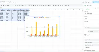
Step 1: Create Your Base Chart
First, you'll need data visualized. In Excel:
- Highlight your data range
- Go to Insert > Charts
- Choose your chart type (bar, line, etc.)

Pro tip: Excelmatic's AI can generate optimized charts from raw data in seconds - no manual formatting needed.
Step 2: Add Major Tick Marks
These are your primary reference points:
- Right-click the axis
- Select "Format Axis"
- Under "Tick Marks", choose position (outside, inside, or cross)
Step 3: Fine-tune With Minor Tick Marks
For extra precision between major points:
- Stay in Format Axis
- Find "Minor Tick Marks"
- Select your preferred style
Customization Pro Tips
Make your charts pop with these easy tweaks:
- Color coding: Match tick marks to your brand colors
- Smart spacing: Adjust intervals to prevent clutter
- Dynamic updates: Excelmatic automatically adjusts tick marks when data changes
Common Pitfalls (And How to Avoid Them)
Even seasoned analysts make these mistakes:
- Overcrowding: Too many tick marks create visual noise
- Fix: Increase interval spacing
- Inconsistent styling: Random colors/sizes look unprofessional
- Fix: Create a style guide for all company charts
- Static charts: Manually updating tick marks wastes time
- Fix: Use Excelmatic's auto-formatting features
Beyond Basic Tick Marks: Advanced Techniques
Ready to level up? Try these:
- Conditional formatting: Highlight specific ranges (e.g., red for negative growth)
- Custom labels: Replace numbers with meaningful text
- Multi-axis charts: Coordinate tick marks across different scales
Why Smart Teams Use Excelmatic for Charts
While Excel's native tools work, they require manual tweaking. Excelmatic revolutionizes chart creation by:
- Automatically optimizing tick mark placement
- Applying consistent styling across all reports
- Updating visuals in real-time as data changes

Our users save 5+ hours weekly on report creation - time better spent analyzing insights rather than formatting charts.
Your Action Plan
- Open your latest report
- Apply these tick mark techniques
- Notice how much clearer your data becomes
Remember: Great data visualization isn't about fancy designs - it's about removing friction in understanding. Tick marks are simple tools that deliver outsized impact.
Want to take your charts to the next level? Try Excelmatic free today and experience AI-powered data visualization that works while you sleep. Your future self (and your team) will thank you.


