Those little error bars showing data variability can transform your charts from "meh" to "wow" in seconds. But if you're not a spreadsheet wizard, adding standard deviation bars in Google Sheets might feel like solving a Rubik's cube blindfolded.
Here's the good news: it's actually pretty simple once you know the steps. Even better? Tools like Excelmatic can automate the entire process with AI. Let's break it down.
Why Standard Deviation Bars Matter (In Plain English)
Imagine you're looking at your team's monthly sales numbers. The average looks great, but are all months performing similarly, or are there wild swings? Standard deviation bars answer that question visually.
They show:
- Tight clusters = consistent performance
- Wide spreads = unpredictable results
For business decisions, this is gold. You wouldn't invest in a stock that swings wildly without knowing, right? Same logic applies to your data.
The Manual Method: Adding Standard Deviation Bars Step-by-Step
1. Set Up Your Data Right
- Label columns clearly (e.g., "Month", "Sales")
- Keep data organized in columns
- Check for missing values or errors
2. Calculate Standard Deviation
Use Google Sheets' built-in formula:
=STDEV(range)
Just replace "range" with your actual data cells (e.g., B2:B12).
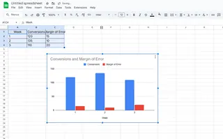
3. Create Your Base Chart
- Highlight your data
- Click Insert > Chart
- Choose your chart type (column charts work well for this)

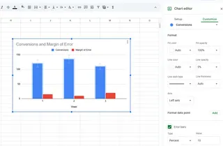
4. Add Those Magic Bars
Here's where it gets slightly tricky since Google Sheets doesn't have a one-click solution:
- Calculate error values (your standard deviation results)
- In Chart Editor: Customize > Series > Error Bars
- Set error amount to your calculated values

The Smart Way: Let AI Do the Heavy Lifting
If that process feels tedious, you're not alone. This is where Excelmatic changes the game. Instead of wrestling with formulas and menus:
- Upload your data to Excelmatic
- Tell it what you want: "Show monthly sales with standard deviation bars"
- Get a professional chart instantly
No formulas to remember. No menu diving. Just clean, insightful visualizations in seconds.
Common Pitfalls (And How to Avoid Them)
Watch out for:
- Wrong cell ranges: Double-check your selected data
- Mixed data types: Don't include headers in your STDEV calculation
- Overcrowded charts: Too many bars can make charts unreadable
Beyond Standard Deviation: Other Ways to Show Variability
While standard deviation bars are great, sometimes you need different views:
- Box plots: Show median, quartiles and outliers
- Histograms: Reveal data distribution patterns
- Scatter plots: Display relationships between variables
Excelmatic can generate all these automatically based on your data's story.
Pro Tips for Impactful Data Visuals
- Color strategically: Use color to highlight key insights
- Keep it simple: Remove unnecessary chart junk
- Annotate: Add brief notes explaining what the variability means
The Bottom Line
Standard deviation bars add crucial context to your data stories. While Google Sheets can do it manually, AI tools like Excelmatic turn what used to be a 15-minute chore into a 15-second task.
Why waste time on spreadsheet mechanics when you could be uncovering insights that move your business forward? That's the power of modern AI-assisted data analysis.
Ready to upgrade your data game? Excelmatic gives you professional-grade visualizations without the spreadsheet headaches. Your future self (and your boss) will thank you.


