Want to make your Google Sheets charts tell the whole story? Standard deviation bars are your secret weapon for showing how spread out your data really is. Think of them as the "error bars" that reveal whether your sales numbers are consistently strong or all over the place.
At Excelmatic, we help growth teams automate their data analysis—but sometimes you need to roll up your sleeves in spreadsheets. Here's how to add standard deviation bars manually, plus how our AI-powered platform can do it in seconds.
Why Standard Deviation Matters (Even If You're Not a Statistician)
Standard deviation measures how far your data points stray from the average. Small deviation? Your numbers are consistent. Big deviation? There's volatility you should notice.
Picture a basketball player's shooting:
- Tight cluster of shots = Steph Curry-level consistency
- Shots scattered everywhere = Rookie season jitters
In business terms, standard deviation helps you spot:
- Reliable vs. erratic sales patterns
- Customer behavior consistency
- Quality control issues in manufacturing
The Manual Method: Adding Standard Deviation Bars in Google Sheets
Step 1: Calculate Your Key Metrics
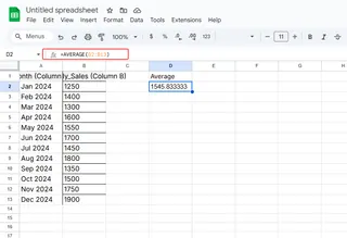
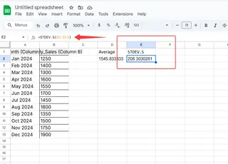
First, find your average and standard deviation using these formulas:
=AVERAGE(B2:B13)  // For mean
=STDEV.S(B2:B13)  // For sample standard deviation


Step 2: Create Your Base Chart
- Highlight your data (e.g., monthly sales)
- Click Insert > Chart
- Choose column or line chart
Step 3: Add the Magic Bars
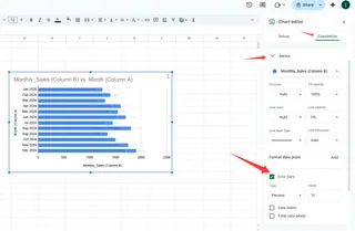
- Click your chart > Chart Editor > Customize
- Find "Series" > "Error bars"
- Select "Custom" and input your standard deviation values

Pro Tip: Use helper columns to calculate "Mean + SD" and "Mean - SD" for cleaner error bars.
Where People Get Stuck (And How to Avoid It)
- Dirty data: Clean duplicates first with Data > Cleanup
- Wrong deviation type: Use STDEV.S for samples, STDEV.P for complete data
- Overcrowded charts: Focus on 1-2 key metrics per visualization
The Excelmatic Shortcut: AI-Powered Error Bars
While Google Sheets gets the job done, our users love how Excelmatic automates standard deviation visualization:
- Upload your dataset
- Ask "Show sales trends with variability"
- Get an interactive chart with perfect error bars—no formulas needed
Example use cases we've helped with:
- E-commerce teams tracking daily conversion rate fluctuations
- SaaS companies monitoring feature usage patterns
- Marketing agencies reporting campaign performance consistency
When to Upgrade From Manual Charts
Consider automation when you:
- Update reports weekly/monthly
- Share findings with non-technical stakeholders
- Need to analyze multiple metrics simultaneously
Excelmatic doesn't just add error bars—it explains what the variability means for your business. Our AI will flag if a 15% deviation is normal for your industry or cause for concern.
Take Your Data Storytelling Further
Standard deviation bars are just the start. Try combining them with:
- Conditional formatting for "red flag" thresholds
- Trendlines to contextualize variability
- Annotations for unusual events (holidays, promotions)
Remember: The goal isn't just prettier charts—it's helping your team make better decisions faster. Whether you stick with manual Google Sheets methods or let Excelmatic automate the process, visualizing variability transforms raw numbers into actionable insights.
Ready to skip the spreadsheet gymnastics? See how Excelmatic creates error-bar charts automatically. Our AI analyzes your data's patterns so you can focus on what matters—growing your business.


