Want to make your Google Sheets data pop without cluttering your workspace? Sparklines are your secret weapon. These mini-charts live inside a single cell, showing trends at a glance—no bulky charts needed.
At Excelmatic, we love helping teams work smarter with data. Sparklines are one of those simple-but-powerful tools that can level up your spreadsheets instantly. Let’s break down how to use them.
What Are Sparklines?
Sparklines are bite-sized charts that fit right into your spreadsheet cells. Unlike traditional charts, they don’t need extra space—just a tiny corner of your sheet to show trends, highs, lows, or comparisons.
Why Use Sparklines?
- Space-saving: No need for separate chart areas.
- Quick insights: Spot trends without analyzing raw numbers.
- Dashboard-friendly: Perfect for reports where real estate is tight.
Google Sheets supports three sparkline types:
- Line: Shows trends over time (great for sales or growth tracking).
- Bar: Compares values side by side.
- Column: Vertical bars for quick comparisons.
How to Add Sparklines in Google Sheets
Ready to try it? Here’s the basic formula:
=SPARKLINE(data_range, {options})
Step-by-Step:
- Click the cell where you want the sparkline.
- Type
=SPARKLINE(and select your data range (e.g.,A1:A12for monthly sales). - Add optional customization (more on that next).
- Hit Enter. Boom—instant visual!
Example:
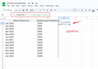
=SPARKLINE(B2:B14, {"charttype","line"})
This creates a line sparkline for data in cells B2 to B14.

Customizing Sparklines
Make your sparklines match your style or highlight key data:
Change the Type
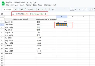
=SPARKLINE(A1:A12, {"charttype","bar"})

Add Color
=SPARKLINE(A1:A12, {"color","#4285F4"}) // Google’s classic blue
Highlight Peaks and Valleys
=SPARKLINE(A1:A12, {"highcolor","green"; "lowcolor","red"})
Pro tip: Use brand colors or conditional formatting to make sparklines part of your team’s reporting style.
Real-World Uses
Sparklines shine in:
- Sales dashboards: Track monthly performance in a single row.
- Project timelines: Visualize task completion rates.
- Financial reports: Spot stock price trends at a glance.
Example: Add a sparkline next to quarterly revenue to instantly show growth trends.
Advanced Tricks
Dynamic Ranges: Use
INDIRECTto auto-update sparklines as data grows:=SPARKLINE(INDIRECT("Sales!B2:B"&COUNTA(Sales!B:B)))Mix with Pivot Tables: Summarize data with a pivot table, then add sparklines for visual context.
Dashboard Magic: Combine sparklines with Excelmatic’s AI analytics to auto-generate insights. (Psst—our tool can suggest the best sparkline type for your data!)
Common Pitfalls
- Wrong data range: Double-check your cell references.
- Over-customizing: Keep it simple—focus on clarity.
- Static ranges: Use dynamic formulas if your data expands.
Sparklines + Excelmatic = Next-Level Data
While sparklines are great, imagine pairing them with AI-powered analysis. Excelmatic automates the heavy lifting:
- Auto-generate sparklines from raw data.
- Suggest trends based on your numbers.
- Build full dashboards in minutes, not hours.
Try adding sparklines today, then supercharge them with Excelmatic’s smart tools. Your future self (and your team) will thank you!
Key Takeaways
- Sparklines = mini-charts for fast, space-saving visuals.
- Use
=SPARKLINE()with data ranges and optional styling. - Perfect for dashboards, reports, and trend spotting.
- Pair with Excelmatic to automate and enhance your data storytelling.
Now go make your data sparkle! 🔥


