Pie charts are the go-to when you need to show how parts make up a whole. But let's be honest—without percentages, they're just pretty colored circles. As a growth manager at Excelmatic, I see teams struggle with this daily. Today, I'll show you how to add percentages in Google Sheets, and how Excelmatic can do this automatically while you focus on insights.
Why Percentages Matter in Pie Charts
Imagine showing your boss a pie chart of Q2 sales. Without percentages, they're left guessing which product drove revenue. Percentages turn guesswork into clear insights. They help you:
- Spot trends at a glance
- Make data-driven decisions faster
- Present findings more convincingly
Creating Your First Pie Chart (The Foundation)
Before we add percentages, let's build the basics:
- Open Google Sheets and enter your data (categories + values)
- Highlight your data range
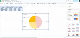
- Click Insert > Chart
- In the Chart Editor, switch to "Pie Chart"

Pro tip: Keep your categories under 7 for readability. More than that? Consider a bar chart instead.
Adding Percentages Like a Pro
Now for the magic:
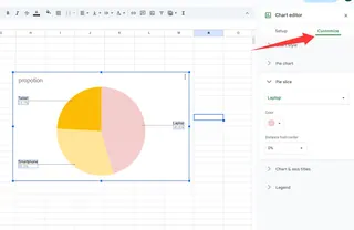
- Click your pie chart to activate the Chart Editor
- Go to Customize > Pie chart
- Find "Slice label" and select "Percentage"

Boom—instant clarity! Your team will now see exactly what each slice represents.
Customization Hacks to Impress Your Team
While you're here, let's make this chart pop:
- Color code by importance (red for urgent, green for positive)
- Reposition the legend to save space
- Add data labels for extra context
Fun fact: In Excelmatic, these customizations happen automatically based on your data patterns. Our AI suggests optimal colors and layouts—no design degree needed.
Common Pitfalls (And How to Avoid Them)
I've seen these mistakes too often:
The "Everything But the Kitchen Sink" Chart
Too many slices? Combine small categories into "Other"The "Math Doesn't Add Up" Problem
Double-check your totals equal 100%The "Forgotten Update"
Set reminders to refresh charts with new data
When Pie Charts Shine Brightest
From my experience, these scenarios love pie charts:
- Budget breakdowns (That 37% marketing spend? Now you see it)
- Market share visuals (Perfect for investor decks)
- Survey results ("68% prefer Option B" jumps right out)
The Excelmatic Advantage
Here's why our users skip the manual work:
- Automatic percentage calculations (No more manual math)
- Smart formatting (Our AI picks the clearest display)
- Live data sync (Charts update as your data changes)
Try pasting your data into Excelmatic—you'll get a percentage-labeled pie chart before you can say "data visualization."
Beyond Pie Charts: Choosing the Right Visual
While pie charts rock for proportions, sometimes you need:
- Bar charts for detailed comparisons
- Line graphs for trends over time
- Scatter plots for correlation insights
In Excelmatic, describe your goal and our AI suggests the perfect chart type. "Show me sales by region over time" gets you an optimized visual instantly.
Pro Tips for Next-Level Data Stories
Want to stand out? Try these:
- Add annotations to highlight key takeaways
- Use consistent color schemes across reports
- Combine charts for richer insights
Remember: The goal isn't just showing data—it's telling its story. With tools like Excelmatic, you spend less time building charts and more time uncovering insights that drive decisions.
Ready to upgrade your data game? Excelmatic turns raw numbers into presentation-ready visuals while you focus on what matters—growing your business. Why manually format when AI can do it better?


